


- Riley Blaze Poster
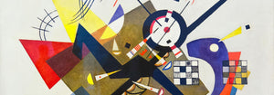
- Solaris Poster
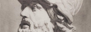
- Campanile di Pisa Poster
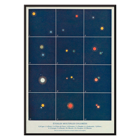
- Etoiles multiples colorées Poster
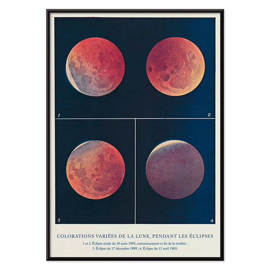
- Colorations variées de la Lune Poster
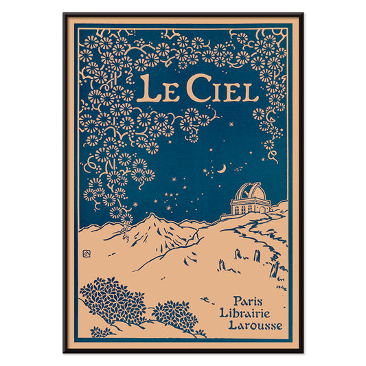
- Le Ciel Poster
- Tarot - The Moon 2 Poster
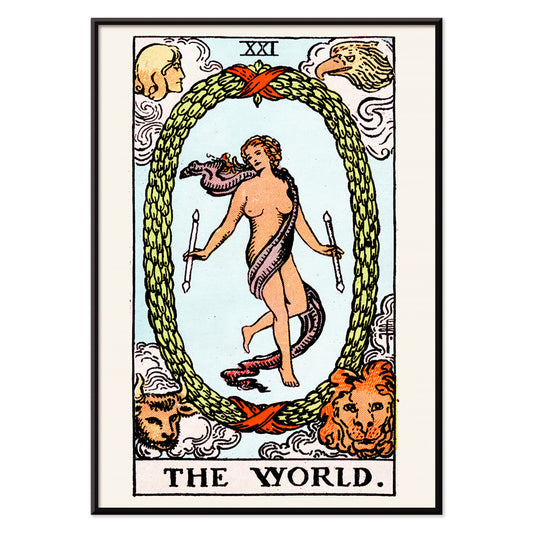
- Tarot - The World Poster
- Signs of the Zodiac Poster
- Coffee-Pot Patent Poster
- Tea or Coffee Pot Patent Poster
- Coffee Mill Patent Poster
-
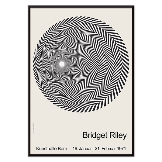
Riley Blaze Poster
Bridget Riley · 1964 · Hypnotic black and white Op Art poster with curving bands that seem to pulse
Poster from €9 · Framed from €16
Regular price From €6,00Regular price -
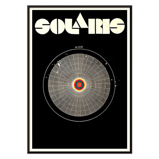
Solaris Poster
Unknown artist · 1972 · Hypnotic cosmic poster with orbiting forms and bold red-blue contrasts
Poster from €9 · Framed from €16
Regular price From €6,00Regular price -
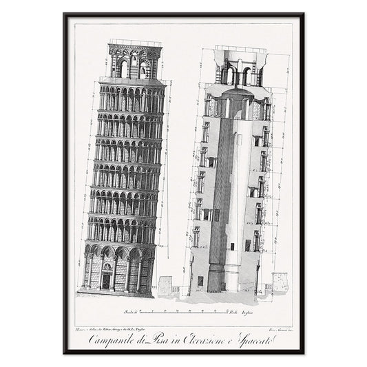
Campanile di Pisa Poster
G.L. Taylor · 1837 · Precise architectural print of the Leaning Tower of Pisa in crisp monochrome
Poster from €9 · Framed from €16
Regular price From €6,00Regular price -
Etoiles multiples colorées Poster
Alphonse Berget · 1925 · Educational astronomy poster mapping multiple star systems in crisp blue with bright star points
Poster from €9 · Framed from €16
Regular price From €6,00Regular price -
Colorations variées de la Lune Poster
Alphonse Berget · 1925 · Chartlike lunar eclipse scientific print showing moons shifting from white to copper red
Poster from €9 · Framed from €16
Regular price From €6,00Regular price -
Le Ciel Poster
Alphonse Berget · 1925 · Art Nouveau astronomy poster featuring a deep blue sky with celestial diagrams
Poster from €9 · Framed from €16
Regular price From €6,00Regular price -
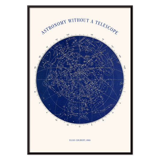
Astronomy without a telescope Poster
Elias Colbert · 1869 · Detailed celestial chart poster mapping constellations for stargazing without instruments
Poster from €9 · Framed from €16
Regular price From €6,00Regular price -
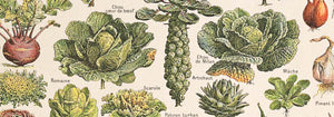
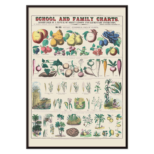
Economical use of plants Poster
Marcius Willson · 1865 · Detailed botanical chart poster mapping practical plant uses in crisp labeled vignettes
Poster from €9 · Framed from €16
Regular price From €6,00Regular price -
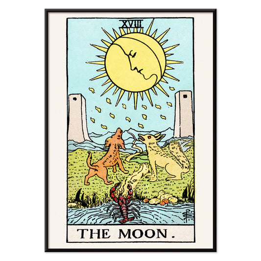
Tarot - The Moon 2 Poster
Rider Waite · 1910 · Mystical Moon tarot poster with twin canines, winding path, and dreamlike night palette
Poster from €9 · Framed from €16
Regular price From €6,00Regular price -
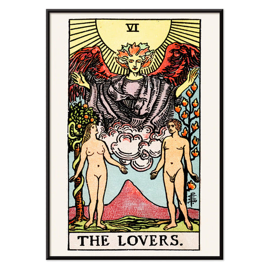
Tarot - The Lovers Poster
Rider Waite · 1910 · Iconic tarot vintage print of an angel blessing lovers beneath symbolic trees
Poster from €9 · Framed from €16
Regular price From €6,00Regular price -
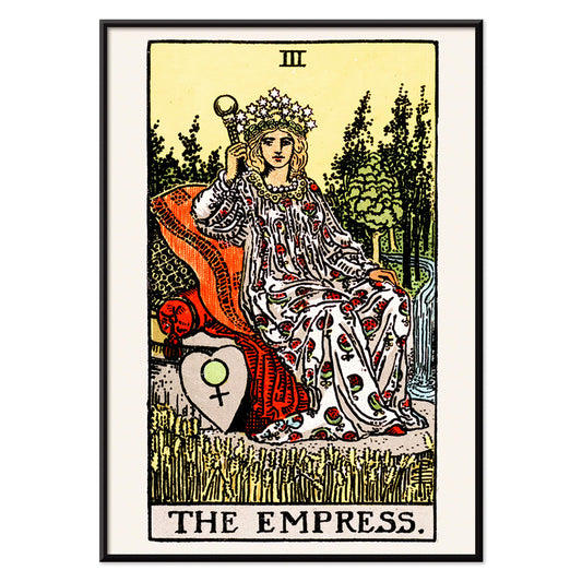
Tarot - The Empress Poster
Rider Waite · 1910 · Symbolic Empress tarot poster with starry crown, wheat field, and Venus shield
Poster from €9 · Framed from €16
Regular price From €6,00Regular price -
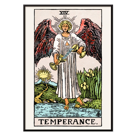
Tarot - Temperance Poster
Rider Waite · 1910 · Iconic Temperance tarot poster featuring an angel pouring water between two cups
Poster from €9 · Framed from €16
Regular price From €6,00Regular price -
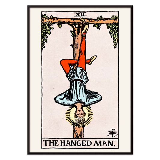
Tarot - The Hanged Man Poster
Rider Waite · 1910 · Symbolic Hanged Man tarot poster with calm blue sky and radiant halo
Poster from €9 · Framed from €16
Regular price From €6,00Regular price -
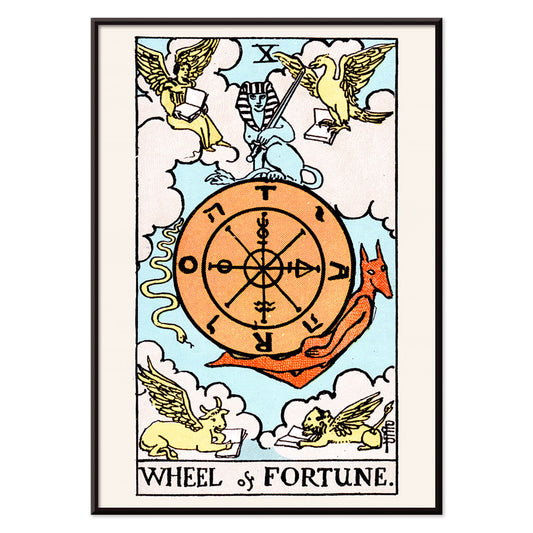
Tarot - The Wheel Of Fortune Poster
Rider Waite · 1910 · Mystical Wheel of Fortune poster featuring a golden wheel, sphinx, and winged corner figures
Poster from €9 · Framed from €16
Regular price From €6,00Regular price -
Tarot - The World Poster
Rider Waite · 1910 · Mystical tarot poster with dancing figure inside laurel wreath and four guardians
Poster from €9 · Framed from €16
Regular price From €6,00Regular price -
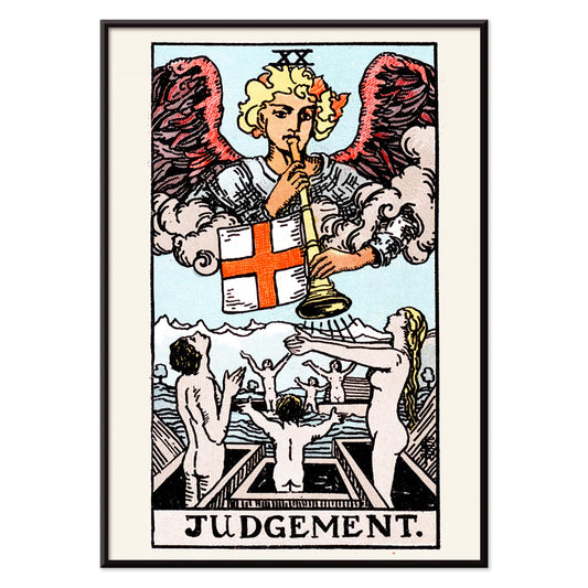
Tarot - Judgement Poster
Rider Waite · 1910 · Iconic Judgement tarot poster with angel trumpet and figures rising above blue water
Poster from €9 · Framed from €16
Regular price From €6,00Regular price -
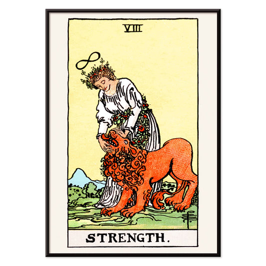
Tarot - Strength Poster
Rider Waite · 1910 · Symbolic Strength tarot poster featuring a calm maiden and lion beneath an infinity sign
Poster from €9 · Framed from €16
Regular price From €6,00Regular price -
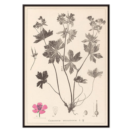
Herbier Français Pl.59 Poster
Antoine Cusin · 1867 · Delicate botanical print of woodland geranium with soft pink blooms and precise linework
Poster from €9 · Framed from €16
Regular price From €6,00Regular price -
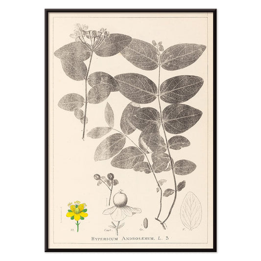
Herbier Français Pl.117 Poster
Antoine Cusin · 1867 · Refined Hypericum androsaemum botanical print with crisp linework and soft yellow and green tones
Poster from €9 · Framed from €16
Regular price From €6,00Regular price -
Blue set of leaves Poster
Owen Jones · 1856 · Ornamental blue leaf botanical print with crisp symmetry and elegant Victorian design
Poster from €9 · Framed from €16
Regular price From €6,00Regular price -
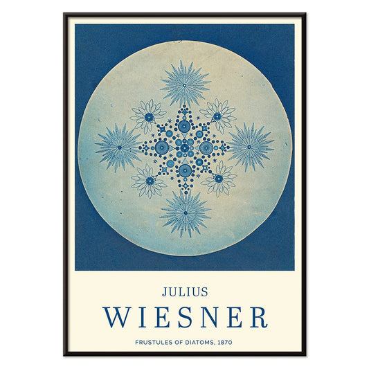
Frustules of Diatoms Poster
Julius Wiesner · 1910 · Cyanotype diatom frustules print with crisp white micro-geometry on deep blue
Poster from €9 · Framed from €16
Regular price From €6,00Regular price -
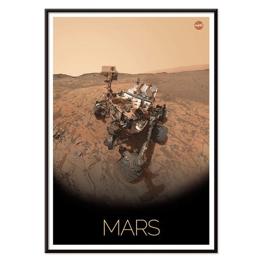
Rover on Mars Poster
NASA · 2006 · Detailed Mars rover poster crossing a rugged red landscape in warm brown and beige tones
Poster from €9 · Framed from €16
Regular price From €6,00Regular price -
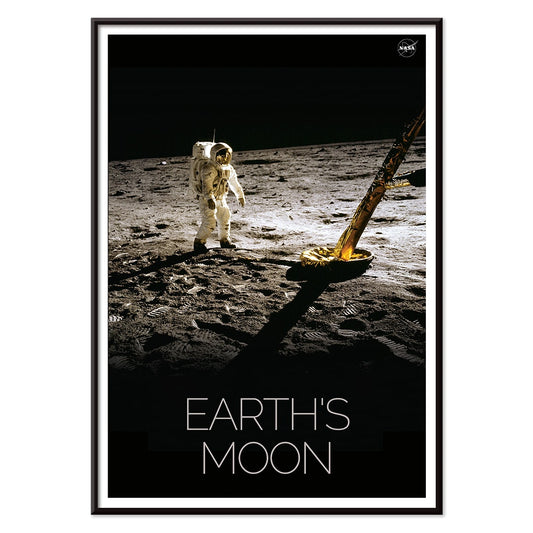
Man on Moon 2 Poster
NASA · 1969 · Iconic lunar exploration poster featuring a solitary astronaut on the textured Moon surface
Poster from €9 · Framed from €16
Regular price From €6,00Regular price -
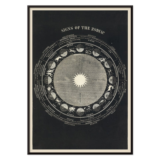
Signs of the Zodiac Poster
Asa Smith · 1850 · Detailed zodiac chart print pairing constellation emblems with crisp Victorian linework
Poster from €9 · Framed from €16
Regular price From €6,00Regular price -
Man on Moon 1 Poster
NASA · 1969 · Historic lunar print featuring an astronaut and rover beneath a stark black sky
Poster from €9 · Framed from €16
Regular price From €6,00Regular price -
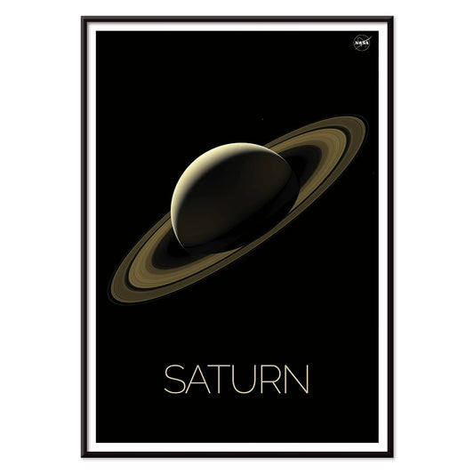
Saturn Poster
NASA · 2018 · Sleek Saturn poster with luminous rings over a deep black starfield
Poster from €9 · Framed from €16
Regular price From €6,00Regular price -
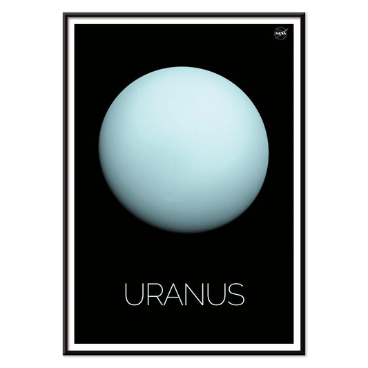
Uranus Poster
NASA · 1986 · Minimalist Uranus poster with a pale blue planet set against deep black space
Poster from €9 · Framed from €16
Regular price From €6,00Regular price -
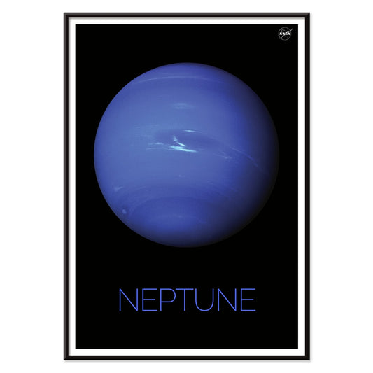
Neptune Poster
NASA · 1989 · Vivid blue Neptune poster floating in deep black space with crisp mission-era typography
Poster from €9 · Framed from €16
Regular price From €6,00Regular price -
Moon Poster
NASA · 1969 · Crisp lunar surface poster with high-contrast craters against deep black space
Poster from €9 · Framed from €16
Regular price From €6,00Regular price -
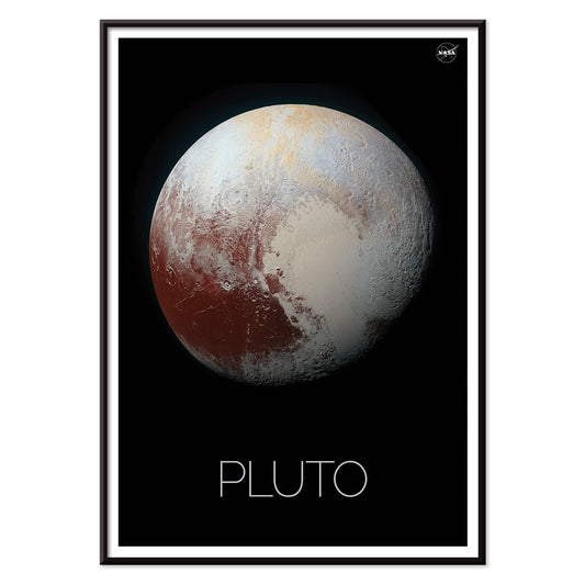
Pluto Poster
NASA · 1994 · Minimal Pluto poster featuring a textured planetary disk on a deep black background
Poster from €9 · Framed from €16
Regular price From €6,00Regular price -
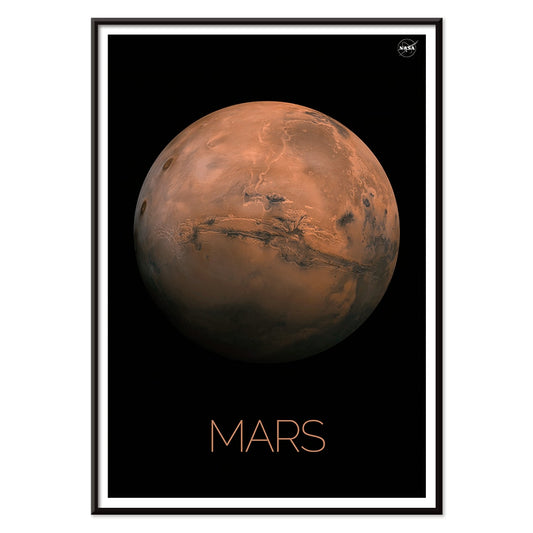
Mars Poster
NASA · 1976 · Iconic Mars poster featuring orange and ochre surface tones against a deep black background
Poster from €9 · Framed from €16
Regular price From €6,00Regular price -
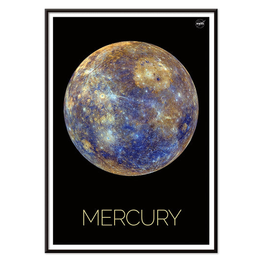
Mercury Poster
NASA · 1979 · Rugged cratered Mercury poster floating in deep black space with warm ochre highlights
Poster from €9 · Framed from €16
Regular price From €6,00Regular price -
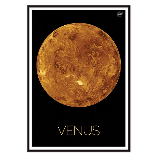
Venus Poster
NASA · 1972 · Retro Venus poster featuring bold orange planet tones and minimalist space age design
Poster from €9 · Framed from €16
Regular price From €6,00Regular price -
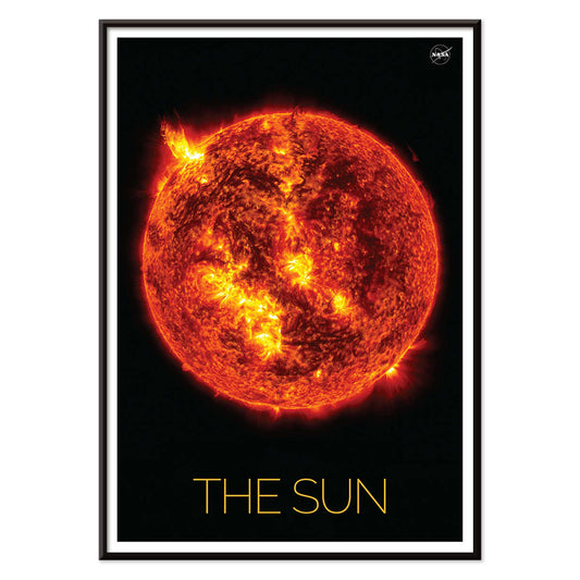
The Sun 3 Poster
NASA · 2019 · Fiery solar surface poster with arcing flares in orange and yellow on black
Poster from €9 · Framed from €16
Regular price From €6,00Regular price -
Earth from Space 2 Poster
NASA · 1990 · Vivid Earth-from-space poster featuring luminous blue oceans and swirling white clouds
Poster from €9 · Framed from €16
Regular price From €6,00Regular price -
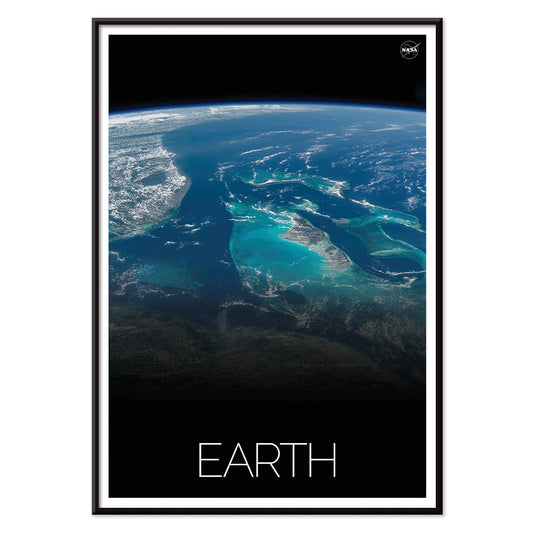
Earth from Space 1 Poster
NASA · 1969 · Iconic Earth-from-space poster featuring swirling white clouds over deep blue oceans
Poster from €9 · Framed from €16
Regular price From €6,00Regular price


36/287 items
Drawn knowledge, hung like art
Science posters carry a quiet drama: the conviction that the world can be measured, named, and drawn. The tradition runs from classroom charts and museum plates to observatory maps and patent sheets, where information becomes composition. In this Science selection, vintage print culture meets wall art, with disciplined linework, calibrated scales, and typography that keeps the eye moving like a reader across a page. What makes these posters so usable as decoration is their dual nature: they look authoritative up close, and from across the room they read as elegant grids, arcs, and constellations.
Observation, printing, and the authority of the diagram
Many of these images were built for clarity, not mood, yet their techniques create atmosphere. Lithography and chromolithography made complex diagrams reproducible; careful registration gave color theory and natural history plates their crisp separations. Michel-Eugène Chevreul’s Cercle chromatique organizes hue as a system, a bridge between scientific method and later modern design. Ernst Haeckel’s Hexacoralla treats marine biology like architecture, where symmetry and repetition feel almost ornamental. E. L. Trouvelot’s The Great Comet of 1881 shows how 19th-century astronomical illustration could be both data-driven and theatrical, with ink-dark space structured by a single luminous event. Even the labels matter: typefaces, legend boxes, and ruled borders create the period voice that signals a vintage poster at a glance.
Interior placement and color logic
In home decor, science wall art works best where the room already welcomes order: studies, corridors, kitchens, and library corners. Pair star maps with Space prints to keep the palette cool and nocturnal, then echo the creams and inky blues with linen, painted wood, or matte ceramics. If your room leans geographic, mix these posters with Maps so grids and coordinates feel intentional rather than busy. For quieter walls, diagrams with generous margins sit naturally beside Minimalist posters, letting negative space act as visual rest. Warm lighting flatters aged-paper tones, while daylight sharpens fine lines and makes the work feel archival rather than instructional.
Curating: density, rhythm, and framing
A strong gallery wall alternates density. Use one information-heavy sheet, then one with open space, so the eye can breathe. The retro cartographic tone of Map of Outer Space, 1969 pairs well with technical line drawings and also with monochrome imagery from Black & White, where contrast and structure are shared values. For a more contemporary rhythm, place circular chromatic diagrams beside Abstract geometry and let repeated arcs and grids connect the wall. Thin black, brushed aluminium, or pale ash frames suit most sheets; a wider mat can mimic specimen margins and keep dense labels legible from seating distance.
Readable beauty, lived with
The lasting appeal of scientific prints is that they reward time. Levi Walter Yaggy’s Geological Chart stacks eras like stage flats, turning deep time into a readable landscape. Hung near bookshelves or a worktable, a vintage art print like this behaves like a reference you never stop noticing: part diagram, part decoration, always slightly narrative. Whether you choose one statement poster or a cluster of small plates, the room gains a sense of curiosity that feels calm rather than performative.