


- Geographical Guide to a Woman's Heart Poster
- Portugal Today Poster
- Beer and Cigarette Poster
- Save the whales Poster
- The New Yorker Poster
- Zoologischer Garten Poster
- The Floor of the Oceans Poster
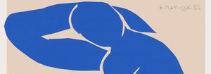
- Nu Bleu III Poster
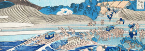
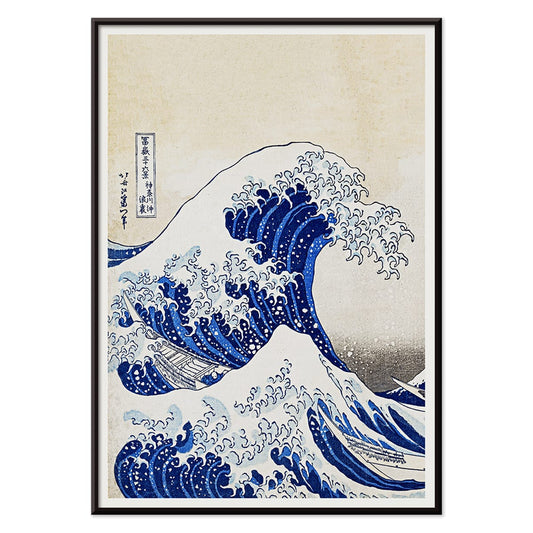
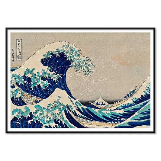
- Kanagawa Great Wave Poster
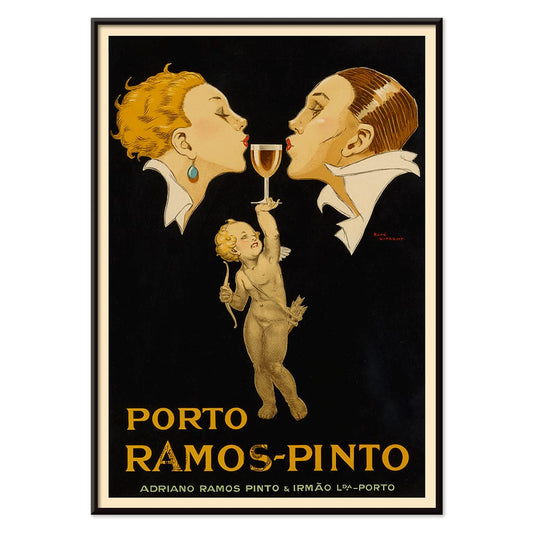
- Porto Ramos-Pinto Poster
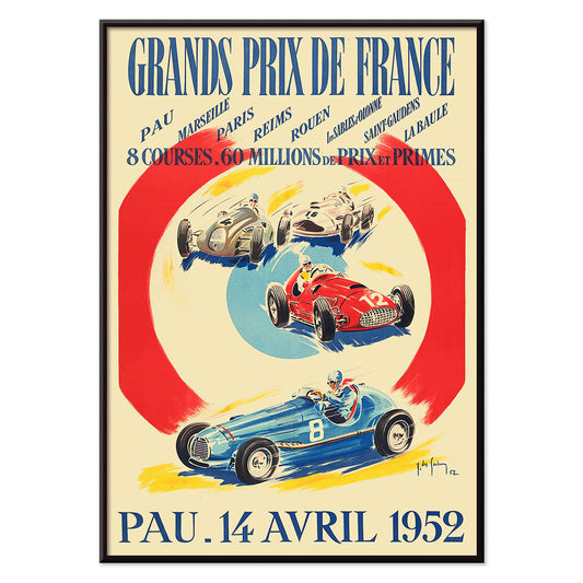
- Grands Prix de France Poster
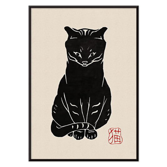
- Black Cat 2 Poster
- Papiers découpés 3 Poster
- Marihuana Poster
- Matisse Dancing Figures Poster
- Le Voyage de Babar Poster
- Coffea Arabica 3 Poster
- Sigmund Freud had it Poster
- Wake up and read Poster
- Solaris Poster
- Babar en Voiture Poster
- The Dream Poster
- Panther Poster
- The Tiger of Ryōkoku Poster
- Cordial Campari Poster
- The Tricolor balloon Poster
- Barcelona Text poster Poster
- The Great Wave Poster
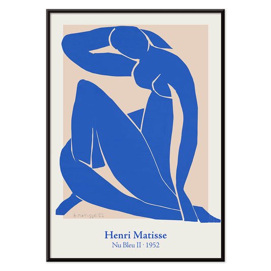
- Nu Bleu II Poster
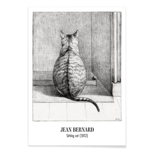
- Sitting cat, from behind Poster
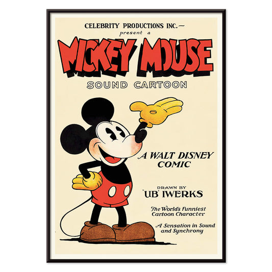
- Mickey Mouse Poster
- Bleu de Ciel Poster
- Papiers découpés 1 Poster
- Star Wars AT-AT Patent Poster
- Bauhaus Poster 2 Poster
- Bauhaus Poster 11 Poster
- Black Leopard Poster
- Black Cat 4 Poster
- The Kiss Poster
- Sitting cat, facing left Poster
- Asakusa Kinryuzan Temple Poster
- Surfboard Patent Poster
- Histoire de Babar Poster
- Brazil 2 Poster
- Bauhaus Poster 6 Poster
- Vertigo Poster
- Colorful Architecture Poster
- Red crown crane Poster
- La Paresse Poster
- Avocado (Persea) Poster
-
Geographical Guide to a Woman's Heart Poster
Jo Lowery · 1960 · Playful heart shaped map poster packed with witty labels and bright midcentury color
Poster from €9 · Framed from €16
Regular price From €6,00Regular price -
Portugal Today Poster
Unknown artist · 1927 · Colorful Portugal travel poster featuring a traditional woman bearing a brimming fruit basket
Poster from €9 · Framed from €16
Regular price From €6,00Regular price -
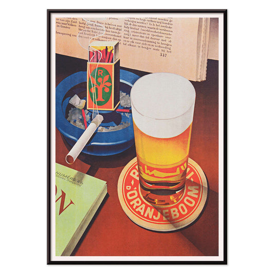
Beer and Cigarette Poster
Unknown artist · 1935 · Graphic beer and cigarette poster featuring a foaming glass and bold red and blue accents
Poster from €9 · Framed from €16
Regular price From €6,00Regular price -
Save the whales Poster
Lawrence Vint · 1973 · Graphic ocean-conservation poster featuring a stylized white whale on rich blue
Poster from €9 · Framed from €16
Regular price From €6,00Regular price -
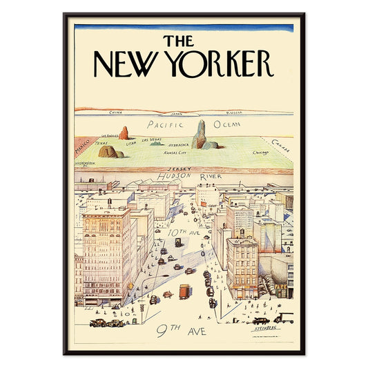
The New Yorker Poster
Saul Steinberg · 1976 · Witty New York cityscape poster with a map-like view and playful scale
Poster from €9 · Framed from €16
Regular price From €6,00Regular price -
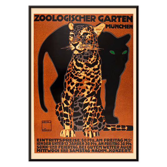
Zoologischer Garten Poster
Ludwig Hohlwein · 1912 · Striking Munich zoo poster featuring a bold striped big cat and crisp lettering
Poster from €9 · Framed from €16
Regular price From €6,00Regular price -
The Floor of the Oceans Poster
Unknown artist · 1967 · Bathymetric world map poster revealing undersea ridges in cool blue tones
Poster from €9 · Framed from €16
Regular price From €6,00Regular price -
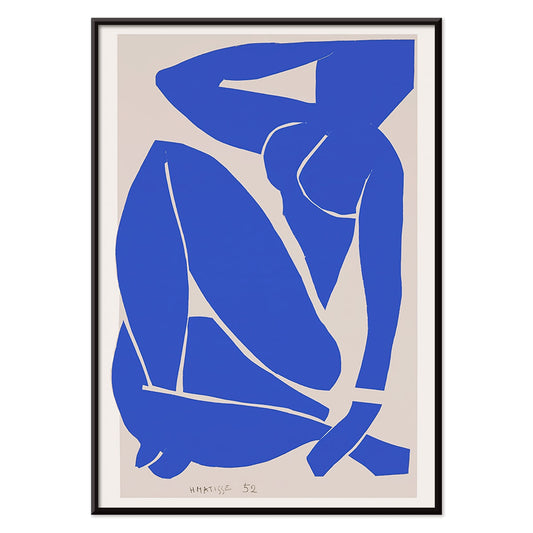
Nu Bleu III Poster
Henri Matisse · 1952 · Iconic blue nude art print with flowing cut-out silhouette on warm beige
Poster from €9 · Framed from €16
Regular price From €6,00Regular price -
Kanagawa Great Wave Poster
Katsushika Hokusai · 1830 · Iconic ukiyo-e poster of a towering wave curling over boats beneath Mount Fuji
Poster from €9 · Framed from €16
Regular price From €6,00Regular price -
Porto Ramos-Pinto Poster
René Vincent · 1925 · Art Deco poster of a couple about to kiss as a cherub offers port wine
Poster from €9 · Framed from €16
Regular price From €6,00Regular price -
Grands Prix de France Poster
Jean Des Gachons · 1952 · Dynamic racing poster featuring speeding cars and circuit listings in bold mid-century color
Poster from €9 · Framed from €16
Regular price From €6,00Regular price -
Black Cat 2 Poster
Unknown artist · 1750 · Minimal black cat vintage print with red seal accent on warm beige
Poster from €9 · Framed from €16
Regular price From €6,00Regular price -
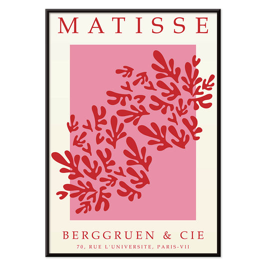
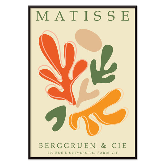
Papiers découpés 3 Poster
MORYARTY · 1949 · Matisse-inspired poster with bold red leaf shapes on airy white and pink
Poster from €9 · Framed from €16
Regular price From €6,00Regular price -
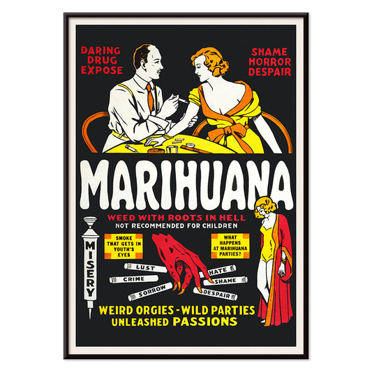
Marihuana Poster
Unknown artist · 1936 · Sensational anti-weed movie poster with fiery lettering and cautionary vignette scenes
Poster from €9 · Framed from €16
Regular price From €6,00Regular price -
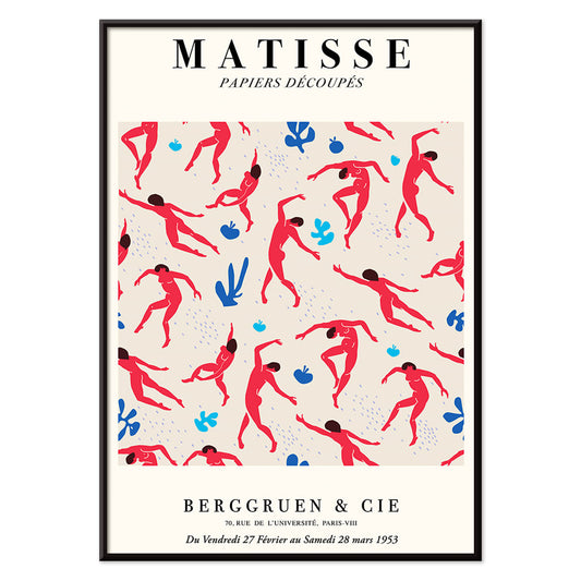
Matisse Dancing Figures Poster
Henri Matisse · 1909 · Energetic dancing figures poster with bold red silhouettes set against deep blue
Poster from €9 · Framed from €16
Regular price From €6,00Regular price -
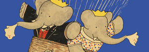
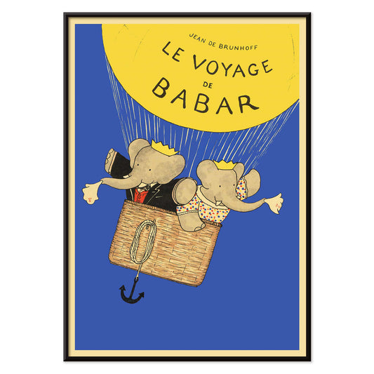
Le Voyage de Babar Poster
Jean de Brunhoff · 1932 · Whimsical Babar balloon poster with bright yellow lift against a clear blue sky
Poster from €9 · Framed from €16
Regular price From €6,00Regular price -
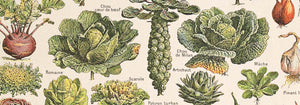
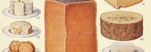
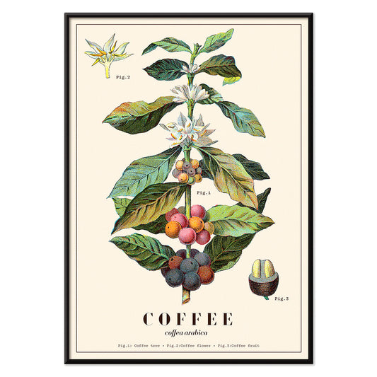
Coffea Arabica 3 Poster
Davis, Sacker & Perkins · 1870 · Detailed Coffea arabica botanical print with blossoms, leaves, and ripening berries
Poster from €9 · Framed from €16
Regular price From €6,00Regular price -
Sigmund Freud had it Poster
Seymour Chwast · 1970 · Witty Freud portrait poster mixing pop typography with surreal symbols in green and orange
Poster from €9 · Framed from €16
Regular price From €6,00Regular price -
Wake up and read Poster
Unknown artist · 1961 · Modernist reading campaign poster with bold typography and crisp red and blue contrast
Poster from €9 · Framed from €16
Regular price From €6,00Regular price -
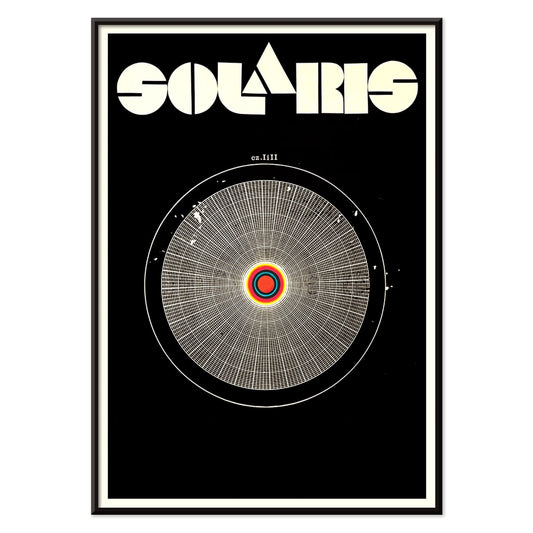
Solaris Poster
Unknown artist · 1972 · Hypnotic cosmic poster with orbiting forms and bold red-blue contrasts
Poster from €9 · Framed from €16
Regular price From €6,00Regular price -
Babar en Voiture Poster
Jean de Brunhoff · 1934 · Playful Babar driving a red car poster with crisp storybook linework
Poster from €9 · Framed from €16
Regular price From €6,00Regular price -
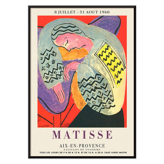
The Dream Poster
Henri Matisse · 1960 · Vibrant sleeping figure poster with flowing contours and bold, flat color shapes
Poster from €9 · Framed from €16
Regular price From €6,00Regular price -
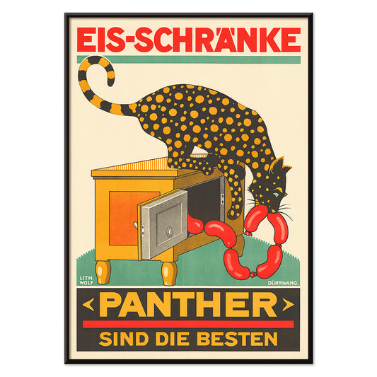
Panther Poster
Unknown artist · 1900 · Whimsical panther poster raiding an icebox with sausages in classic Swiss advertising style
Poster from €9 · Framed from €16
Regular price From €6,00Regular price -
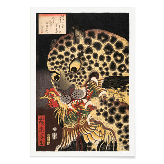
The Tiger of Ryōkoku Poster
Utagawa Hirokage · 1860 · Dramatic ukiyo-e art print of a tiger seizing a rooster beneath bold calligraphy
Poster from €9 · Framed from €16
Regular price From €6,00Regular price -
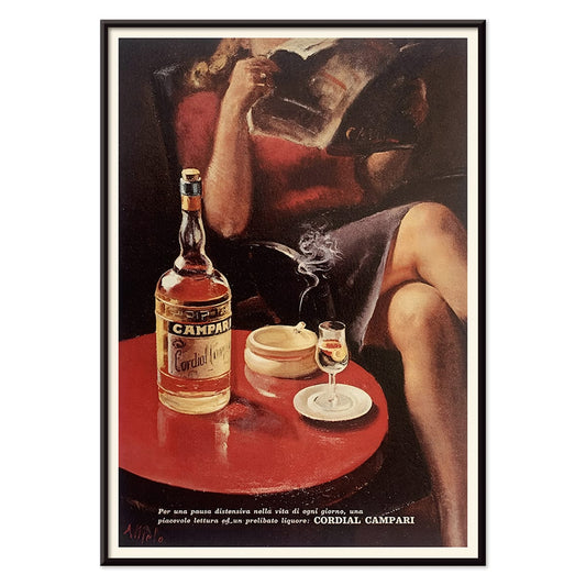
Cordial Campari Poster
Unknown artist · 1926 · Art Deco Campari poster featuring a poised woman and bold red geometric forms
Poster from €9 · Framed from €16
Regular price From €6,00Regular price -
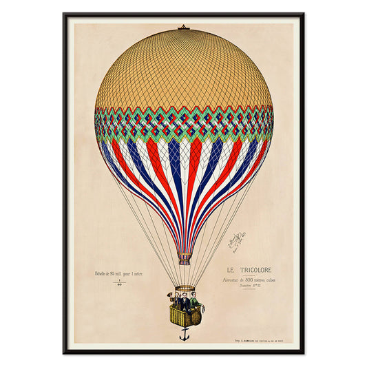
The Tricolor balloon Poster
Unknown artist · 1874 · Tricolor hot air balloon poster drifting above Paris with a proud French flag palette
Poster from €9 · Framed from €16
Regular price From €6,00Regular price -
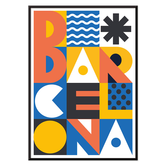
Barcelona Text poster Poster
MORYARTY · 2021 · Modern Barcelona poster with bold stacked typography and bright geometric color blocks
Poster from €9 · Framed from €16
Regular price From €6,00Regular price -
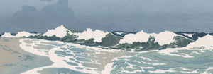
The Great Wave Poster
Katsushika Hokusai · 1831 · Iconic Japanese wave poster with Mount Fuji and boats under towering surf
Poster from €9 · Framed from €16
Regular price From €6,00Regular price -
Nu Bleu II Poster
Henri Matisse · 1952 · Iconic blue nude poster in bold cut-paper shapes against a warm neutral ground
Poster from €9 · Framed from €16
Regular price From €6,00Regular price -
Sitting cat, from behind Poster
Jean Bernard · 1812 · Quiet cat vintage print rendered in soft greys, seen from behind
Poster from €9 · Framed from €16
Regular price From €6,00Regular price -
Mickey Mouse Poster
Unknown artist · 1928 · Cheerful Mickey Mouse poster with bold black outlines and vintage animation style
Poster from €9 · Framed from €16
Regular price From €6,00Regular price -
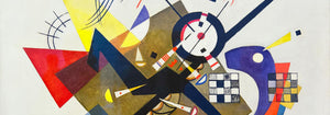
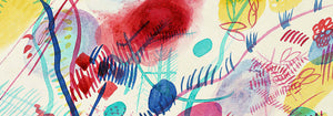
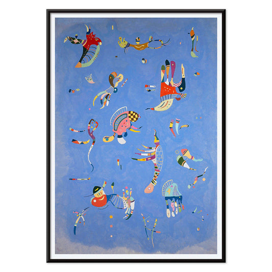
Bleu de Ciel Poster
Wassily Kandinsky · 1925 · Airy abstract art print of floating forms on sky-blue ground with bright accents
Poster from €9 · Framed from €16
Regular price From €6,00Regular price -
Papiers découpés 1 Poster
MORYARTY · 2021 · Vibrant cut-paper abstract poster with orange and green shapes on warm beige ground
Poster from €9 · Framed from €16
Regular price From €6,00Regular price -
Star Wars AT-AT Patent Poster
George Lucas · 1981 · Blueprint style AT AT patent poster with multi view diagrams on warm beige
Poster from €9 · Framed from €16
Regular price From €6,00Regular price -
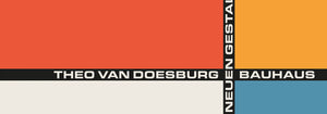
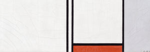
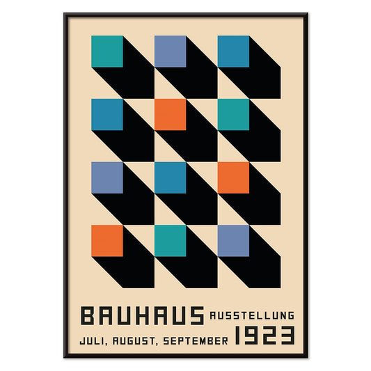
Bauhaus Poster 2 Poster
MORYARTY · 1923 · Bauhaus-inspired geometric poster featuring bold black, orange, and blue shapes with clean lines
Poster from €9 · Framed from €16
Regular price From €6,00Regular price -
Bauhaus Poster 11 Poster
MORYARTY · Contemporary · Geometric poster with bold circles and diagonals in primary colors on white
Poster from €9 · Framed from €16
Regular price From €6,00Regular price


36/201 items
- Geographical Guide to a Woman's Heart Poster
- Portugal Today Poster
- Beer and Cigarette Poster
- Save the whales Poster
- The New Yorker Poster
- Zoologischer Garten Poster
- The Floor of the Oceans Poster
- Nu Bleu III Poster
- Kanagawa Great Wave Poster
- Porto Ramos-Pinto Poster
- Grands Prix de France Poster
- Black Cat 2 Poster
- Papiers découpés 3 Poster
- Marihuana Poster
- Matisse Dancing Figures Poster
- Le Voyage de Babar Poster
- Coffea Arabica 3 Poster
- Sigmund Freud had it Poster
- Wake up and read Poster
- Solaris Poster
- Babar en Voiture Poster
- The Dream Poster
- Panther Poster
- The Tiger of Ryōkoku Poster
- Cordial Campari Poster
- The Tricolor balloon Poster
- Barcelona Text poster Poster
- The Great Wave Poster
- Nu Bleu II Poster
- Sitting cat, from behind Poster
- Mickey Mouse Poster
- Bleu de Ciel Poster
- Papiers découpés 1 Poster
- Star Wars AT-AT Patent Poster
- Bauhaus Poster 2 Poster
- Bauhaus Poster 11 Poster
A curator-led cross section of poster culture
Our Selection gathers the kind of images that once lived on street corners, in shop windows, and on gallery walls, then learned how to behave in a home. It is not a single movement but a conversation between vintage poster design, modern art print sensibilities, and documentary photography. The common thread is legibility and atmosphere: work that reads clearly from a distance, then rewards a closer look with paper grain, ink edges, and deliberate restraint. For a broader overview of formats and eras, the main All Posters index helps place this edit in context.
Design history in miniature, from lithography to the photo screen
Classic posters were engineered for attention, which is why their compositions tend to be decisive: simplified shapes, high contrast, and typography that can hold its own against city noise. Many of the most memorable examples relied on lithography, where separate colour stones built flat fields that still feel fresh today. Later processes introduced halftone dots and photographic grain, adding a different kind of texture and realism. If you gravitate toward structure and reduced form, the language of abstract graphics often sits nearby; for an image with a quieter, observational pull, Photo offers a related sensibility. A more nervous, handwritten line can be found through Egon Schiele, where drawing becomes psychology as much as depiction.
Interior placement: how to use a varied edit room by room
Because the selection spans several visual registers, it works best when the room sets the volume. In living spaces with oak, linen, or boucle, choose a vintage poster with softened pigments or warm paper tones so the wall art feels integrated rather than loud. Hallways benefit from vertical emphasis and repeated intervals, which is where Vertical Posters can help establish rhythm. In kitchens and dining corners, sharper typography and botanical detail tend to feel natural; pairing with Botanical keeps the palette grounded in greens and off-whites. For bedrooms, lean toward lower contrast prints and calmer spacing, or move into the tonal discipline of Black & White to keep the light gentle.
Curating a gallery wall without forcing harmony
Good decoration relies on pacing: one assertive image, several quieter ones, and a repeated cue that ties the set together, such as a single ink colour or shared margin width. A practical approach is to anchor the group with a typographic or emblematic sheet, then add a photograph or landscape fragment as a softer counterweight. When you want a stronger graphic note, borrow a companion from Advertising; when you want slower, museum-like cadence, echo it with a piece from Classic Art. Frame choice does the final editing: pale wood lifts warm palettes, black metal sharpens linework, and a generous mount makes aged paper feel intentional. A simple route is to keep frames consistent while letting imagery vary, then adjust spacing until the negative space becomes part of the composition.
An edit that can evolve with your rooms
The strength of Our Selection is its openness: it behaves like a personal archive, ready to be re-sequenced as furniture shifts and colour choices mature. Some homes keep the mix eclectic; others gradually steer it toward a decade, a subject, or a single dominant hue. Either way, the poster and print languages here were made to coexist, and the most convincing gallery walls are the ones that look accumulated rather than planned.