


You may also like
-
Familiar colors Poster
Marcius Willson · 1890 · Educational color chart poster featuring geometric squares and triangles in vivid primary colors
Poster from €9 · Framed from €16
Regular price From €6,00Regular price -
Peinture et Teinture Poster
Claude Augé · 1908 · Educational color chart poster pairing French labels with orderly pigment swatches
Poster from €9 · Framed from €16
Regular price From €6,00Regular price -
Cercle chromatique Poster
Michel Eugène Chevreul · 1861 · Classic scientific print of a chromatic circle mapping harmonious hue relationships
Poster from €9 · Framed from €16
Regular price From €6,00Regular price -
Prismatic Color Wheel Poster
Moses Harris · 1766 · Enlightenment color wheel print featuring radiant primary and secondary hues in a precise arrangement
Poster from €9 · Framed from €16
Regular price From €6,00Regular price


-

"Very nice Posters. The quality is amazing and we received it very quickly !"
-

"A shop to visit absolutely. Huge selection of posters. We spent more than an hour there !"
-

"Perfect to find gift. Price are very good. An they can frame and pack it on site"


About the Artist
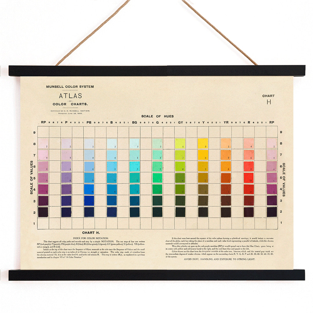
Albert Henry Munsell was an American artist, educator, and pioneering color theorist whose innovations in the early 20th century transformed the way color was understood and communicated. With a background bridging both fine art and science, Munsell sought to create a universal language of color that could be used by artists, educators, and industry professionals alike. His systematic approach laid the groundwork for modern color standards and continues to influence color education today.
The Artwork
The Munsell color chart, published in 1915, was designed as a practical reference for accurately identifying and comparing colors. Emerging during a period of rapid industrialization and scientific advancement, the chart answered the growing need for standardized color communication in manufacturing, education, and the arts. Its creation marked a significant moment in design history, reflecting the era's commitment to precision, clarity, and shared knowledge.
This chart also resonates with the spirit of scientific wall art, where visual clarity and systematic organization are celebrated. It stands as a testament to the intersection of creativity and rationality that defined early modern design.
Style & Characteristics
The artwork features a meticulously organized grid of colored blocks, each labeled with precise notations for hue, value, and chroma. The palette includes a harmonious spectrum—blue, green, yellow, red, pink, orange, and purple—arranged to highlight subtle gradations and relationships between colors. The overall effect is both orderly and visually engaging, with crisp typography and clear divisions lending a sense of structure and balance.
The mood is thoughtful and methodical, yet the vibrant colors introduce a playful energy. This balance of logic and beauty appeals to admirers of Bauhaus design posters and minimalist wall decor, where function and aesthetics are seamlessly integrated.
In Interior Design
This vintage color chart poster brings a sense of intellectual curiosity and creative inspiration to any space, making it ideal for studios, offices, or study areas. Its clean lines and colorful composition complement modern, Scandinavian, and mid-century interiors, and it can serve as a striking focal point or blend into a gallery wall arrangement.
Pairing it with neutral backgrounds enhances its clarity, while echoing one of its hues in decor accents creates a cohesive look. The chart is particularly suited for those who appreciate the history of design and the beauty of visual order.