


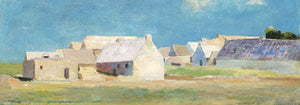


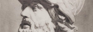


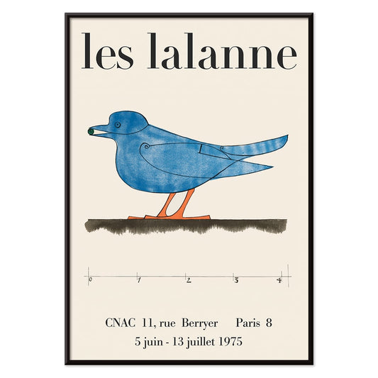
- Les Lalanne Poster
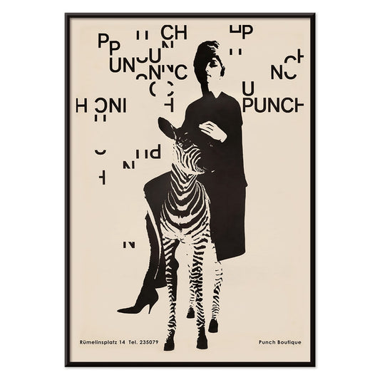
- Punch Boutique Poster
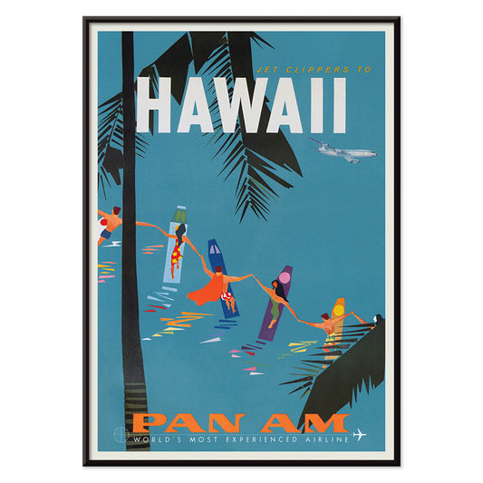
- Jet Clipper to Hawaii Poster
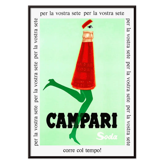
- Campari Soda Poster
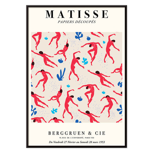
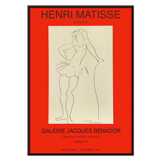
- Matisse Dancing Figures Poster
- Parler Seul 2 Poster
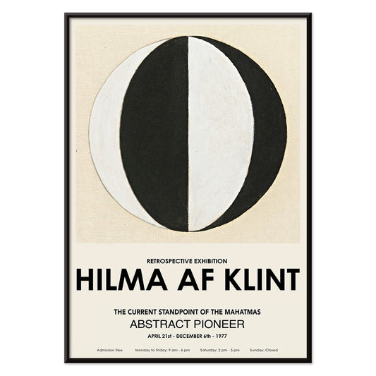
- The Current Standpoint of the Mahatmas Poster
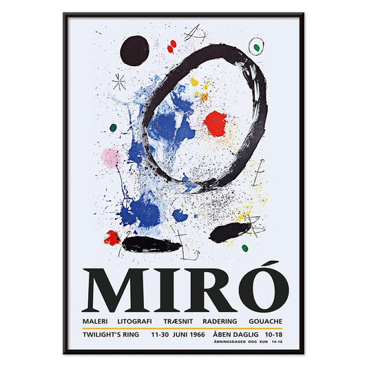
- Twilight’s Ring Poster
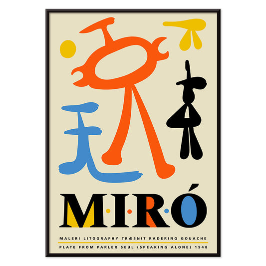
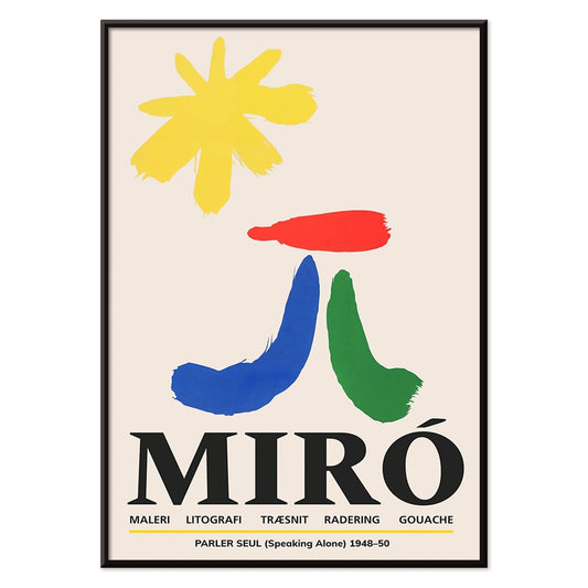
- Parler Seul Poster
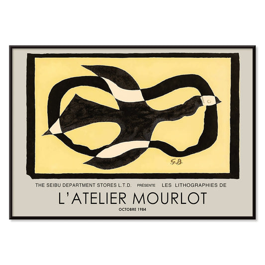
- Bird passing through a Cloud Poster
- Riley Blaze Poster
- Almanaque Poster
- Bauhaus 20 Poster
- Bauhaus 21 Poster
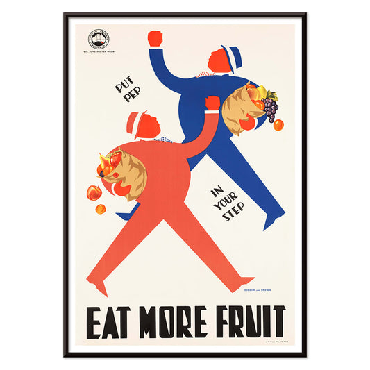
- Eat more fruits Poster
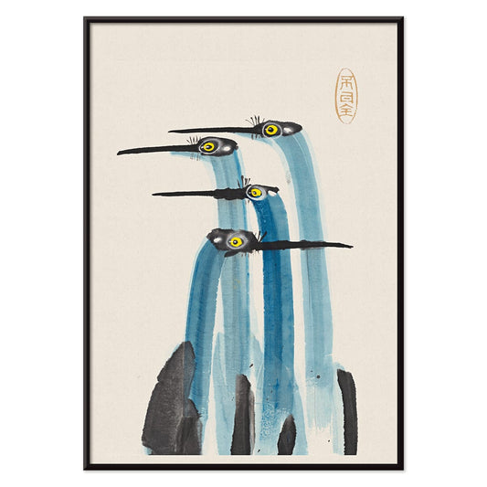
- Blue Japanese Crane Poster
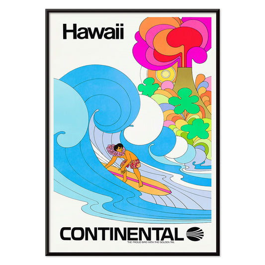
- Continental Hawaii Airline Poster
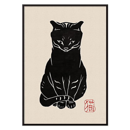
- Black Cat 4 Poster
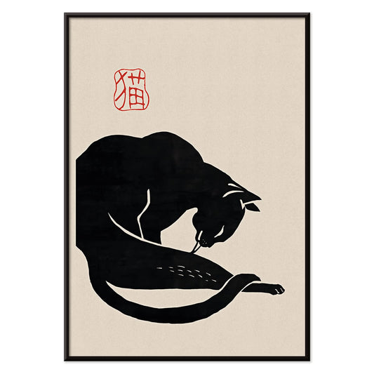
- Black Cat 3 Poster
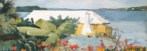
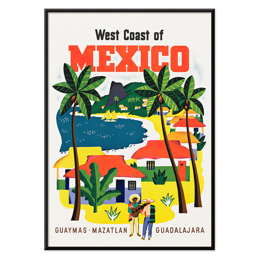
- West Coast of Mexico Poster
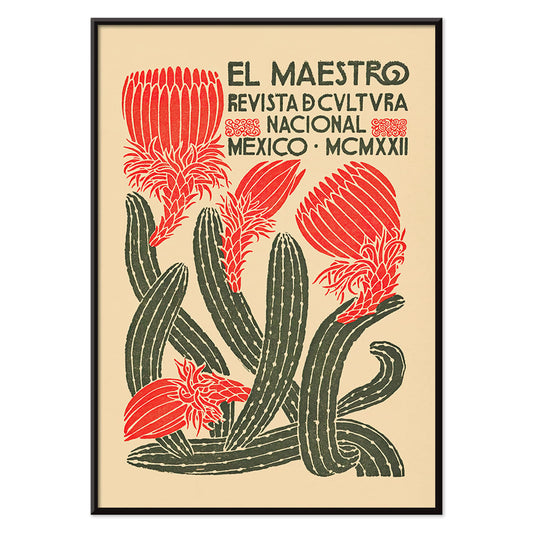
- El Maestro 1 Poster
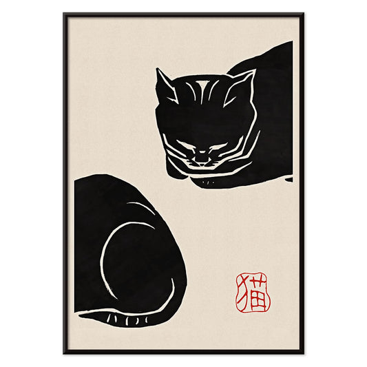
- Black Cat 2 Poster
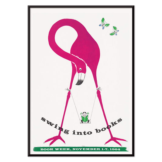
- Swing into books Poster
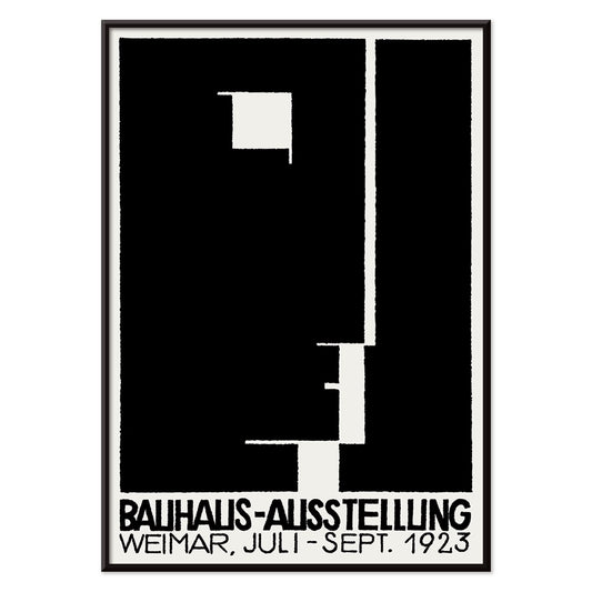
- Bauhaus Ausstellung Poster
- Prunus avium Poster
- Etoiles multiples colorées Poster
- Colorations variées de la Lune Poster
- Le Ciel Poster
- Flower Market Valencia Poster
- Flower Market Lisbon Poster
- Flower Market Barcelona Poster
- Girl with a earing Poster
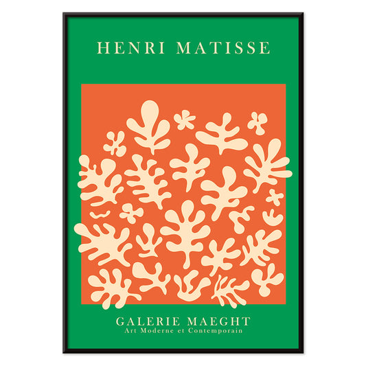
- Orange cut outs Poster
- Japanese Art Poster
- View of the Eiffel Tower Poster
- Pegasus in front of a cloud Poster
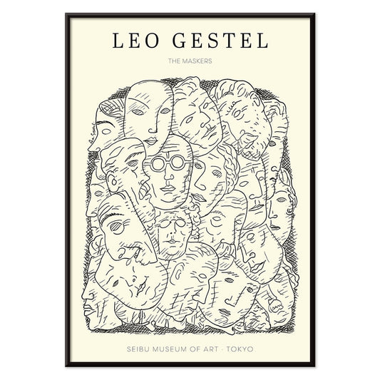
- Maskers Poster
- Zoologischer Garten Poster
- L'Art Hollandais contemporain Poster
-
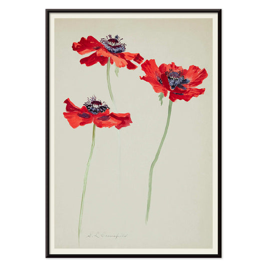
Three Studies of Poppies Poster
Sophia Crownfield · 1900 · Delicate botanical print presenting three poppy studies with vivid petals and slender stems
Poster from €9 · Framed from €16
Regular price From €6,00Regular price -
Les Lalanne Poster
François-Xavier Lalanne · 1975 · Minimal exhibition poster featuring a stylized blue bird on warm beige ground
Poster from €9 · Framed from €16
Regular price From €6,00Regular price -
Punch Boutique Poster
Paul Mitzkat · 1950 · Witty black and beige poster featuring an elegant woman beside a zebra
Poster from €9 · Framed from €16
Regular price From €6,00Regular price -
Jet Clipper to Hawaii Poster
Unknown artist · 1950 · Mid-century Hawaii travel poster blending aviation glamour with sunlit island leisure
Poster from €9 · Framed from €16
Regular price From €6,00Regular price -
Campari Soda Poster
Unknown artist · 1932 · Playful Campari Soda advertising poster with a strolling bottle against deep black
Poster from €9 · Framed from €16
Regular price From €6,00Regular price -
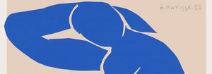
Matisse Dancing Figures Poster
Henri Matisse · 1909 · Energetic dancing figures poster with bold red silhouettes set against deep blue
Poster from €9 · Framed from €16
Regular price From €6,00Regular price -
Parler Seul 2 Poster
Joan Miro · 1948 · Playful biomorphic poster with floating black lines and orange, blue, yellow accents on beige
Poster from €9 · Framed from €16
Regular price From €6,00Regular price -
The Current Standpoint of the Mahatmas Poster
Hilma Af Klint · 1920 · Geometric art print featuring circles and triangles in bold black and white symmetry
Poster from €9 · Framed from €16
Regular price From €6,00Regular price -
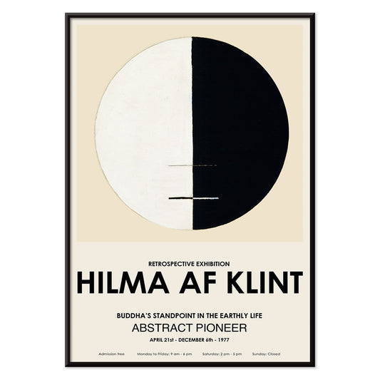
Buddha's Standpoint in the Earthly Life Poster
Hilma af Klint · 1917 · Meditative abstract art print centering Buddhist symbolism in a calm circular diagram
Poster from €9 · Framed from €16
Regular price From €6,00Regular price -
Twilight’s Ring Poster
Joan Miro · 2018 · Playful abstract poster of orbiting shapes and star-like marks on deep blue
Poster from €9 · Framed from €16
Regular price From €6,00Regular price -
Parler Seul Poster
Joan Miro · 1948 · Playful abstract poster with floating symbols, bold lines, and primary color accents
Poster from €9 · Framed from €16
Regular price From €6,00Regular price -
Bird passing through a Cloud Poster
George Braque · 1957 · Abstract bird poster drifting through a cloud with crisp black lines on warm yellow
Poster from €9 · Framed from €16
Regular price From €6,00Regular price -
Metropolis Julie Poster
Dennis Mukai · 1988 · Bold femme portrait poster in black, red, and blue with city-night energy
Poster from €9 · Framed from €16
Regular price From €6,00Regular price -
Max Bill Poster
Max Bill · 1974 · Geometric abstract poster with interlocking forms in vivid red, orange, green, and purple
Poster from €9 · Framed from €16
Regular price From €6,00Regular price -
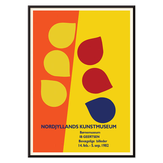
Ib Geertsen Poster
Ib Geertsen · 1982 · Vibrant geometric poster balancing bold primary blocks with crisp Scandinavian modernism
Poster from €9 · Framed from €16
Regular price From €6,00Regular price -
Joan Miro Osaka Poster
Joan Miro · 1970 · Playful abstract poster with calligraphic black forms and bright primary accents
Poster from €9 · Framed from €16
Regular price From €6,00Regular price -
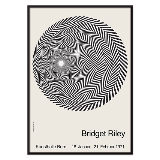
Riley Blaze Poster
Bridget Riley · 1964 · Hypnotic black and white Op Art poster with curving bands that seem to pulse
Poster from €9 · Framed from €16
Regular price From €6,00Regular price -
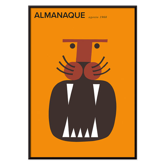
Almanaque Poster
Sebastiao Rodrigues · 1960 · Abstract lion poster with bold orange and black geometry in a mid-century style
Poster from €9 · Framed from €16
Regular price From €6,00Regular price -
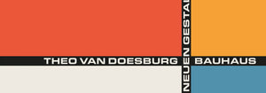
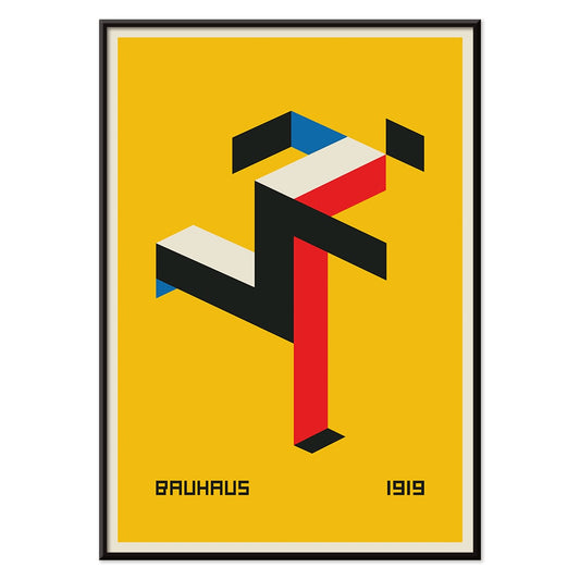
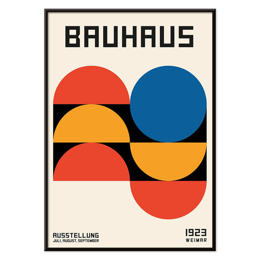
Bauhaus 20 Poster
Unknown artist · 1923 · Dynamic Bauhaus poster balancing primary blocks and crisp geometry on white space
Poster from €9 · Framed from €16
Regular price From €6,00Regular price -
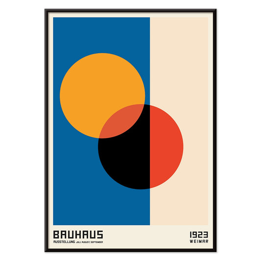
Bauhaus 21 Poster
Unknown artist · 1924 · Geometric Bauhaus poster with orange circle, blue block, and crisp black lines
Poster from €9 · Framed from €16
Regular price From €6,00Regular price -
Eat more fruits Poster
Unknown artist · 1950 · Cheerful public health poster with stylized shoppers and brimming fruit baskets
Poster from €9 · Framed from €16
Regular price From €6,00Regular price -
Blue Japanese Crane Poster
Unknown artist · 1889 · Serene Japanese crane art print with cool blue plumage and airy negative space
Poster from €9 · Framed from €16
Regular price From €6,00Regular price -
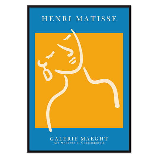
Exposition Matisse Poster
Unknown artist · 1980 · Minimalist exhibition poster featuring a dancing figure in black line and bold red text
Poster from €9 · Framed from €16
Regular price From €6,00Regular price -
Continental Hawaii Airline Poster
Unknown artist · 1960 · Joyful Hawaii surf poster with lei-wearing surfer and psychedelic flower backdrop
Poster from €9 · Framed from €16
Regular price From €6,00Regular price -
Black Cat 4 Poster
Unknown artist · 1750 · Striking black cat vintage print with bold silhouette on warm beige ground
Poster from €9 · Framed from €16
Regular price From €6,00Regular price -
Black Cat 3 Poster
Unknown artist · 1750 · Minimal black cat print with bold silhouette and red calligraphy on warm beige
Poster from €9 · Framed from €16
Regular price From €6,00Regular price -
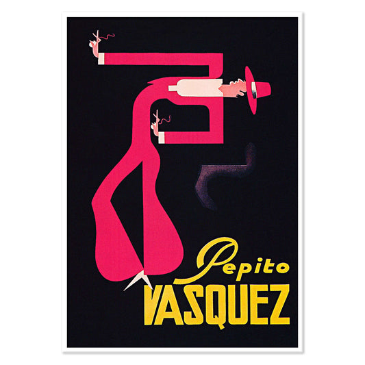
Pepito Vasquez Poster
Tito Livio De Madrazo · 1954 · Dynamic dance poster with an elongated ribbon-like figure on bold black
Poster from €9 · Framed from €16
Regular price From €6,00Regular price -
West Coast of Mexico Poster
Ray Bethers · 1935 · Sunlit coastal village poster with palms, blue sea, and bold travel typography
Poster from €9 · Framed from €16
Regular price From €6,00Regular price -
El Maestro 1 Poster
Unknown artist · 1921 · Mexican floral poster with bold red blossoms and stylized green cactus on beige
Poster from €9 · Framed from €16
Regular price From €6,00Regular price -
Black Cat 2 Poster
Unknown artist · 1750 · Minimal black cat vintage print with red seal accent on warm beige
Poster from €9 · Framed from €16
Regular price From €6,00Regular price -
Swing into books Poster
Unknown artist · 1964 · Playful Book Week poster of a reading child swinging from a flamingo
Poster from €9 · Framed from €16
Regular price From €6,00Regular price -
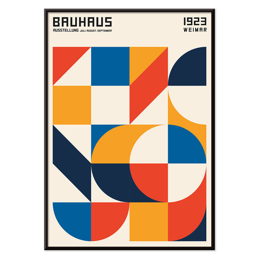
Bauhaus Ausstellung Poster
Unknown artist · 1923 · Bauhaus exhibition poster featuring bold black and white geometry and clean sans serif type
Poster from €9 · Framed from €16
Regular price From €6,00Regular price -
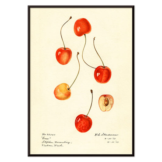
Prunus avium Poster
Charles Steadman · 1917 · Delicate cherry botanical print with ripe fruit clusters and fresh leaves on beige
Poster from €9 · Framed from €16
Regular price From €6,00Regular price -
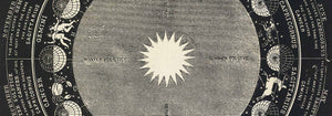
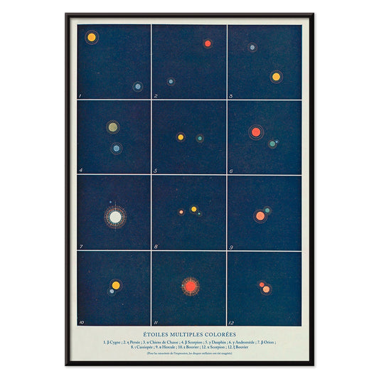
Etoiles multiples colorées Poster
Alphonse Berget · 1925 · Educational astronomy poster mapping multiple star systems in crisp blue with bright star points
Poster from €9 · Framed from €16
Regular price From €6,00Regular price -
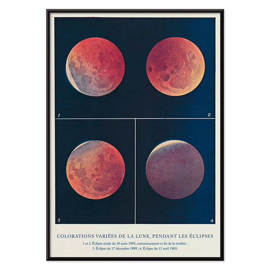
Colorations variées de la Lune Poster
Alphonse Berget · 1925 · Chartlike lunar eclipse scientific print showing moons shifting from white to copper red
Poster from €9 · Framed from €16
Regular price From €6,00Regular price -
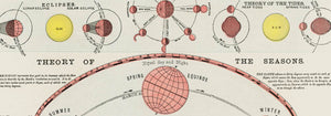
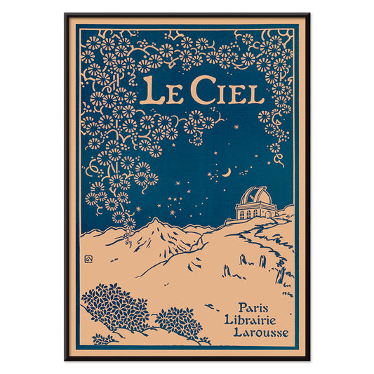
Le Ciel Poster
Alphonse Berget · 1925 · Art Nouveau astronomy poster featuring a deep blue sky with celestial diagrams
Poster from €9 · Framed from €16
Regular price From €6,00Regular price -
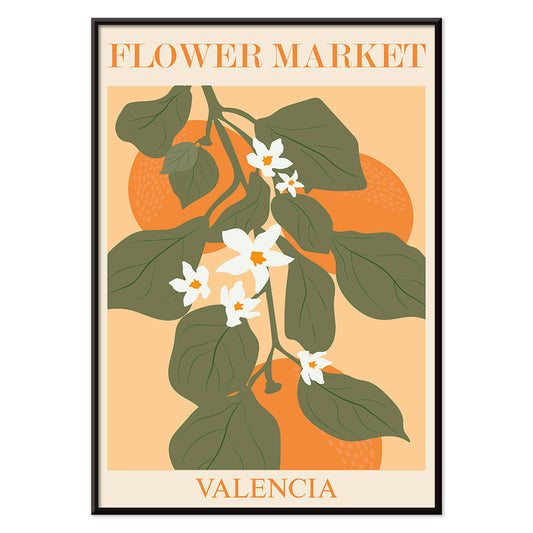
Flower Market Valencia Poster
MORYARTY · 2022 · Bright botanical poster of Valencia leaves and white blossoms on warm orange
Poster from €9 · Framed from €16
Regular price From €6,00Regular price -
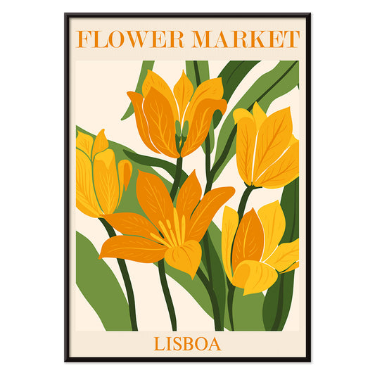
Flower Market Lisbon Poster
MORYARTY · 2019 · Sunlit Lisbon flower market poster with bold blooms and lush green leaves
Poster from €9 · Framed from €16
Regular price From €6,00Regular price -
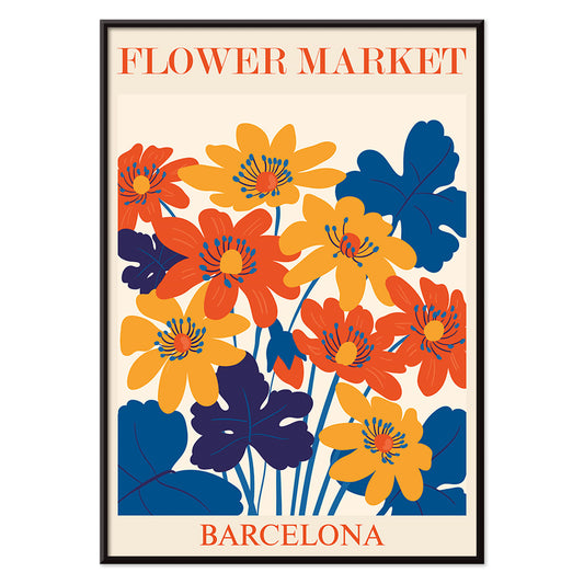
Flower Market Barcelona Poster
MORYARTY · 2022 · Vibrant floral tile motif poster with bold Mediterranean colors and clean geometry
Poster from €9 · Framed from €16
Regular price From €6,00Regular price -
Girl with a earing Poster
MORYARTY · 2022 · Matisse inspired portrait poster with blue background, white face, and yellow earring
Poster from €9 · Framed from €16
Regular price From €6,00Regular price -
Orange cut outs Poster
MORYARTY · 2022 · Abstract cut-out poster with orange shapes and green accents on warm beige
Poster from €9 · Framed from €16
Regular price From €6,00Regular price -
Japanese Art Poster
Julius Klinger · 1927 · Delicate fish and seaweed poster balancing Japanese-inspired linework with calm negative space
Poster from €9 · Framed from €16
Regular price From €6,00Regular price -
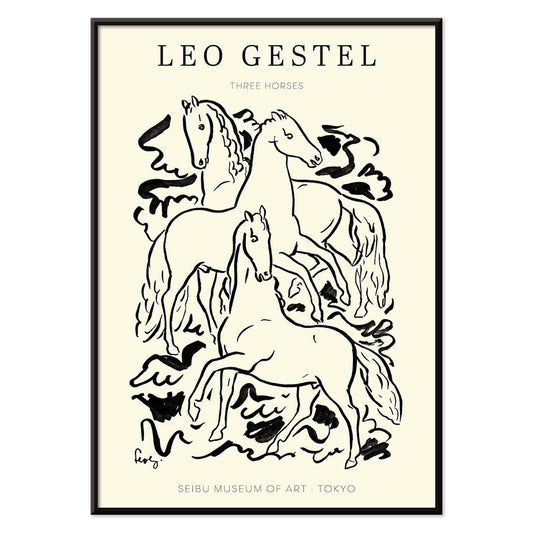
Three Horses Poster
Leo Gestel · 1925 · Expressive black-and-white horse art print capturing motion through spare, energetic linework
Poster from €9 · Framed from €16
Regular price From €6,00Regular price -
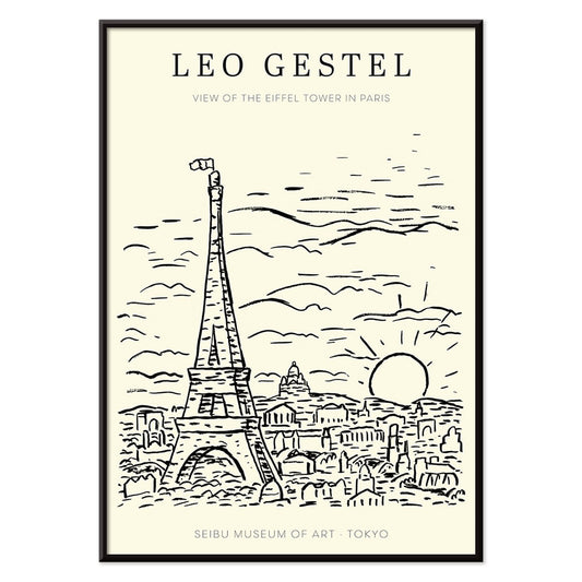
View of the Eiffel Tower Poster
Leo Gestel · 1921 · Expressive black and white Eiffel Tower poster rendered with dynamic modernist lines
Poster from €9 · Framed from €16
Regular price From €6,00Regular price -
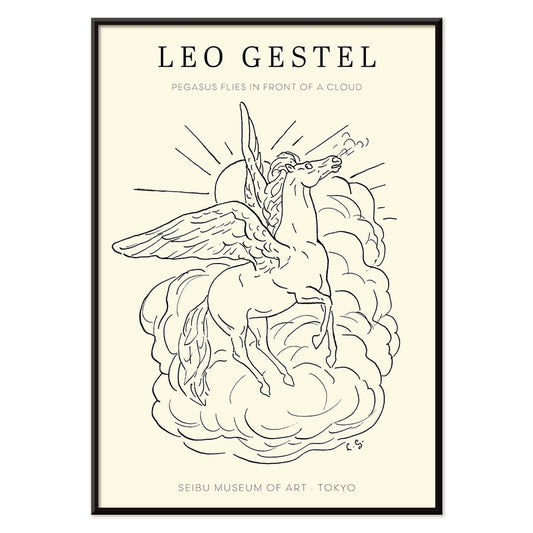
Pegasus in front of a cloud Poster
Leo Gestel · 1922 · Airy black-and-white poster of Pegasus flying above a single rounded cloud
Poster from €9 · Framed from €16
Regular price From €6,00Regular price -
Maskers Poster
Leo Gestel · 1923 · Striking mask face poster in bold monochrome with angular modernist geometry
Poster from €9 · Framed from €16
Regular price From €6,00Regular price -
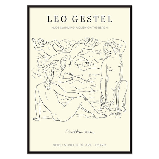
Nude women swimming Poster
Leo Gestel · 1925 · Expressive black-and-white poster of nude swimmers rendered in bold, fluid lines
Poster from €9 · Framed from €16
Regular price From €6,00Regular price -
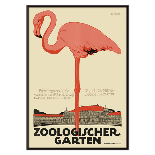
Zoologischer Garten Poster
Julius Klinger · 1910 · Elegant flamingo poster with Art Nouveau lettering and airy architectural framing
Poster from €9 · Framed from €16
Regular price From €6,00Regular price -
L'Art Hollandais contemporain Poster
Paul Fierens · 1933 · Elegant black-and-white nude poster balancing refined linework and modern French typography
Poster from €9 · Framed from €16
Regular price From €6,00Regular price -
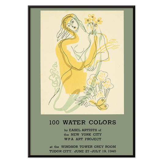
100 water colors Poster
WPA Art Project · 1940 · Modernist poster featuring a stylized woman with flowers in bold yellow and green
Poster from €9 · Framed from €16
Regular price From €6,00Regular price -
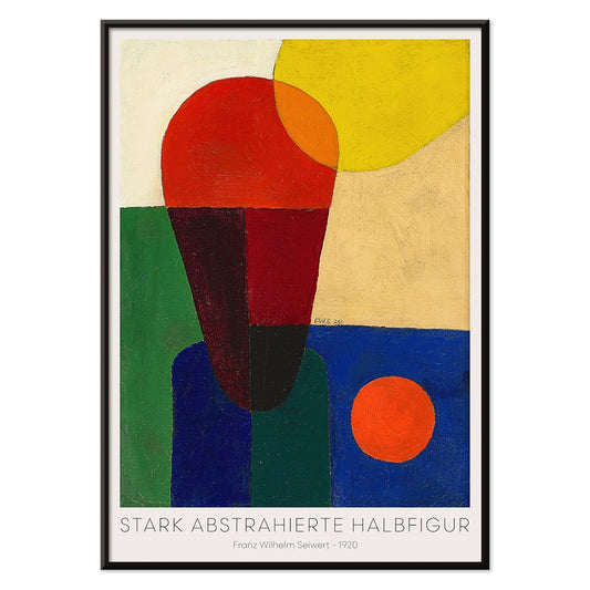
Stark abstrahierte Halbfigur Poster
Franz Wilhelm Seiwert · 1920 · Geometric half-figure art print balancing bold primary blocks with a crisp modernist rhythm
Poster from €9 · Framed from €16
Regular price From €6,00Regular price -
Bauhaus Poster 19 Poster
MORYARTY · 1923 · Geometric Bauhaus poster featuring balanced circles and squares in vivid primary colors
Poster from €9 · Framed from €16
Regular price From €6,00Regular price -
Bauhaus Poster 18 Poster
MORYARTY · 1926 · Geometric circles and bars poster in primary colors for crisp modernist walls
Poster from €9 · Framed from €16
Regular price From €6,00Regular price -
Bauhaus Poster 17 Poster
MORYARTY · Geometric Bauhaus poster featuring intersecting circles and primary color accents on warm beige
Poster from €9 · Framed from €16
Regular price From €6,00Regular price -
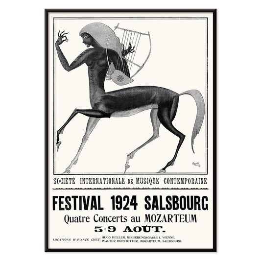
Festival de musique contemporaine de Salsbourg Poster
Edmund Dulac · 1924 · Mythic centaur and lyre festival poster rendered in striking black and white contrast
Poster from €9 · Framed from €16
Regular price From €6,00Regular price -
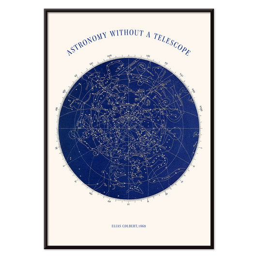
Astronomy without a telescope Poster
Elias Colbert · 1869 · Detailed celestial chart poster mapping constellations for stargazing without instruments
Poster from €9 · Framed from €16
Regular price From €6,00Regular price -
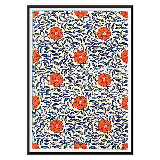
Flower pattern Poster
Owen Jones · 1912 · Refined floral pattern poster with crisp symmetry in red and blue on white
Poster from €9 · Framed from €16
Regular price From €6,00Regular price -
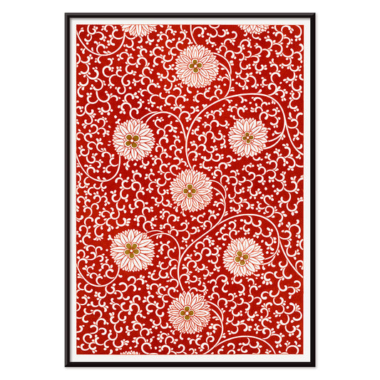
Red floral pattern Poster
Owen Jones · 1912 · Ornamental floral poster with white blossoms and scrolling vines on deep red
Poster from €9 · Framed from €16
Regular price From €6,00Regular price -
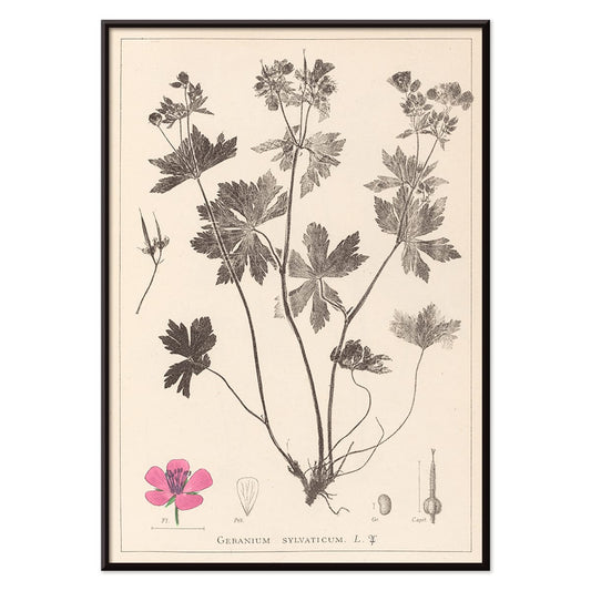
Herbier Français Pl.59 Poster
Antoine Cusin · 1867 · Delicate botanical print of woodland geranium with soft pink blooms and precise linework
Poster from €9 · Framed from €16
Regular price From €6,00Regular price -
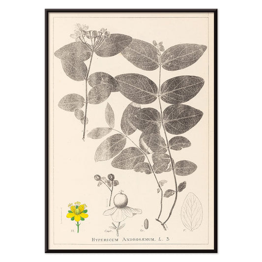
Herbier Français Pl.117 Poster
Antoine Cusin · 1867 · Refined Hypericum androsaemum botanical print with crisp linework and soft yellow and green tones
Poster from €9 · Framed from €16
Regular price From €6,00Regular price -
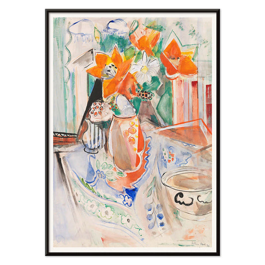
Floral still life with bowl Poster
Oskar Moll · 1902 · Vibrant floral still life poster balancing a bold bouquet with a grounded bowl
Poster from €9 · Framed from €16
Regular price From €6,00Regular price -
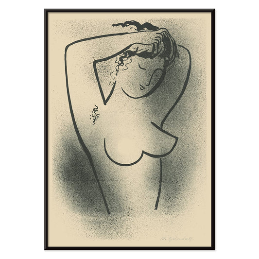
Toaleta Poster
Mikuláš Galanda · 1937 · Minimal black-and-white nude poster drawn in fluid modernist contour lines
Poster from €9 · Framed from €16
Regular price From €6,00Regular price -
Lisbon Azulejo 1 Poster
MORYARTY · Contemporary · Blue azulejo ship poster with ornate tile border and crisp nautical linework
Poster from €9 · Framed from €16
Regular price From €6,00Regular price -
Lisbon Azulejo 2 Poster
MORYARTY · 1755 · Blue-and-white azulejo pattern poster with ornate tile motifs and crisp symmetry
Poster from €9 · Framed from €16
Regular price From €6,00Regular price -
Auf Weiss II Poster
Wassily Kandinsky · 1923 · Dynamic geometric abstract poster on white with primary colors and crisp black lines
Poster from €9 · Framed from €16
Regular price From €6,00Regular price -
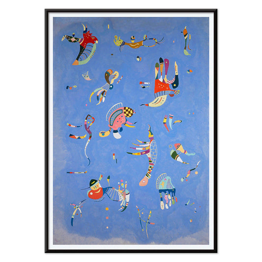
Circles in a circle Poster
Wassily Kandinsky · 1923 · Radiant abstract poster of layered circles floating on a deep black field
Poster from €9 · Framed from €16
Regular price From €6,00Regular price -
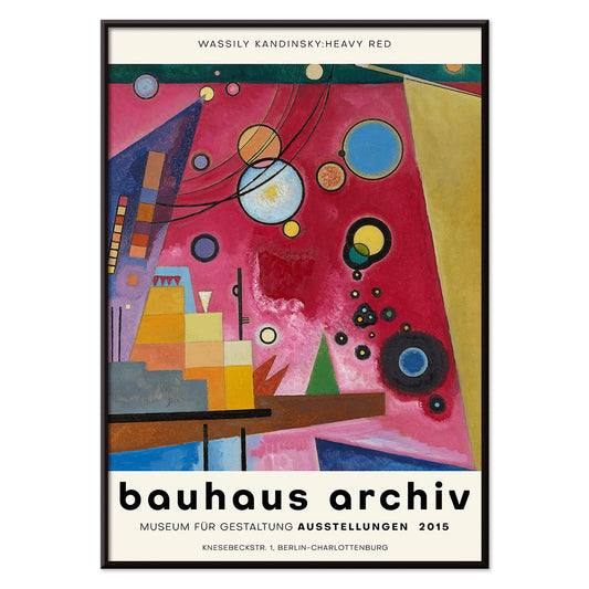
Heavy Red Poster
Wassily Kandinsky · 1924 · Dynamic abstract poster centered on a heavy red block with crisp geometric accents
Poster from €9 · Framed from €16
Regular price From €6,00Regular price -
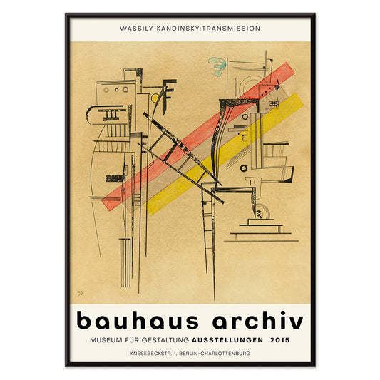
Transmission Poster
Wassily Kandinsky · 1935 · Abstract geometric poster with playful circles, lines, and chromatic accents on warm ground
Poster from €9 · Framed from €16
Regular price From €6,00Regular price -
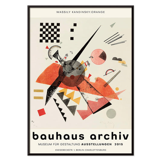
Orange Poster
Wassily Kandinsky · 1923 · Geometric orange poster balancing circles and sharp lines on an airy white ground
Poster from €9 · Framed from €16
Regular price From €6,00Regular price -
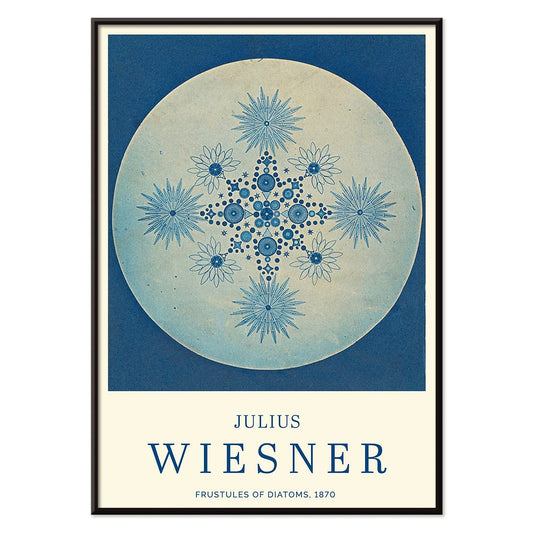
Frustules of Diatoms Poster
Julius Wiesner · 1910 · Cyanotype diatom frustules print with crisp white micro-geometry on deep blue
Poster from €9 · Framed from €16
Regular price From €6,00Regular price -
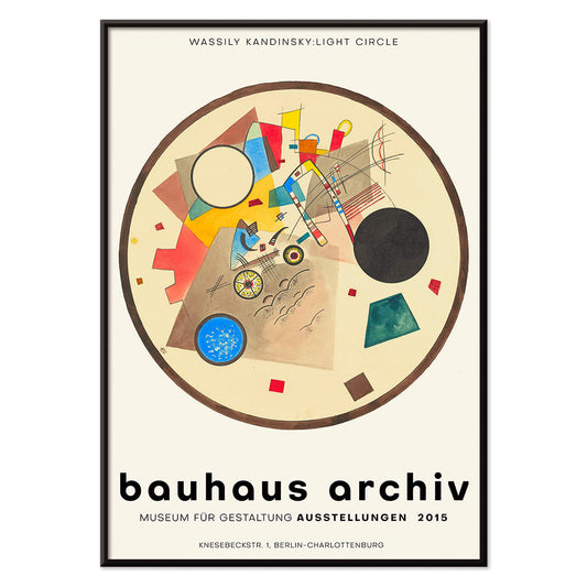
Light Circle Poster
Wassily Kandinsky · 1922 · Geometric abstract poster with luminous circles and sharp angles on a deep dark ground
Poster from €9 · Framed from €16
Regular price From €6,00Regular price -
Bleu de Ciel Poster
Wassily Kandinsky · 1925 · Airy abstract art print of floating forms on sky-blue ground with bright accents
Poster from €9 · Framed from €16
Regular price From €6,00Regular price


72/197 items
- Les Lalanne Poster
- Punch Boutique Poster
- Jet Clipper to Hawaii Poster
- Campari Soda Poster
- Matisse Dancing Figures Poster
- Parler Seul 2 Poster
- The Current Standpoint of the Mahatmas Poster
- Twilight’s Ring Poster
- Parler Seul Poster
- Bird passing through a Cloud Poster
- Riley Blaze Poster
- Almanaque Poster
- Bauhaus 20 Poster
- Bauhaus 21 Poster
- Eat more fruits Poster
- Blue Japanese Crane Poster
- Continental Hawaii Airline Poster
- Black Cat 4 Poster
- Black Cat 3 Poster
- West Coast of Mexico Poster
- El Maestro 1 Poster
- Black Cat 2 Poster
- Swing into books Poster
- Bauhaus Ausstellung Poster
- Prunus avium Poster
- Etoiles multiples colorées Poster
- Colorations variées de la Lune Poster
- Le Ciel Poster
- Flower Market Valencia Poster
- Flower Market Lisbon Poster
- Flower Market Barcelona Poster
- Girl with a earing Poster
- Orange cut outs Poster
- Japanese Art Poster
- View of the Eiffel Tower Poster
- Pegasus in front of a cloud Poster
- Maskers Poster
- Zoologischer Garten Poster
- L'Art Hollandais contemporain Poster
- Stark abstrahierte Halbfigur Poster
- Bauhaus Poster 19 Poster
- Bauhaus Poster 18 Poster
- Bauhaus Poster 17 Poster
- Lisbon Azulejo 1 Poster
- Lisbon Azulejo 2 Poster
- Auf Weiss II Poster
- Circles in a circle Poster
- Heavy Red Poster
- Transmission Poster
- Orange Poster
- Light Circle Poster
- Bleu de Ciel Poster
The pleasure of less
Minimalism in vintage poster culture is not about absence so much as selection: one clear idea given room to resonate. Here, graphic maps, Bauhaus geometry, and pared-back exhibition prints rely on line, circle, and margin to carry meaning. Blank space works like a pause in music, slowing the eye before it follows a route, a grid, or a single word. Some sheets borrow the cadence of architectural plans; others echo museum catalogues and mid-century wayfinding. Restraint links them all: limited palettes, confident typography, and compositions that feel measured rather than busy. For a wider context, the clean logic of Minimalist often overlaps with the sharper beats of Abstract posters and the crisp austerity of Black & White wall art.
Color theory and modernist structure
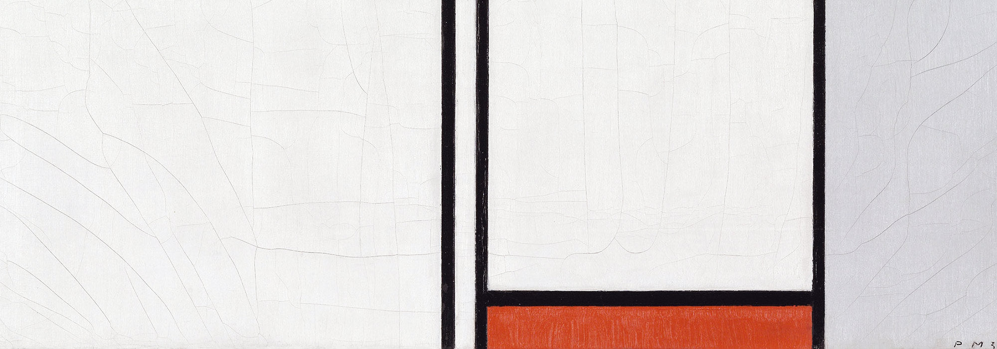
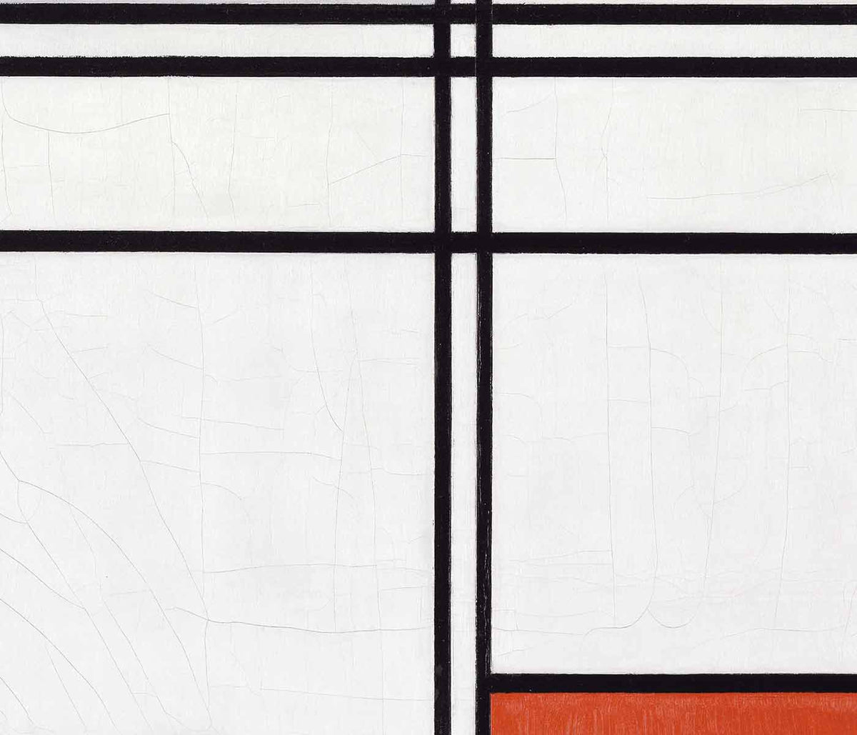
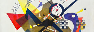
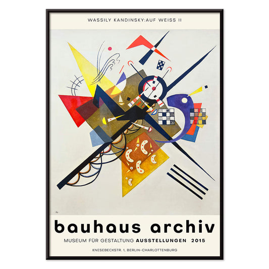
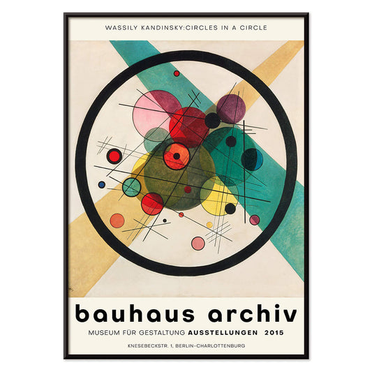
Several works treat modern color science as image, translating perception into simple, legible systems. Eugène Chevreul’s Cercle chromatique turns the spectrum into a disciplined ring, a reminder that nineteenth-century research on contrast and harmony fed later painting and graphic design alike. Lithography and early print reproduction favored flat tints and crisp edges, and that technical clarity suits the minimalist temperament. In a different register, Wassily Kandinsky’s Circles in a circle balances playful orbiting forms with a strict internal order, tying directly into the visual language gathered in Bauhaus. Bridget Riley’s Riley Blaze shows how reduced means can still produce physical sensation, as alternating bands and angles create optical vibration.
Where minimalist posters work at home
Minimalist posters suit interiors that already privilege light and texture: linen, pale oak, brushed steel, warm plaster, and matte ceramics. They also sit comfortably with concrete, terrazzo, and glass, where a spare composition stops the room from feeling over-specified. In an entryway, a city plan reads as a quiet landmark; pairing it with related sheets from Maps keeps the travel note subtle rather than touristic. In a studio or office, geometry mirrors shelving lines and desk edges, while a single saturated accent can echo a book spine or chair upholstery. If you want the calm to lean toward nature, a restrained landscape from Landscape can soften the harder angles without abandoning clarity.
Curating pairs and gallery walls
A strong gallery wall in this style depends less on quantity than on rhythm. Mix temperatures: hang Kamisaka Sekka’s Mount Fuji (1909) beside a typographic modernist sheet for a conversation between Japanese flatness and European grids, extending naturally into the broader visual traditions in Oriental. Introduce one organic counterpoint, such as a spare botanical study from Botanical, to keep the arrangement from feeling overly engineered. Keep spacing consistent, repeat one accent color across two prints, and let the largest piece act as the anchor so the wall reads as composed rather than accumulated.
Utility, craft, and a quiet finish
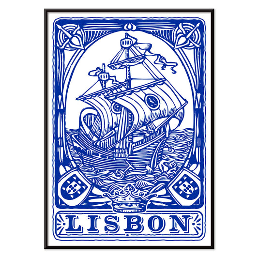
What keeps minimalist vintage wall art from turning clinical is its original purpose: exhibition posters, diagrams, travel graphics, and design studies made for public reading. That utilitarian origin gives paper grain and registration marks their own understated character. Even a decorative tile study like Lisbon Azulejo, Blue painted tile 2 holds craft inside a clean grid, where tiny irregularities reward close looking. For framing, thin black aluminium sharpens edges, while natural ash or oak softens bright accents; see Frames. Leave generous negative space around the work, and the room gains a steadier visual tempo.