


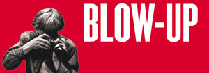
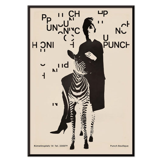
- Punch Boutique Poster
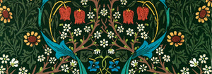
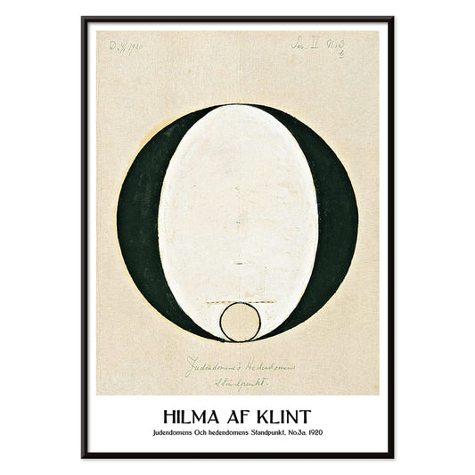
- Judaism and Paganism Standpoint Poster
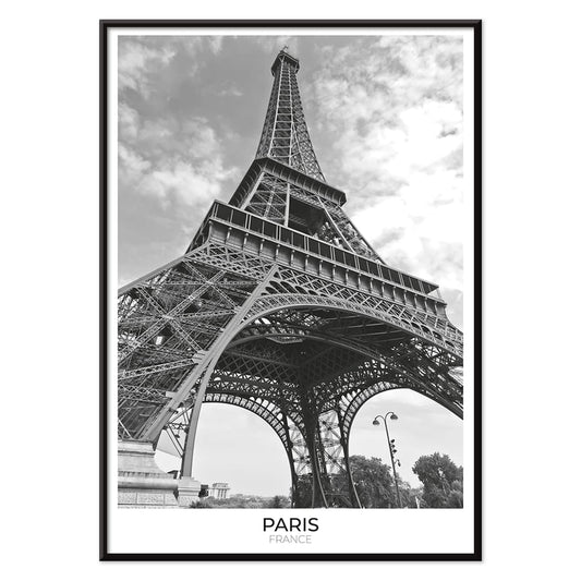
- Tour Eiffel 2 Poster
- The Current Standpoint of the Mahatmas Poster
- Riley Blaze Poster
- La Paresse Poster
- Black Cat 4 Poster
- Black Cat 3 Poster
- Sherlock Holmes Poster
- Black Cat 2 Poster
- Solaris Poster
- Campanile di Pisa Poster
- Kabuki Poster
- Red Lips Poster
- Bauhaus Ausstellung Poster
- Head of a Woman Poster
- Japanese Art Poster
- View of the Eiffel Tower Poster
- Pegasus in front of a cloud Poster
- Maskers Poster
- L'Art Hollandais contemporain Poster
- Marihuana Poster
- Lisbon Bridge Poster
- Surfer in Portugal Poster
- Lisbon Tramway 28 Poster
- Alfama Poster
- Lisbon Old City 1 Poster
-
Before going to bed Poster
Michael Heumuller · 1950 · Intimate black-and-white bedroom poster with poised figure and cinematic evening shadows
Poster from €9 · Framed from €16
Regular price From €6,00Regular price -
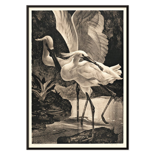
Lepelaars Poster
Adriaan van Hoff · 1923 · Elegant spoonbill poster in crisp black and white with Art Deco poise
Poster from €9 · Framed from €16
Regular price From €6,00Regular price -
Punch Boutique Poster
Paul Mitzkat · 1950 · Witty black and beige poster featuring an elegant woman beside a zebra
Poster from €9 · Framed from €16
Regular price From €6,00Regular price -
Judaism and Paganism Standpoint Poster
Hilma af Klint · 1920 · Mystical geometric art print with crisp black symbols balanced on a calm beige ground
Poster from €9 · Framed from €16
Regular price From €6,00Regular price -
Tour Eiffel 2 Poster
Unknown artist · 1925 · Striking black-and-white Eiffel Tower poster with crisp iron latticework and Paris skyline
Poster from €9 · Framed from €16
Regular price From €6,00Regular price -
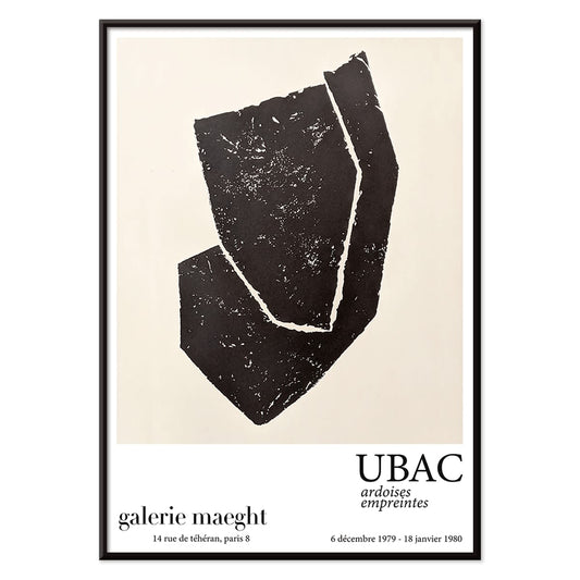
Ardoises Empreintes Poster
Raoul Ubac · 1979 · Abstract poster with engraved slate textures and shadowy organic forms
Poster from €9 · Framed from €16
Regular price From €6,00Regular price -
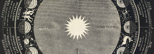
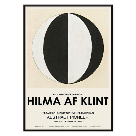
The Current Standpoint of the Mahatmas Poster
Hilma Af Klint · 1920 · Geometric art print featuring circles and triangles in bold black and white symmetry
Poster from €9 · Framed from €16
Regular price From €6,00Regular price -
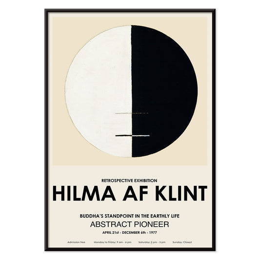
Buddha's Standpoint in the Earthly Life Poster
Hilma af Klint · 1917 · Meditative abstract art print centering Buddhist symbolism in a calm circular diagram
Poster from €9 · Framed from €16
Regular price From €6,00Regular price -
Metropolis Julie Poster
Dennis Mukai · 1988 · Bold femme portrait poster in black, red, and blue with city-night energy
Poster from €9 · Framed from €16
Regular price From €6,00Regular price -
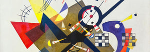
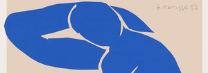
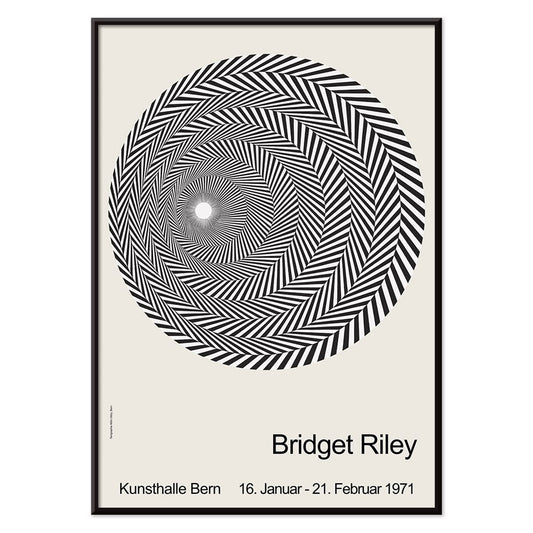
Riley Blaze Poster
Bridget Riley · 1964 · Hypnotic black and white Op Art poster with curving bands that seem to pulse
Poster from €9 · Framed from €16
Regular price From €6,00Regular price -
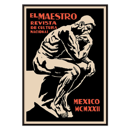
El Maestro 3 Poster
Unknown artist · 1921 · Graphic educational poster with a monumental scribe figure in black, beige, and red
Poster from €9 · Framed from €16
Regular price From €6,00Regular price -
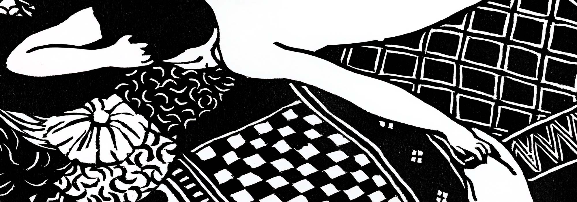
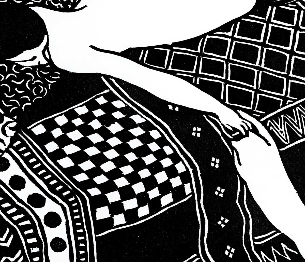
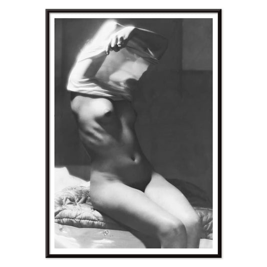
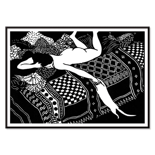
La Paresse Poster
Félix Emile-Jean Vallotton · 1896 · Intimate black and white nude art print featuring a reclining figure and watchful cat
Poster from €9 · Framed from €16
Regular price From €6,00Regular price -
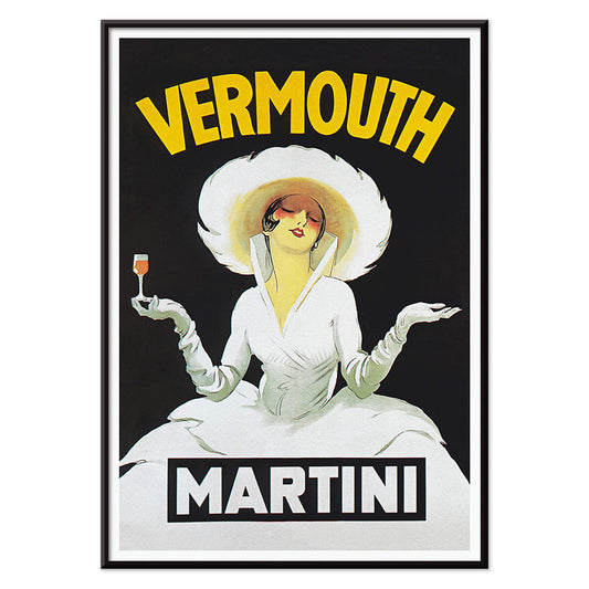
Vermouth Martini Poster
Marcello Dudovich · 1918 · Chic vermouth advertising poster featuring a poised woman in white and bold yellow accents
Poster from €9 · Framed from €16
Regular price From €6,00Regular price -
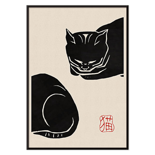
Black Cat 4 Poster
Unknown artist · 1750 · Striking black cat vintage print with bold silhouette on warm beige ground
Poster from €9 · Framed from €16
Regular price From €6,00Regular price -
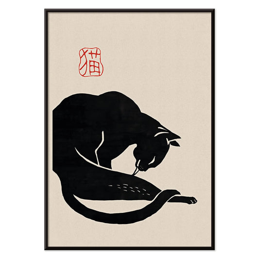
Black Cat 3 Poster
Unknown artist · 1750 · Minimal black cat print with bold silhouette and red calligraphy on warm beige
Poster from €9 · Framed from €16
Regular price From €6,00Regular price -
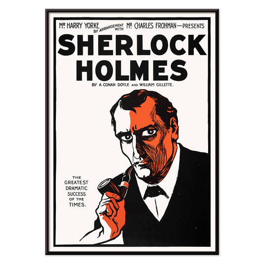
Sherlock Holmes Poster
Unknown artist · 1901 · Dramatic Sherlock Holmes poster featuring pipe and deerstalker in stark black, white, orange
Poster from €9 · Framed from €16
Regular price From €6,00Regular price -
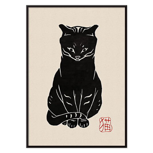
Black Cat 2 Poster
Unknown artist · 1750 · Minimal black cat vintage print with red seal accent on warm beige
Poster from €9 · Framed from €16
Regular price From €6,00Regular price -
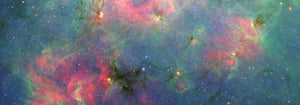
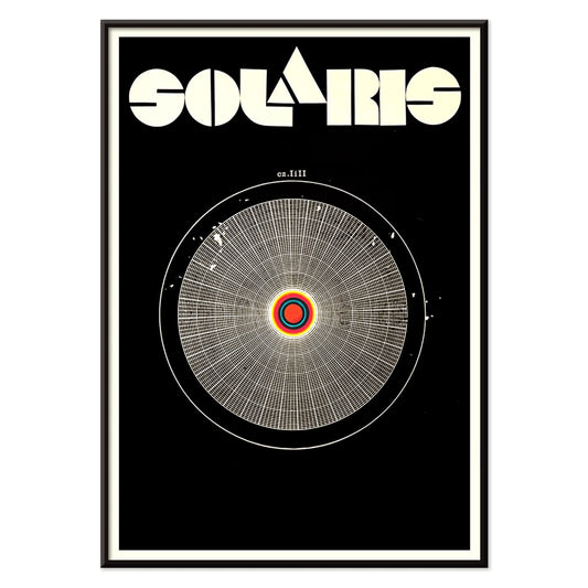
Solaris Poster
Unknown artist · 1972 · Hypnotic cosmic poster with orbiting forms and bold red-blue contrasts
Poster from €9 · Framed from €16
Regular price From €6,00Regular price -
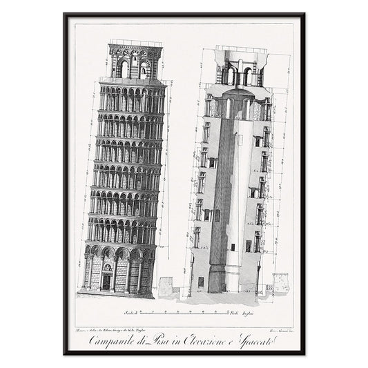
Campanile di Pisa Poster
G.L. Taylor · 1837 · Precise architectural print of the Leaning Tower of Pisa in crisp monochrome
Poster from €9 · Framed from €16
Regular price From €6,00Regular price -
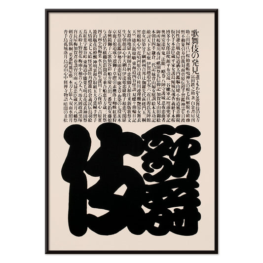
Kabuki Poster
Ikko Tanaka · 1974 · Minimal Kabuki mask poster pairing bold black forms with refined beige negative space
Poster from €9 · Framed from €16
Regular price From €6,00Regular price -
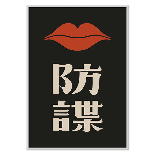
Red Lips Poster
Ikko Tanaka · 1972 · High-contrast poster featuring a stylized face and vivid red lips
Poster from €9 · Framed from €16
Regular price From €6,00Regular price -
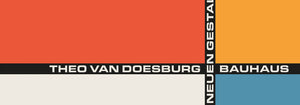
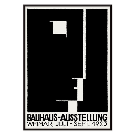
Bauhaus Ausstellung Poster
Unknown artist · 1923 · Bauhaus exhibition poster featuring bold black and white geometry and clean sans serif type
Poster from €9 · Framed from €16
Regular price From €6,00Regular price -
Les Palmiers Histoire Iconographique 1 Poster
Oswald de Kerchove de Denterghem · 1878 · Detailed palm botanical print with crisp linework and calm natural history elegance
Poster from €9 · Framed from €16
Regular price From €6,00Regular price -
Les Palmiers Histoire Iconographique 2 Poster
Oswald de Kerchove de Denterghem · 1878 · Elegant botanical print of a palm study arranged like a scientific plate
Poster from €9 · Framed from €16
Regular price From €6,00Regular price -
Les Palmiers Histoire Iconographique 3 Poster
Oswald de Kerchove de Denterghem · 1878 · Detailed palm botanical print with crisp linework and elegant natural history labeling
Poster from €9 · Framed from €16
Regular price From €6,00Regular price -
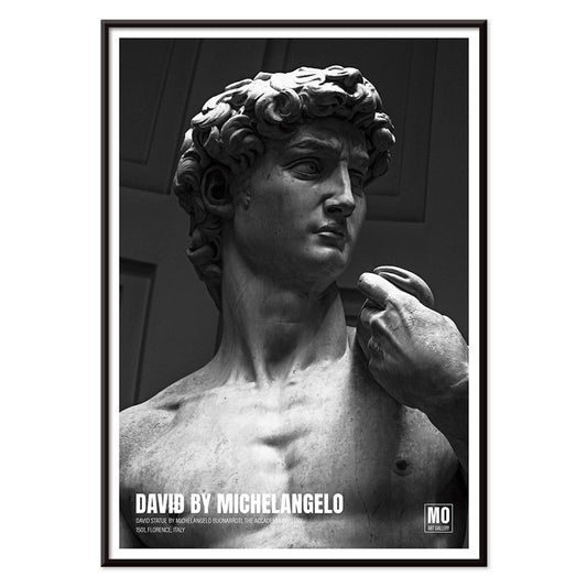
David of Michelangelo 2 Poster
Mo Art Gallery · 1504 · Monochrome David art print highlighting the sculpted gaze and marble texture
Poster from €9 · Framed from €16
Regular price From €6,00Regular price -
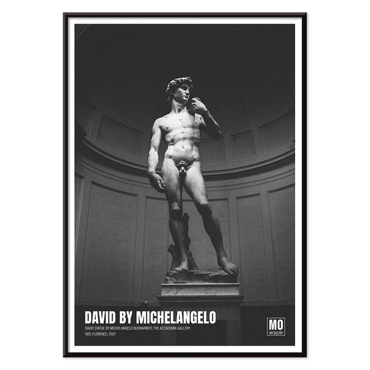
David of Michelangelo Poster
Mo Art Gallery · 1504 · Monochrome David sculpture poster emphasizing Renaissance form and marble detail
Poster from €9 · Framed from €16
Regular price From €6,00Regular price -
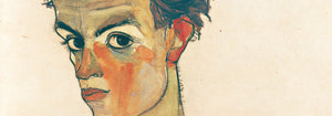
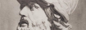
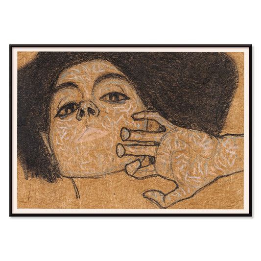
Head of a Woman Poster
Egon Schiele · 1908 · Expressive portrait art print with spare linework and warm brown washes
Poster from €9 · Framed from €16
Regular price From €6,00Regular price -
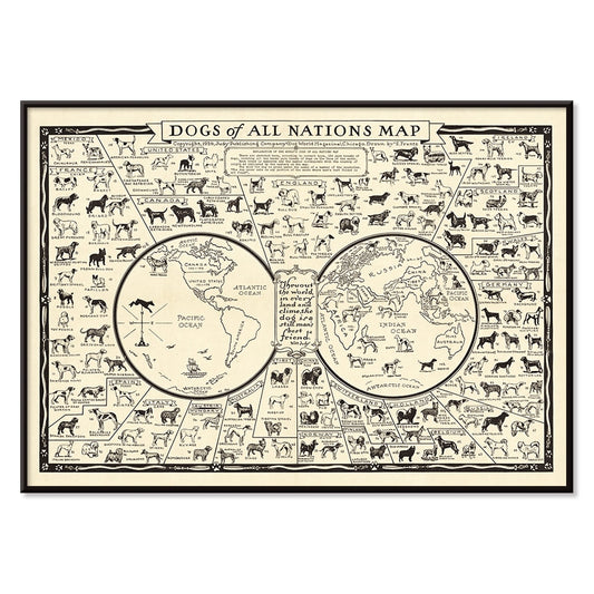
Dogs of All Nations Poster
E. Frantz · 1936 · Detailed canine map poster presenting dog breeds worldwide in crisp black linework
Poster from €9 · Framed from €16
Regular price From €6,00Regular price -
Ile De Corse Poster
Depot General de la Marine · 1831 · Nautical Corsica poster with precise coastline linework on softly aged paper
Poster from €9 · Framed from €16
Regular price From €6,00Regular price -
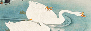
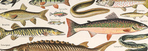
Japanese Art Poster
Julius Klinger · 1927 · Delicate fish and seaweed poster balancing Japanese-inspired linework with calm negative space
Poster from €9 · Framed from €16
Regular price From €6,00Regular price -
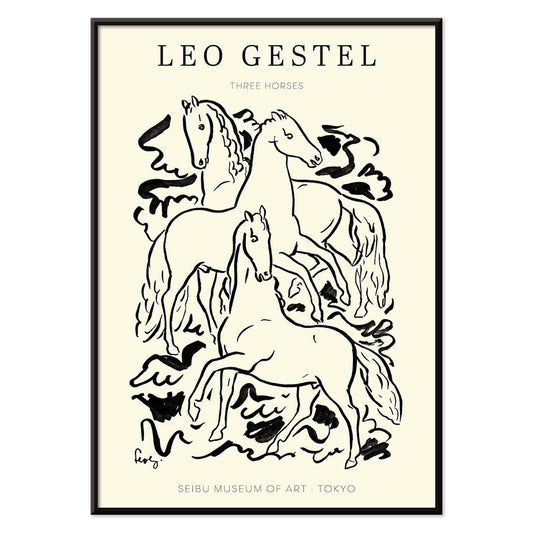
Three Horses Poster
Leo Gestel · 1925 · Expressive black-and-white horse art print capturing motion through spare, energetic linework
Poster from €9 · Framed from €16
Regular price From €6,00Regular price -
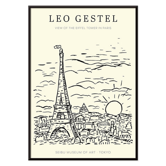
View of the Eiffel Tower Poster
Leo Gestel · 1921 · Expressive black and white Eiffel Tower poster rendered with dynamic modernist lines
Poster from €9 · Framed from €16
Regular price From €6,00Regular price -
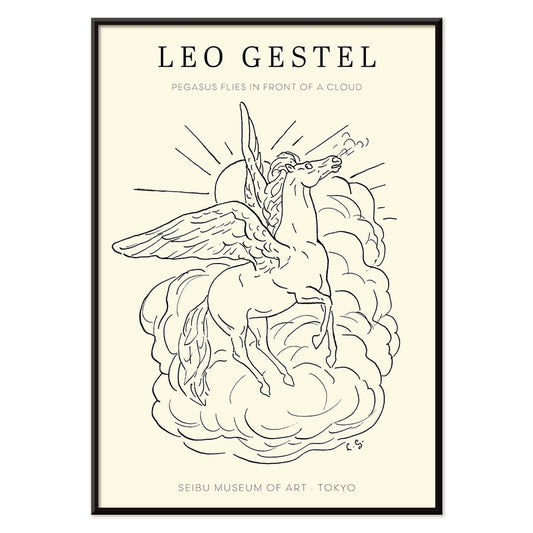
Pegasus in front of a cloud Poster
Leo Gestel · 1922 · Airy black-and-white poster of Pegasus flying above a single rounded cloud
Poster from €9 · Framed from €16
Regular price From €6,00Regular price -
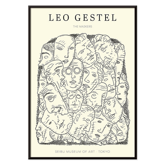
Maskers Poster
Leo Gestel · 1923 · Striking mask face poster in bold monochrome with angular modernist geometry
Poster from €9 · Framed from €16
Regular price From €6,00Regular price -
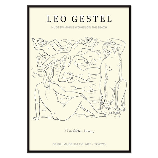
Nude women swimming Poster
Leo Gestel · 1925 · Expressive black-and-white poster of nude swimmers rendered in bold, fluid lines
Poster from €9 · Framed from €16
Regular price From €6,00Regular price -
L'Art Hollandais contemporain Poster
Paul Fierens · 1933 · Elegant black-and-white nude poster balancing refined linework and modern French typography
Poster from €9 · Framed from €16
Regular price From €6,00Regular price -
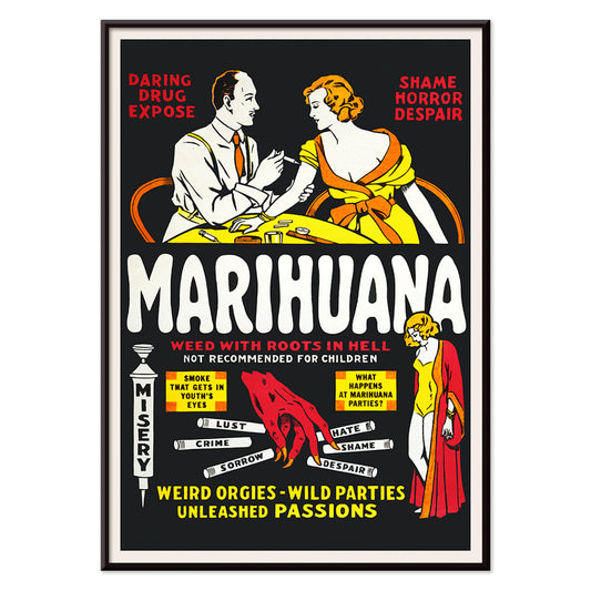
Marihuana Poster
Unknown artist · 1936 · Sensational anti-weed movie poster with fiery lettering and cautionary vignette scenes
Poster from €9 · Framed from €16
Regular price From €6,00Regular price -
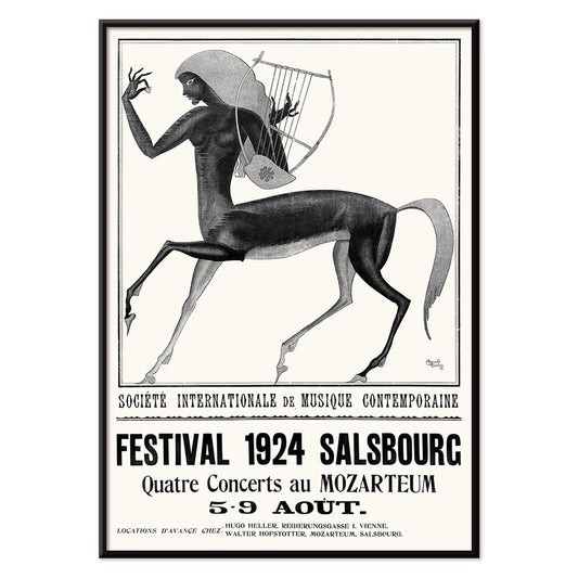
Festival de musique contemporaine de Salsbourg Poster
Edmund Dulac · 1924 · Mythic centaur and lyre festival poster rendered in striking black and white contrast
Poster from €9 · Framed from €16
Regular price From €6,00Regular price -
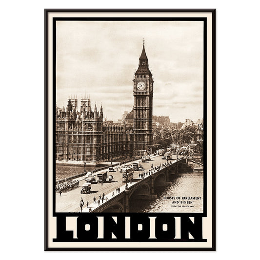
London Big Ben Poster
Dixon Scott · 1926 · Sepia London skyline poster featuring Big Ben and the Houses of Parliament above the Thames
Poster from €9 · Framed from €16
Regular price From €6,00Regular price -
Pelléas et Mélisande Poster
Choudens · 1902 · Dreamlike opera poster of two lovers by a river in misty monochrome
Poster from €9 · Framed from €16
Regular price From €6,00Regular price -
Carmen Poster
Choudens · 1875 · Vintage Carmen opera poster featuring an ornate archway scene and bold black typography
Poster from €9 · Framed from €16
Regular price From €6,00Regular price -
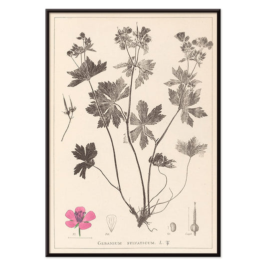
Herbier Français Pl.59 Poster
Antoine Cusin · 1867 · Delicate botanical print of woodland geranium with soft pink blooms and precise linework
Poster from €9 · Framed from €16
Regular price From €6,00Regular price -
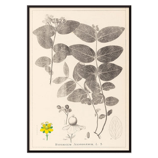
Herbier Français Pl.117 Poster
Antoine Cusin · 1867 · Refined Hypericum androsaemum botanical print with crisp linework and soft yellow and green tones
Poster from €9 · Framed from €16
Regular price From €6,00Regular price -
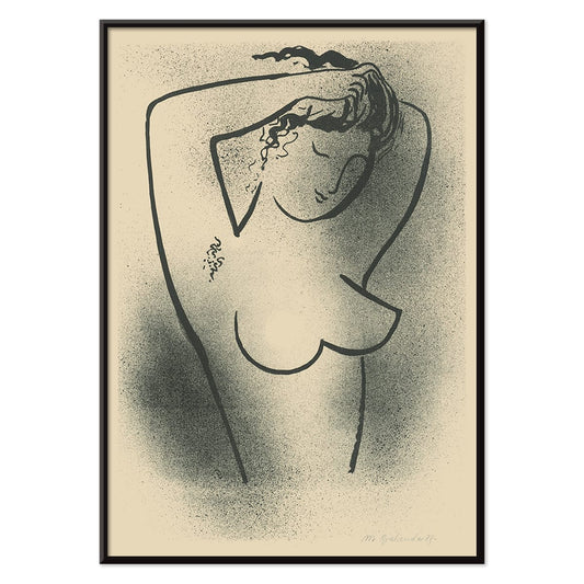
Toaleta Poster
Mikuláš Galanda · 1937 · Minimal black-and-white nude poster drawn in fluid modernist contour lines
Poster from €9 · Framed from €16
Regular price From €6,00Regular price -
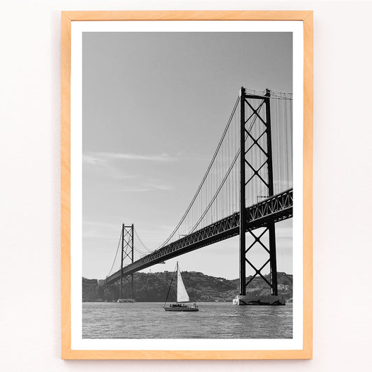
Lisbon Bridge Poster
MORYARTY · 2017 · Minimal black-and-white bridge poster with a lone sailboat and calm river space
Poster from €9 · Framed from €16
Regular price From €6,00Regular price -
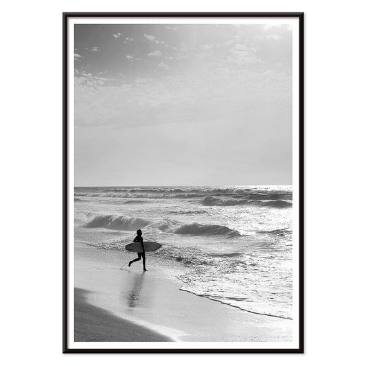
Surfer in Portugal Poster
MORYARTY · 2022 · Minimal black-and-white surfer poster capturing calm shoreline energy and open Atlantic horizons
Poster from €9 · Framed from €16
Regular price From €6,00Regular price -
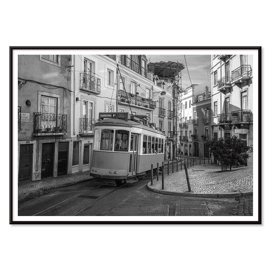
Lisbon Tramway 28 Poster
MORYARTY · Modern · Monochrome Lisbon Tram 28 poster with crisp city lines and nostalgic travel mood
Poster from €9 · Framed from €16
Regular price From €6,00Regular price -
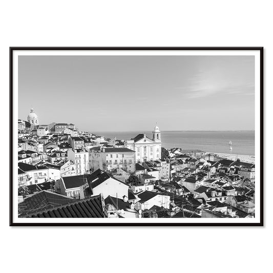
Alfama Poster
MORYARTY · 1940 · Monochrome Alfama skyline poster capturing Lisbon rooftops in crisp graphic silhouette
Poster from €9 · Framed from €16
Regular price From €6,00Regular price -
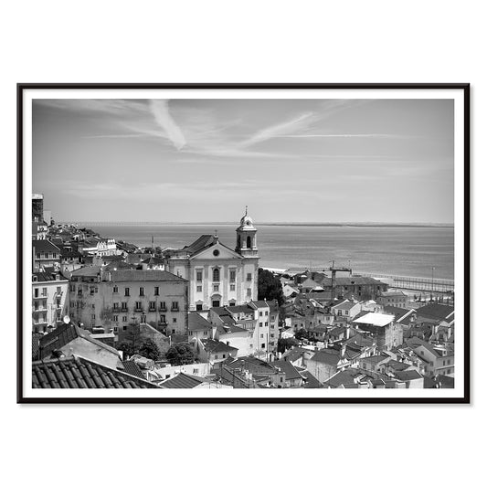
Lisbon Old City 1 Poster
MORYARTY · 2017 · Black-and-white Lisbon cityscape poster with layered rooftops and a calm waterfront horizon
Poster from €9 · Framed from €16
Regular price From €6,00Regular price -
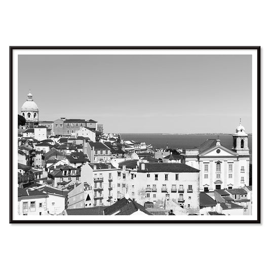
Lisbon Old City 2 Poster
MORYARTY · 1950 · Monochrome Lisbon rooftops poster with stacked facades and quiet Old Town atmosphere
Poster from €9 · Framed from €16
Regular price From €6,00Regular price -
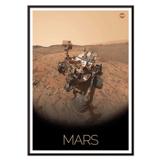
Rover on Mars Poster
NASA · 2006 · Detailed Mars rover poster crossing a rugged red landscape in warm brown and beige tones
Poster from €9 · Framed from €16
Regular price From €6,00Regular price -
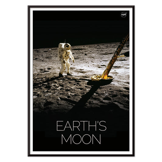
Man on Moon 2 Poster
NASA · 1969 · Iconic lunar exploration poster featuring a solitary astronaut on the textured Moon surface
Poster from €9 · Framed from €16
Regular price From €6,00Regular price -
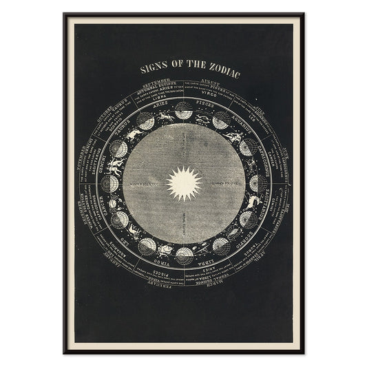
Signs of the Zodiac Poster
Asa Smith · 1850 · Detailed zodiac chart print pairing constellation emblems with crisp Victorian linework
Poster from €9 · Framed from €16
Regular price From €6,00Regular price -
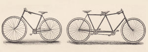
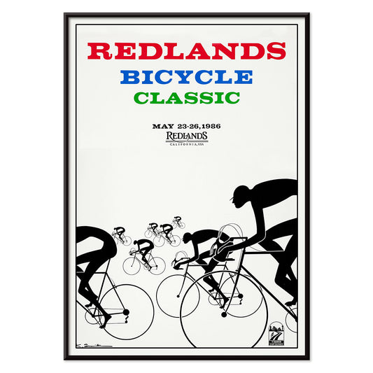
Redlands bicycle classic Poster
Karlis Smiltens · 1991 · Dynamic cycling poster with bold red, blue, and green racers in motion
Poster from €9 · Framed from €16
Regular price From €6,00Regular price -
Man on Moon 1 Poster
NASA · 1969 · Historic lunar print featuring an astronaut and rover beneath a stark black sky
Poster from €9 · Framed from €16
Regular price From €6,00Regular price -
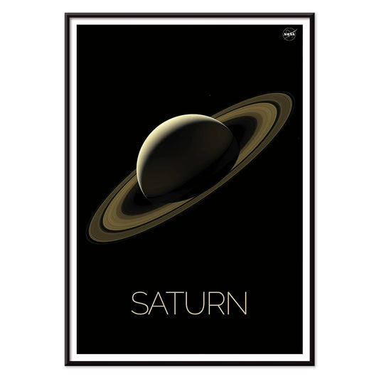
Saturn Poster
NASA · 2018 · Sleek Saturn poster with luminous rings over a deep black starfield
Poster from €9 · Framed from €16
Regular price From €6,00Regular price -
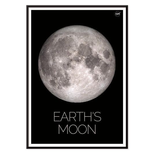
Moon Poster
NASA · 1969 · Crisp lunar surface poster with high-contrast craters against deep black space
Poster from €9 · Framed from €16
Regular price From €6,00Regular price -
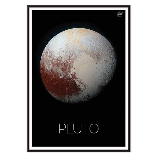
Pluto Poster
NASA · 1994 · Minimal Pluto poster featuring a textured planetary disk on a deep black background
Poster from €9 · Framed from €16
Regular price From €6,00Regular price -
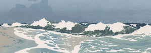
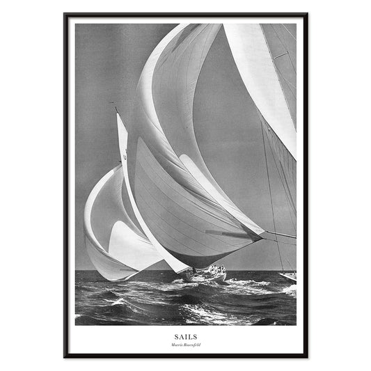
Sails Poster
Morris Rosenfeld · 1946 · High-contrast sailing poster capturing clustered yacht sails and crisp sea-breeze energy
Poster from €9 · Framed from €16
Regular price From €6,00Regular price -
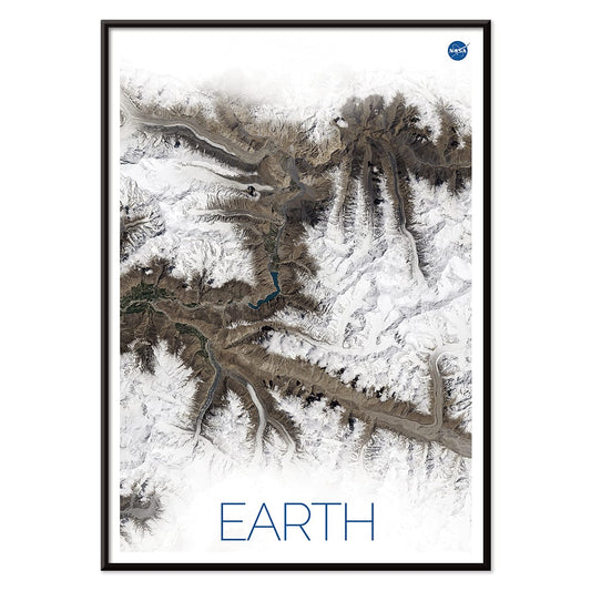
Earth 1 Poster
NASA · 1972 · Striking satellite poster featuring snow bright mountain ridges and deep blue atmospheric haze
Poster from €9 · Framed from €16
Regular price From €6,00Regular price -
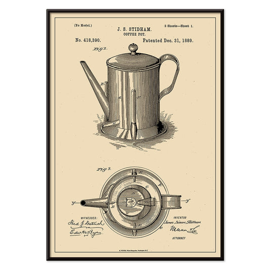
Coffee-Pot Patent Poster
J.S. Stidham · 1889 · Detailed coffee pot patent vintage print with numbered diagrams and crisp technical linework
Poster from €9 · Framed from €16
Regular price From €6,00Regular price -
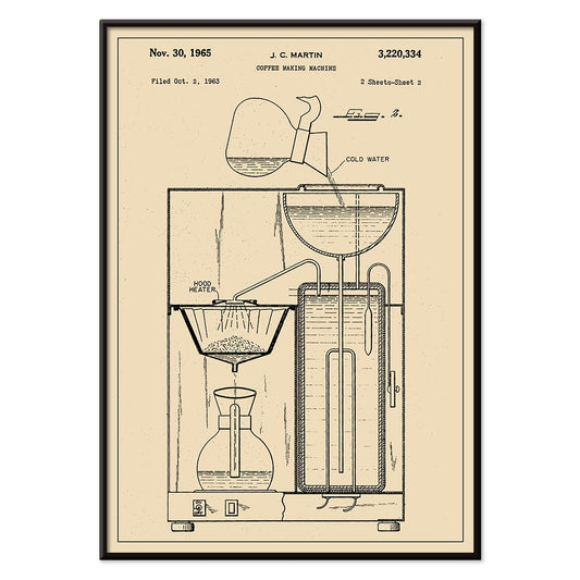
Coffee Making Machine Patent Poster
J.C. Martin · 1965 · Detailed coffee maker patent vintage print with precise line diagrams on warm beige
Poster from €9 · Framed from €16
Regular price From €6,00Regular price -
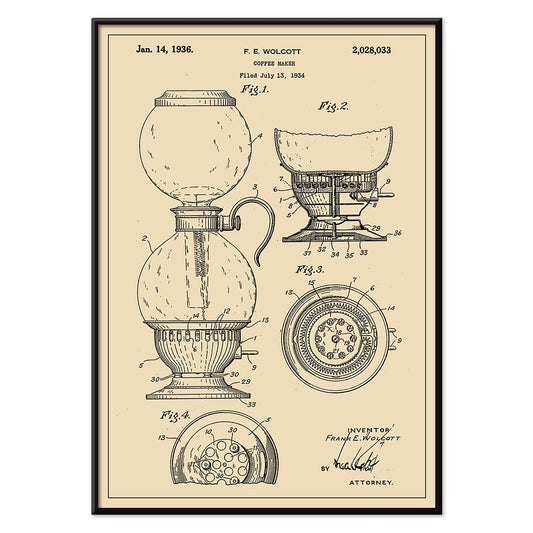
Coffee Maker Patent Poster
F.E. Wolcott · 1934 · Technical coffee maker patent vintage print with crisp blueprint linework on warm beige
Poster from €9 · Framed from €16
Regular price From €6,00Regular price -
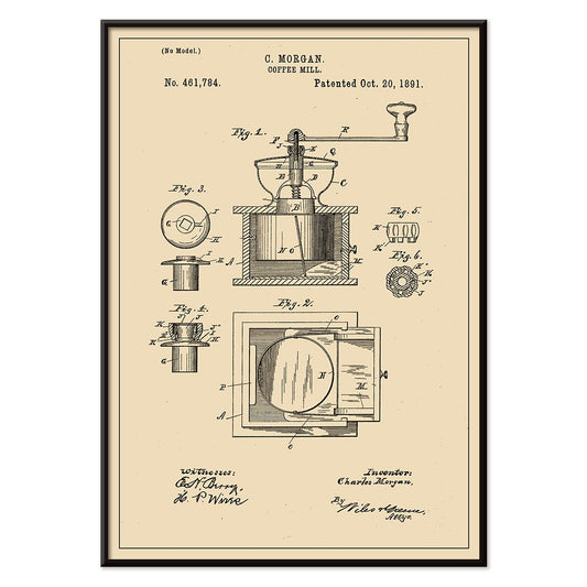
Coffee Mill Patent Poster
C. Morgan · 1891 · Detailed coffee mill patent poster with crisp technical linework on warm beige
Poster from €9 · Framed from €16
Regular price From €6,00Regular price -
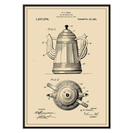
Tea or Coffee Pot Patent Poster
B.F. Olsen · 1921 · Crisp patent print showing a tea or coffee pot in precise sectional views
Poster from €9 · Framed from €16
Regular price From €6,00Regular price -
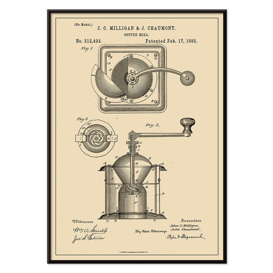
Coffee Mill Patent Poster
J.C. Milligan · 1885 · Detailed coffee grinder vintage print with precise patent linework on warm beige
Poster from €9 · Framed from €16
Regular price From €6,00Regular price -
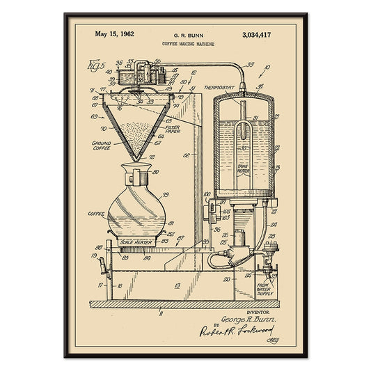
Coffee Making Machine Patent Poster
G.R. Bunn · 1962 · Precise vintage print of a coffee making machine patent with schematic multi-view diagrams
Poster from €9 · Framed from €16
Regular price From €6,00Regular price -
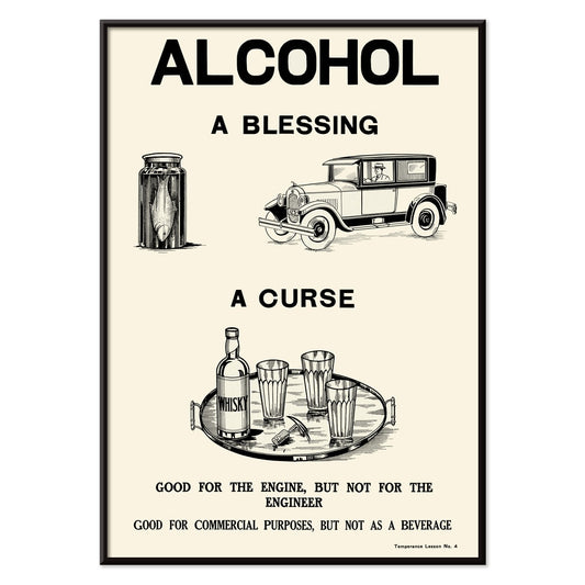
Alcohol Temperance 1 Poster
Dominion Scientific Temperance Committee · 1912 · Bold temperance poster contrasting modern life and bottle imagery in stark monochrome
Poster from €9 · Framed from €16
Regular price From €6,00Regular price -
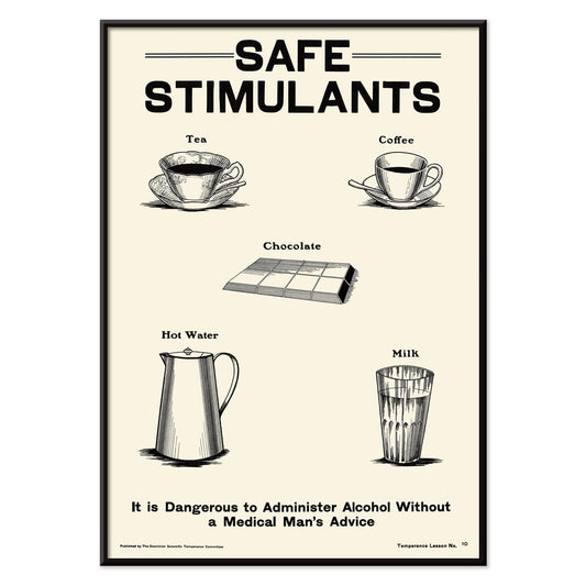
Alcohol Temperance 2 Poster
Dominion Scientific Temperance Committee · 1912 · Educational temperance poster presenting tea and coffee as safe everyday stimulants
Poster from €9 · Framed from €16
Regular price From €6,00Regular price -
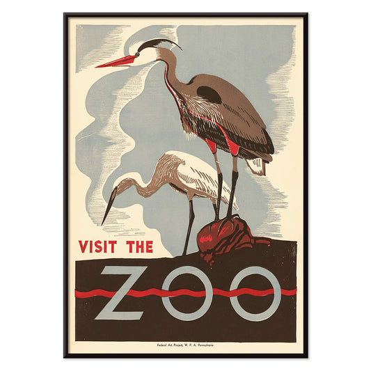
Visit the zoo 2 Poster
Unknown artist · 1936 · WPA era crane poster featuring bold silhouettes and inviting city visitors to the zoo
Poster from €9 · Framed from €16
Regular price From €6,00Regular price -
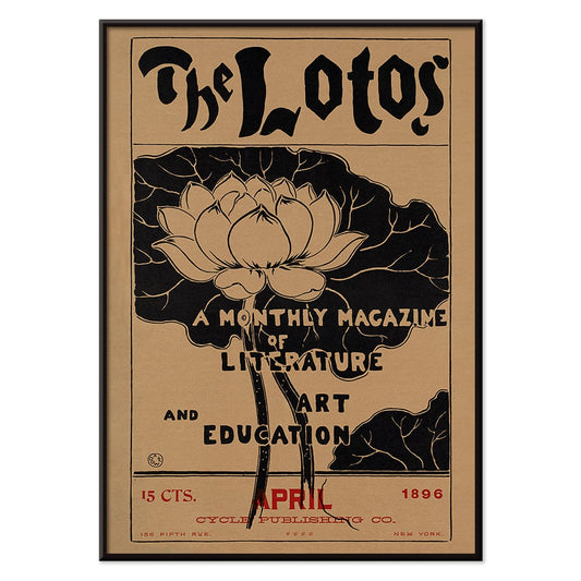
The lotos Poster
Arthur Wesley Dow · 1896 · Elegant lotus poster with calm symmetry, crisp black linework, and warm red accents
Poster from €9 · Framed from €16
Regular price From €6,00Regular price


72/345 items
- Punch Boutique Poster
- Judaism and Paganism Standpoint Poster
- Tour Eiffel 2 Poster
- The Current Standpoint of the Mahatmas Poster
- Riley Blaze Poster
- La Paresse Poster
- Black Cat 4 Poster
- Black Cat 3 Poster
- Sherlock Holmes Poster
- Black Cat 2 Poster
- Solaris Poster
- Campanile di Pisa Poster
- Kabuki Poster
- Red Lips Poster
- Bauhaus Ausstellung Poster
- Head of a Woman Poster
- Japanese Art Poster
- View of the Eiffel Tower Poster
- Pegasus in front of a cloud Poster
- Maskers Poster
- L'Art Hollandais contemporain Poster
- Marihuana Poster
- Lisbon Bridge Poster
- Surfer in Portugal Poster
- Lisbon Tramway 28 Poster
- Alfama Poster
- Lisbon Old City 1 Poster
- Lisbon Old City 2 Poster
- Signs of the Zodiac Poster
- Redlands bicycle classic Poster
- Sails Poster
- Coffee-Pot Patent Poster
- Tea or Coffee Pot Patent Poster
- Coffee Mill Patent Poster
- Visit the zoo 2 Poster
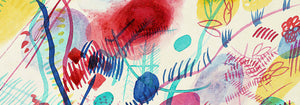
Ink, silver, and the pleasure of contrast
Black and white imagery has its own climate: sharp, quiet, and a little cinematic. Greys move like weather across paper, from charcoal haze to bright, hard white. Here, vintage poster culture meets photography, scientific plates, and modernist abstraction, all held together by value, line, and negative space. Without colour to distract, a print’s rhythm becomes clearer: the sweep of a brushstroke, the grain of film, the logic of a diagram. These posters suit decoration that leans on materials and light, where wall art can sit beside books, ceramics, and textured fabrics with measured presence.
From Expressionist intimacy to natural history
Expressionist drawing made the body a site of psychological candour, and Egon Schiele pushed that language with nervous contour and abrupt, unfinished space. In Two Women Embracing (1913) by Egon Schiele, the closeness of the figures is heightened by the surrounding white paper, which behaves like silence in a room. A different tradition appears in scientific illustration, where clarity is a form of beauty. Ernst Haeckel’s plates used careful symmetry and controlled line to make taxonomy legible, yet they also fed the era’s design vocabulary. Hexacoralla from Kunstformen der Natur (1904) by Ernst Haeckel reads as both marine biology and ornament, a bridge between microscope and decoration.
Where monochrome wall art works best
Monochrome prints excel in transitional spaces because contrast holds up at a glance. In a hallway or stairwell, black and white posters can read like a continuous narrative; pairing photography with diagrams keeps the eye moving. In studios and kitchens, technical line feels at home among shelving and tools, and cartography offers pattern without a loud palette. Whitbreads new plan of London (1853) by J. Whitbread brings street geometry that behaves almost like textiles. For related moods, Photo leans atmospheric, while Science and Maps keep the emphasis on structure.
Curating across movements: Op art, Bauhaus, and restraint
Because black and white reduces decisions, it also makes mixing eras easier. Op art relies on the eye’s own mechanics, and Bridget Riley’s Riley Blaze (1964) by Bridget Riley introduces vibration and optical tension that suits pared-back rooms and matte surfaces. Bauhaus graphics speak differently: they prioritise clarity, proportion, and the poster as a modern public language. Bauhaus Ausstellung 1923 works well near metal shelving, record sleeves, and functional objects, where geometry feels conversational rather than decorative. For ink-led balance and asymmetry, Oriental offers a useful counterpoint, while Minimalist keeps the focus on negative space.
Framing, pairing, and letting paper tone matter
Monochrome wall art rewards close attention to paper tone and margins. Warm whites soften rooms with timber and linen; colder whites sharpen steel, glass, and concrete. Start with one decisive poster above a console, then build outward by repeating a single cue, such as line weight or border width, so a gallery wall feels cohesive without matching. Frame choice is part of the palette: black frames intensify contrast, while natural wood introduces warmth around photographic greys. Use Frames to keep edges clean and consistent, and consider mixing formats via Vertical Posters and Horizontal Posters to control pacing across the wall.