


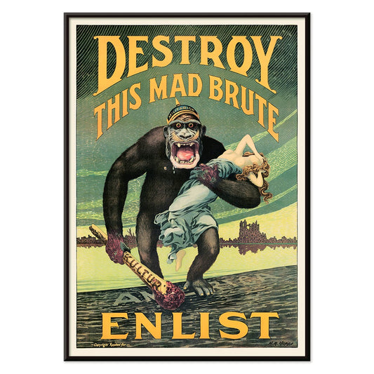
- Destroy this mad brute Poster
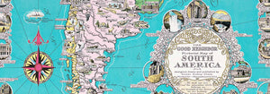
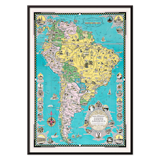
- The good neighbor of South America Poster
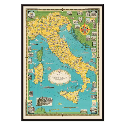
- Italy with Vatican City Poster
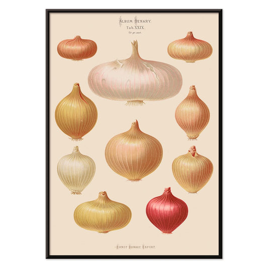
- Onions Poster
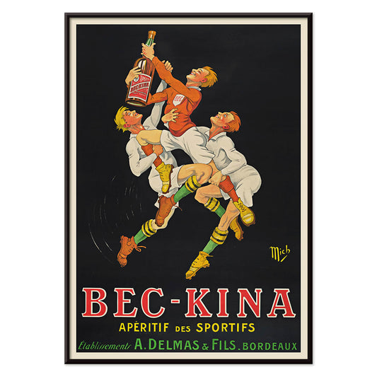
- Bec-Kina Poster
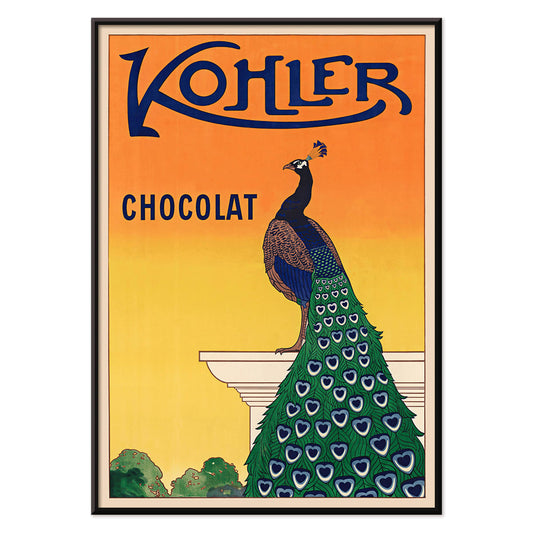
- Kohler Chocolat Poster
- Strawberry Thief Poster
- Tom Krojer Exhibition Poster Poster
- Ernst Kirchner Exhibition Poster
- El Comienzo Poster
- Parler Seul 2 Poster
- Twilight’s Ring Poster
- Parler Seul Poster
- Faun and Nymphe Poster
- The Dream Poster
- Le Concert Poster
- Bird passing through a Cloud Poster
- Female Artist Poster
- Revenge of the Pink Panther Poster
- Woman and Bird at Night Poster
- Bauhaus 20 Poster
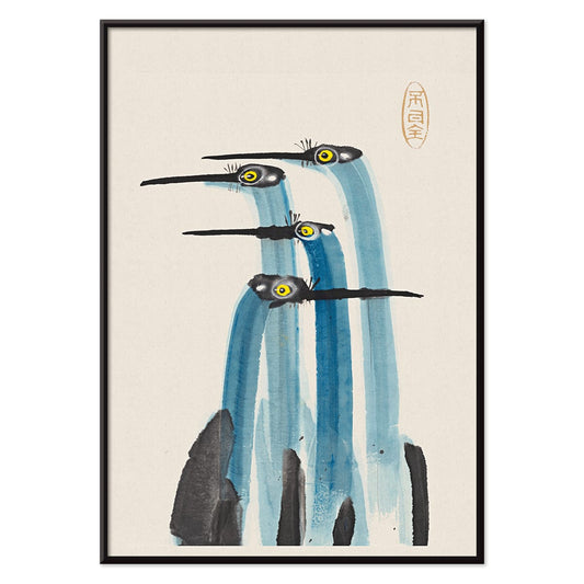
- Blue Japanese Crane Poster
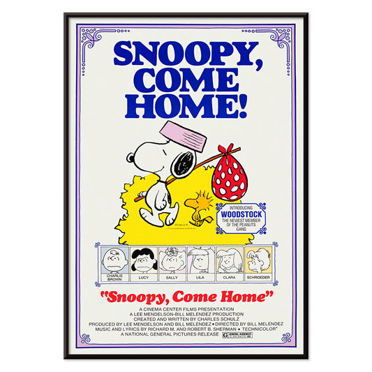
- Snoopy come home Poster
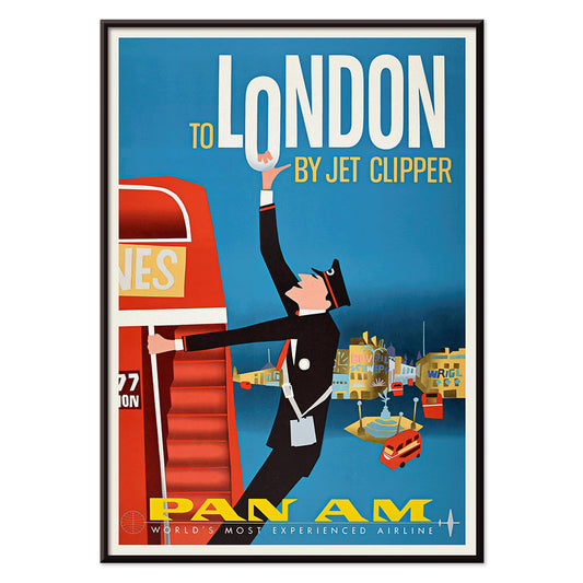
- To London by Jet Clipper Poster
- Kyushu-Okinawa Poster
- Xerez Pedro Domeco Poster
- Balsam Aperitif Poster
- Butter Poster
- Crans Poster
- Monte Carlo Poster
- Beer and Cigarette Poster
- West Coast of Mexico Poster
- Rita Gaufres Poster
- Hibiscus Poster
-
Destroy this mad brute Poster
Harry Ryle Hopps · 1917 · Dramatic wartime poster featuring a helmeted gorilla advancing with club and captive
Poster from €9 · Framed from €16
Regular price From €6,00Regular price -
The good neighbor of South America Poster
Ernest Dudley Chase · 1935 · Bright illustrated South America map poster with animals, landmarks, and sea routes
Poster from €9 · Framed from €16
Regular price From €6,00Regular price -
Italy with Vatican City Poster
Ernest Dudley Chase · 1935 · Illustrated Italy map poster featuring landmark vignettes and crisp lettering in vibrant colors
Poster from €9 · Framed from €16
Regular price From €6,00Regular price -
Onions Poster
Ernst Benary · 1876 · Detailed onion botanical print with bulbs, roots, and green shoots on beige
Poster from €9 · Framed from €16
Regular price From €6,00Regular price -
Bec-Kina Poster
Michel Liebeaux · 1900 · Energetic rugby themed aperitif poster with bold figures reaching for a bottle
Poster from €9 · Framed from €16
Regular price From €6,00Regular price -
Kohler Chocolat Poster
F. Champenois · 1914 · Elegant Art Nouveau peacock poster advertising Kohler chocolate on a radiant orange background
Poster from €9 · Framed from €16
Regular price From €6,00Regular price -
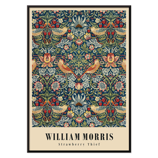
Strawberry Thief Poster
William Morris · 1883 · Iconic Arts and Crafts poster with thrushes, strawberries, and scrolling foliage in rich blues
Poster from €9 · Framed from €16
Regular price From €6,00Regular price -
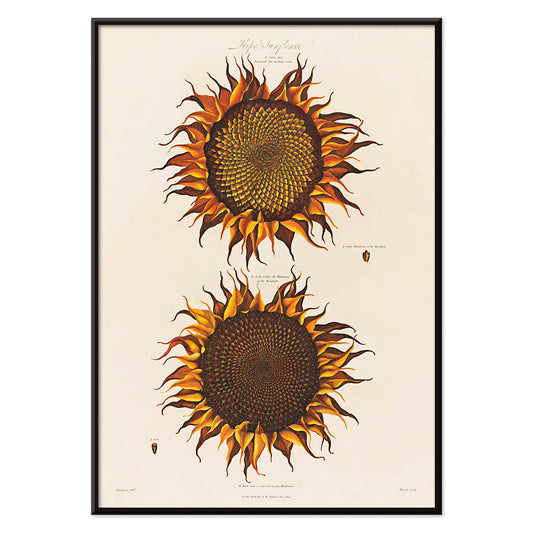
Ripe Sunflower Poster
Robert John Thornton · 1799 · Dramatic ripe sunflower botanical print with curling petals and lush green leaves
Poster from €9 · Framed from €16
Regular price From €6,00Regular price -
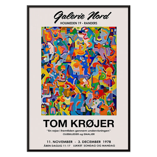
Tom Krojer Exhibition Poster Poster
Tom Krojer · 1989 · Dynamic geometric exhibition poster balancing vivid color blocks with crisp modern typography
Poster from €9 · Framed from €16
Regular price From €6,00Regular price -
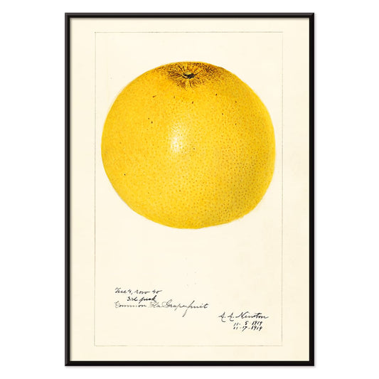
Citrus paradisi Poster
Amanda Almira Newton · 1919 · Luminous grapefruit botanical print balancing scientific clarity with soft watercolor shading
Poster from €9 · Framed from €16
Regular price From €6,00Regular price -
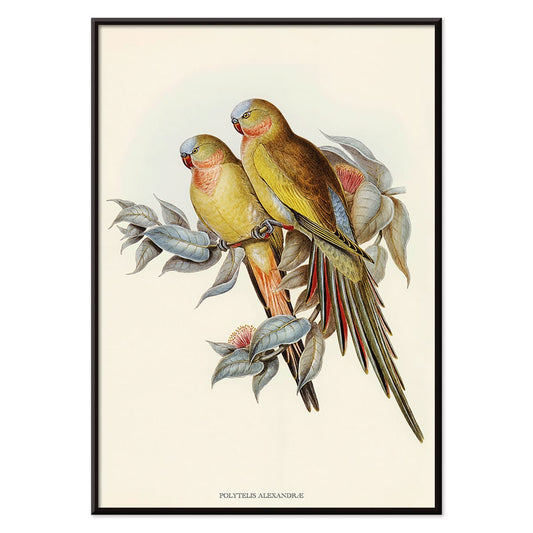
Polytelis Alexandrae Poster
Unknown artist · 1873 · Elegant parakeet print featuring two long-tailed birds in fresh green and rose hues
Poster from €9 · Framed from €16
Regular price From €6,00Regular price -
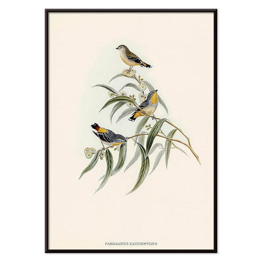
Pardalotus Xanthopygius Poster
Unknown artist · 1838 · Delicate pardalote print with three birds perched on eucalyptus branches in soft natural tones
Poster from €9 · Framed from €16
Regular price From €6,00Regular price -
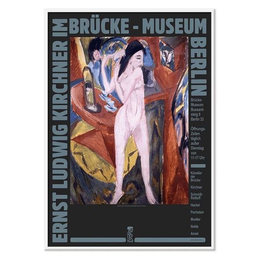
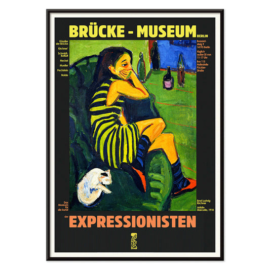
Ernst Kirchner Exhibition Poster
Ernst Kirchner · 1910 · Expressionist nude exhibition poster with bold black outlines and vivid blue and red
Poster from €9 · Framed from €16
Regular price From €6,00Regular price -
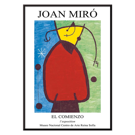
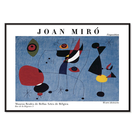
El Comienzo Poster
Joan Miro · 1972 · Playful abstract poster with biomorphic shapes and bold lines in vivid primary colors
Poster from €9 · Framed from €16
Regular price From €6,00Regular price -
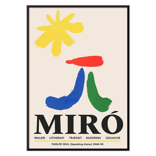
Parler Seul 2 Poster
Joan Miro · 1948 · Playful biomorphic poster with floating black lines and orange, blue, yellow accents on beige
Poster from €9 · Framed from €16
Regular price From €6,00Regular price -
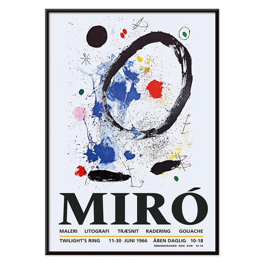
Twilight’s Ring Poster
Joan Miro · 2018 · Playful abstract poster of orbiting shapes and star-like marks on deep blue
Poster from €9 · Framed from €16
Regular price From €6,00Regular price -
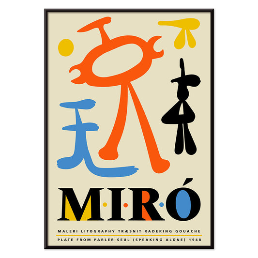
Parler Seul Poster
Joan Miro · 1948 · Playful abstract poster with floating symbols, bold lines, and primary color accents
Poster from €9 · Framed from €16
Regular price From €6,00Regular price -
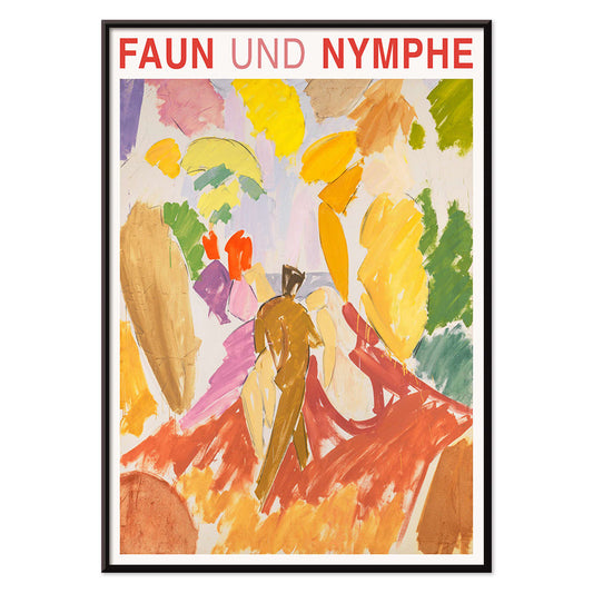
Faun and Nymphe Poster
Edvard Weie · 1941 · Expressive mythic poster pairing a faun and nymph in bold modernist color blocks
Poster from €9 · Framed from €16
Regular price From €6,00Regular price -
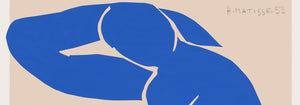
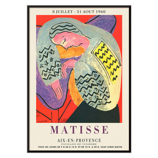
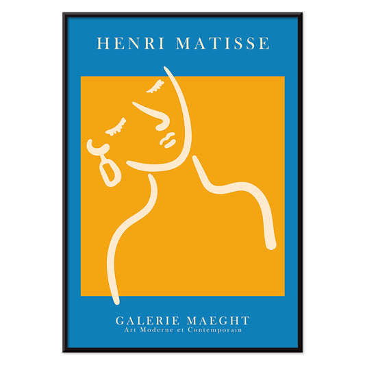
The Dream Poster
Henri Matisse · 1960 · Vibrant sleeping figure poster with flowing contours and bold, flat color shapes
Poster from €9 · Framed from €16
Regular price From €6,00Regular price -
Le Concert Poster
Hulusi Mercan · 1960 · Energetic abstract poster of musical instruments with bold red blue and yellow shapes
Poster from €9 · Framed from €16
Regular price From €6,00Regular price -
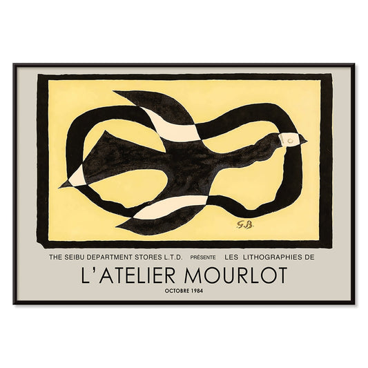
Bird passing through a Cloud Poster
George Braque · 1957 · Abstract bird poster drifting through a cloud with crisp black lines on warm yellow
Poster from €9 · Framed from €16
Regular price From €6,00Regular price -
Female Artist Poster
Ernst Ludwig Kirchner · 1910 · Angular figure art print with bold black contours and high-contrast color fields
Poster from €9 · Framed from €16
Regular price From €6,00Regular price -
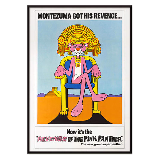
Revenge of the Pink Panther Poster
Unknown artist · 1978 · Playful Pink Panther movie poster with regal throne pose and bold retro colors
Poster from €9 · Framed from €16
Regular price From €6,00Regular price -
Woman and Bird at Night Poster
Joan Miro · 1947 · Playful surrealist poster with midnight blue field and bright red and yellow signs
Poster from €9 · Framed from €16
Regular price From €6,00Regular price -
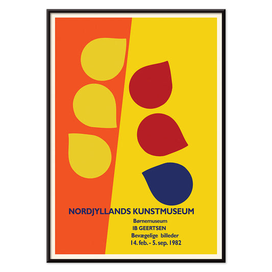
Ib Geertsen Poster
Ib Geertsen · 1982 · Vibrant geometric poster balancing bold primary blocks with crisp Scandinavian modernism
Poster from €9 · Framed from €16
Regular price From €6,00Regular price -
Joan Miro Osaka Poster
Joan Miro · 1970 · Playful abstract poster with calligraphic black forms and bright primary accents
Poster from €9 · Framed from €16
Regular price From €6,00Regular price -
The Clothed Maja Poster
Francisco Goya · 1802 · Iconic reclining figure art print with crisp whites, green sash, and golden cushions
Poster from €9 · Framed from €16
Regular price From €6,00Regular price -
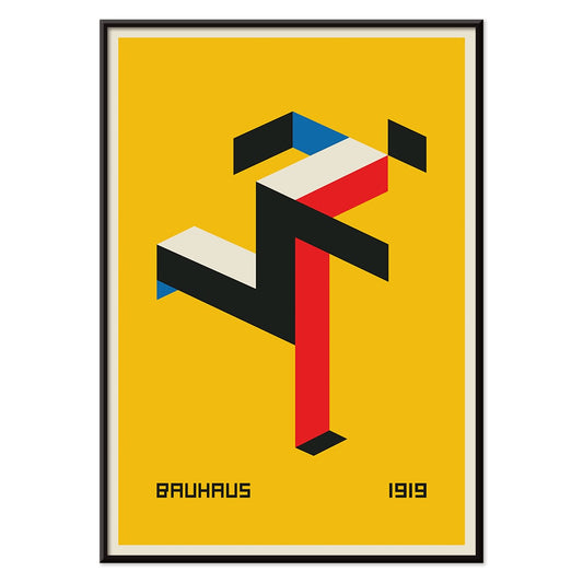
Bauhaus 20 Poster
Unknown artist · 1923 · Dynamic Bauhaus poster balancing primary blocks and crisp geometry on white space
Poster from €9 · Framed from €16
Regular price From €6,00Regular price -
Blue Japanese Crane Poster
Unknown artist · 1889 · Serene Japanese crane art print with cool blue plumage and airy negative space
Poster from €9 · Framed from €16
Regular price From €6,00Regular price -
Snoopy come home Poster
Unknown artist · 1972 · Cheerful Snoopy and Woodstock poster with clean lines and bright primary colors
Poster from €9 · Framed from €16
Regular price From €6,00Regular price -
To London by Jet Clipper Poster
Unknown artist · 1955 · Mid-century London travel poster pairing a Pan Am stewardess with a red double-decker bus
Poster from €9 · Framed from €16
Regular price From €6,00Regular price -
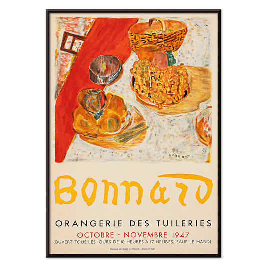
Exposition Bonnard Poster
Unknown artist · 1947 · Sunlit still life poster balancing bold color blocks and elegant exhibition typography
Poster from €9 · Framed from €16
Regular price From €6,00Regular price -
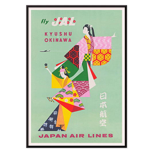
Kyushu-Okinawa Poster
Unknown artist · 1962 · Vibrant Japanese travel poster featuring traditional figures and bold island-inspired graphic shapes
Poster from €9 · Framed from €16
Regular price From €6,00Regular price -
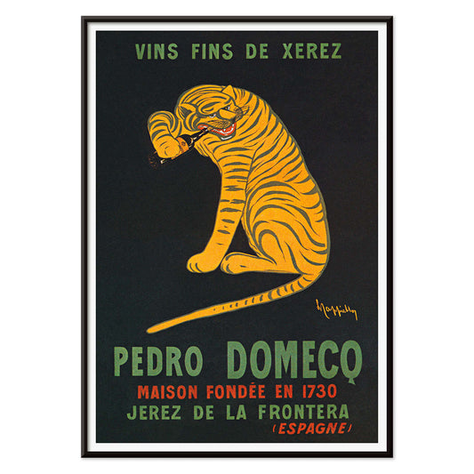
Xerez Pedro Domeco Poster
Leonetto Cappiello · 1930 · Iconic tiger poster leaping from deep black to advertise Xerez sherry
Poster from €9 · Framed from €16
Regular price From €6,00Regular price -
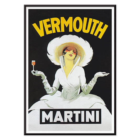
Vermouth Martini Poster
Marcello Dudovich · 1918 · Chic vermouth advertising poster featuring a poised woman in white and bold yellow accents
Poster from €9 · Framed from €16
Regular price From €6,00Regular price -
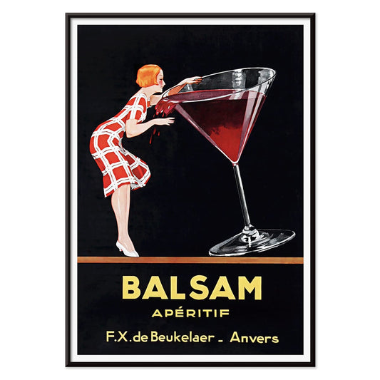
Balsam Aperitif Poster
Jean d'Ylen · 1923 · Playful Art Deco poster of a chic woman beside an oversized cocktail glass
Poster from €9 · Framed from €16
Regular price From €6,00Regular price -
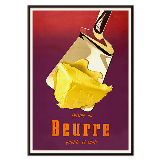
Butter Poster
Donald Brun · 1951 · Playful butter poster with smooth airbrushed shading and bold mid-century Swiss clarity
Poster from €9 · Framed from €16
Regular price From €6,00Regular price -
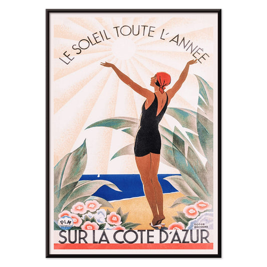
Sur la Cote d'Azur Poster
Roger Broders · 1950 · Sunlit Riviera poster with stylized beachgoers, sailboats, and bold Art Deco forms
Poster from €9 · Framed from €16
Regular price From €6,00Regular price -
Crans Poster
Unknown artist · 1955 · Dynamic alpine ski poster with bold color blocks, crisp slopes, and blue sky
Poster from €9 · Framed from €16
Regular price From €6,00Regular price -
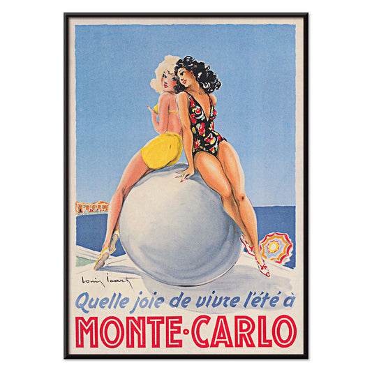
Monte Carlo Poster
Louis Icart · 1952 · Glamorous Monte Carlo poster with poised swimmer and crisp Art Deco lettering
Poster from €9 · Framed from €16
Regular price From €6,00Regular price -
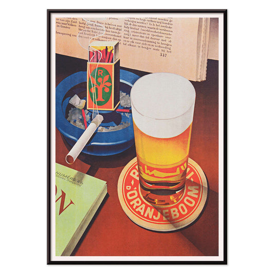
Beer and Cigarette Poster
Unknown artist · 1935 · Graphic beer and cigarette poster featuring a foaming glass and bold red and blue accents
Poster from €9 · Framed from €16
Regular price From €6,00Regular price -
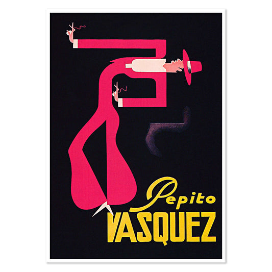
Pepito Vasquez Poster
Tito Livio De Madrazo · 1954 · Dynamic dance poster with an elongated ribbon-like figure on bold black
Poster from €9 · Framed from €16
Regular price From €6,00Regular price -
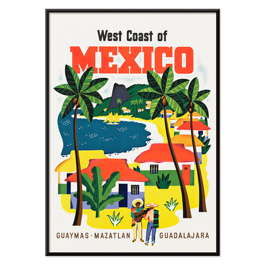
West Coast of Mexico Poster
Ray Bethers · 1935 · Sunlit coastal village poster with palms, blue sea, and bold travel typography
Poster from €9 · Framed from €16
Regular price From €6,00Regular price -
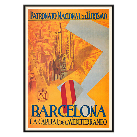
Capital del Mediterraneo Poster
Unknown artist · 1992 · Graphic Barcelona travel poster with stylized cityscape and bold blue, red accents
Poster from €9 · Framed from €16
Regular price From €6,00Regular price -
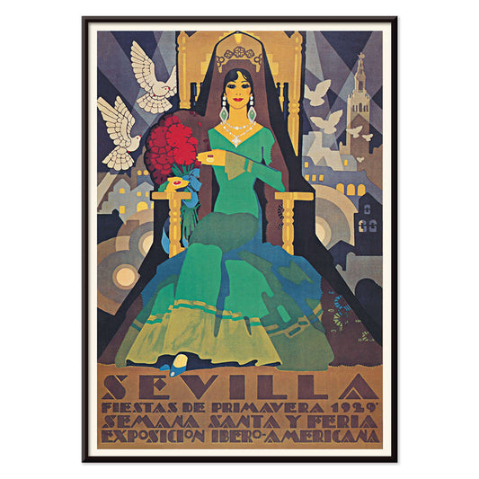
Sevilla Fiestas de primavera 1 Poster
Unknown artist · 1929 · Art Deco festival poster from Seville featuring a green-clad figure and two white doves
Poster from €9 · Framed from €16
Regular price From €6,00Regular price -
Sevilla Fiestas de primavera 2 Poster
Unknown artist · 1932 · Vibrant Seville festival poster featuring a flamenco dancer above a stylized city skyline
Poster from €9 · Framed from €16
Regular price From €6,00Regular price -
Exposition Cantonale Neuchateloise Poster
Edmond Boitel · 1908 · Vibrant Belle Epoque floral poster with abundant bouquet and crisp exhibition lettering
Poster from €9 · Framed from €16
Regular price From €6,00Regular price -
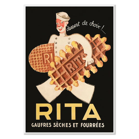
Rita Gaufres Poster
Leon Dupin · 1933 · Playful waffle poster featuring a smiling chef and warm golden tones
Poster from €9 · Framed from €16
Regular price From €6,00Regular price -
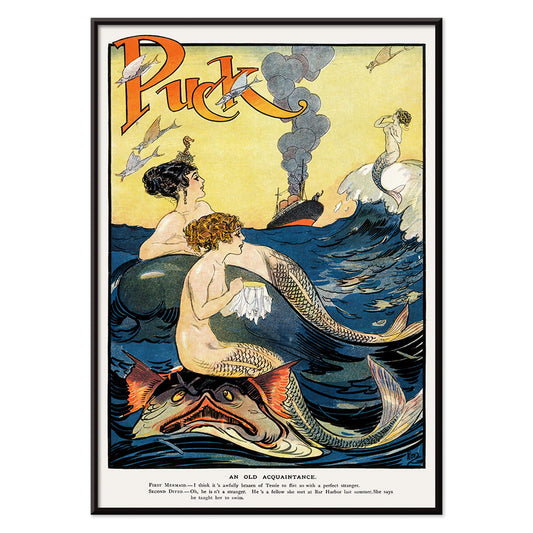
Mermaids sewing Poster
Unknown artist · 1911 · Whimsical mermaids poster with bold outlines and playful nautical fantasy
Poster from €9 · Framed from €16
Regular price From €6,00Regular price -
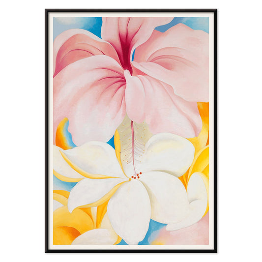
Hibiscus Poster
Georgia O’Keeffe · 1939 · Luminous hibiscus art print with sensuous close-up petals and calm modernist simplicity
Poster from €9 · Framed from €16
Regular price From €6,00Regular price -
4eme Bal de l'AAAA Poster
Foujita · 1926 · Elegant Montmartre ball poster with crisp linework and soft pink yellow blue accents
Poster from €9 · Framed from €16
Regular price From €6,00Regular price -
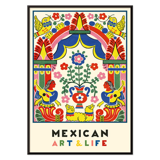
Mexican Art & Life 1 Poster
Unknown artist · 1938 · Vibrant modernist Mexican poster with bold folk-inspired geometry and lively color
Poster from €9 · Framed from €16
Regular price From €6,00Regular price -
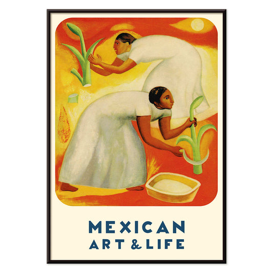
Mexican Art & Life 4 Poster
Unknown artist · 1938 · Vibrant Mexican harvest poster with two field workers under a radiant sun
Poster from €9 · Framed from €16
Regular price From €6,00Regular price -
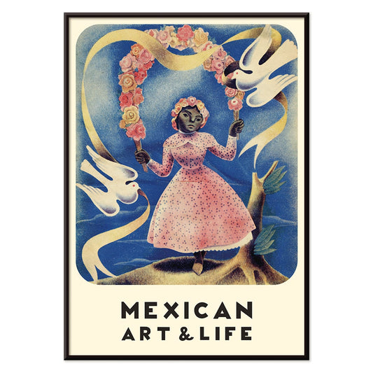
Mexican Art & Life 2 Poster
Unknown artist · 1938 · Vintage magazine poster of a girl in a pink dress holding white doves
Poster from €9 · Framed from €16
Regular price From €6,00Regular price -
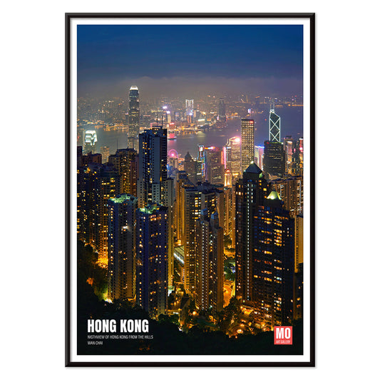
Hong Kong Nightview Poster
Mo Art Gallery · 2023 · Vibrant Hong Kong skyline poster with neon highlights shimmering across a deep blue harbor
Poster from €9 · Framed from €16
Regular price From €6,00Regular price -
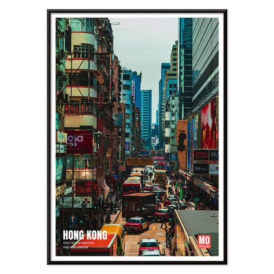
Kowloon Poster
Mo Art Gallery · 2023 · Vibrant Kowloon street poster capturing Hong Kong energy in bold blue, red, and yellow
Poster from €9 · Framed from €16
Regular price From €6,00Regular price -
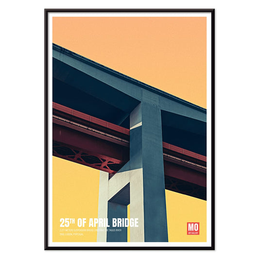
25th of April Bridge Poster
Mo Art Gallery · 2023 · Geometric Lisbon bridge poster balancing bold arcs, cables, and sunlit color blocks
Poster from €9 · Framed from €16
Regular price From €6,00Regular price -
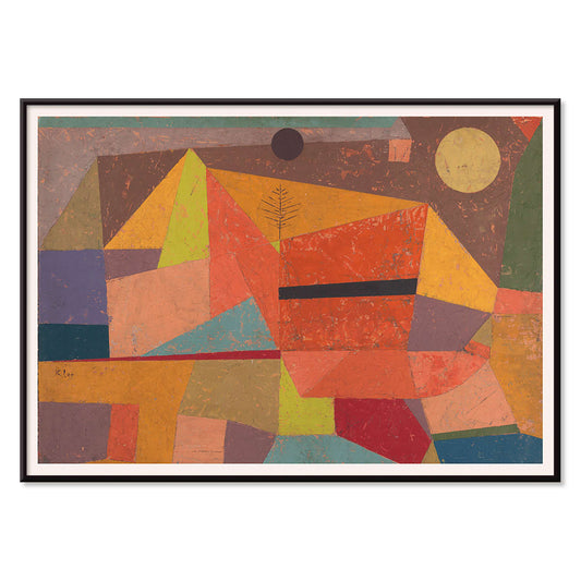
Joyful Mountain Poster
Paul Klee · 1929 · Joyful abstract mountain art print built from rhythmic color blocks and fine black lines
Poster from €9 · Framed from €16
Regular price From €6,00Regular price -
Market scene in the Dutch East Indies Poster
Pierre Jean Apol · 1912 · Sunlit tropical market art print with bustling figures and vivid street color
Poster from €9 · Framed from €16
Regular price From €6,00Regular price -
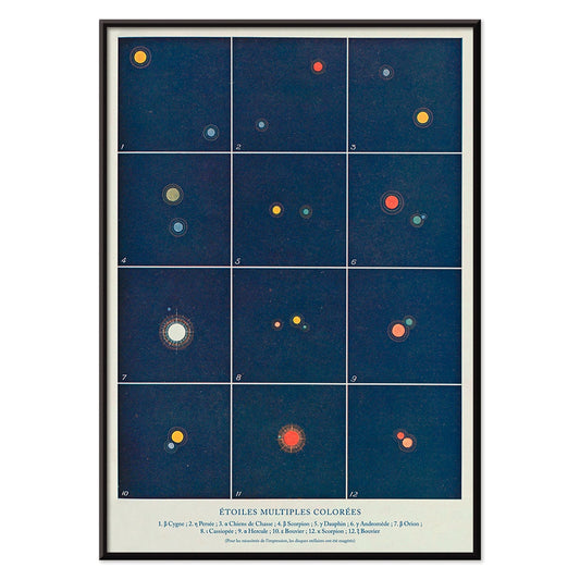
Etoiles multiples colorées Poster
Alphonse Berget · 1925 · Educational astronomy poster mapping multiple star systems in crisp blue with bright star points
Poster from €9 · Framed from €16
Regular price From €6,00Regular price -
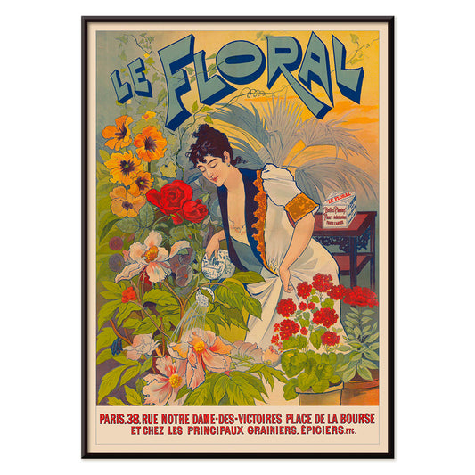
Le Floral Poster
Unknown artist · 1891 · Graceful Art Nouveau poster featuring a woman surrounded by colorful flowers and ornate lettering
Poster from €9 · Framed from €16
Regular price From €6,00Regular price -
Le Printemps en France Poster
Raoul Dufy · 1925 · Joyful Eiffel Tower poster with airy springtime lines and bright Paris energy
Poster from €9 · Framed from €16
Regular price From €6,00Regular price -
Tropical Flowers II Poster
Unknown artist · 1912 · Decorative tropical flower print with stylized foliage and warm early modern pattern rhythm
Poster from €9 · Framed from €16
Regular price From €6,00Regular price -
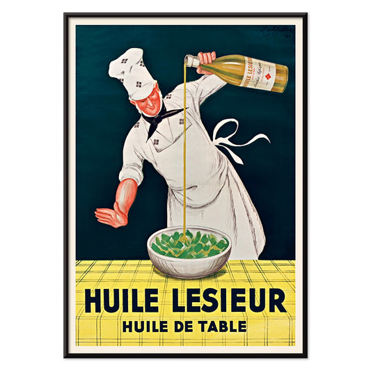
Huile Lesieur Poster
Leonetto Cappiello · 1930 · Spirited chef advertising poster pouring golden oil with bold red type on black background
Poster from €9 · Framed from €16
Regular price From €6,00Regular price -
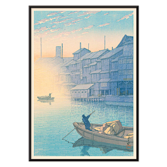
Morning at Dotonbori Poster
Kawase Hasui · 1935 · Tranquil riverside morning art print with soft reflections and quiet boats
Poster from €9 · Framed from €16
Regular price From €6,00Regular price -
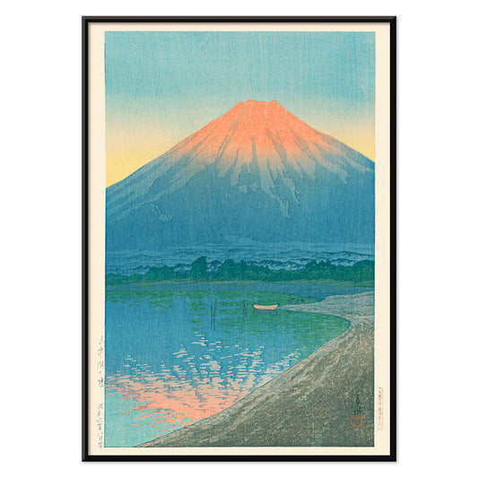
Daybreak over Lake Yamanaka Poster
Kawase Hasui · 1931 · Serene Mount Fuji sunrise print with still lake reflections in cool blues
Poster from €9 · Framed from €16
Regular price From €6,00Regular price -
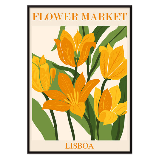
Flower Market Lisbon Poster
MORYARTY · 2019 · Sunlit Lisbon flower market poster with bold blooms and lush green leaves
Poster from €9 · Framed from €16
Regular price From €6,00Regular price -
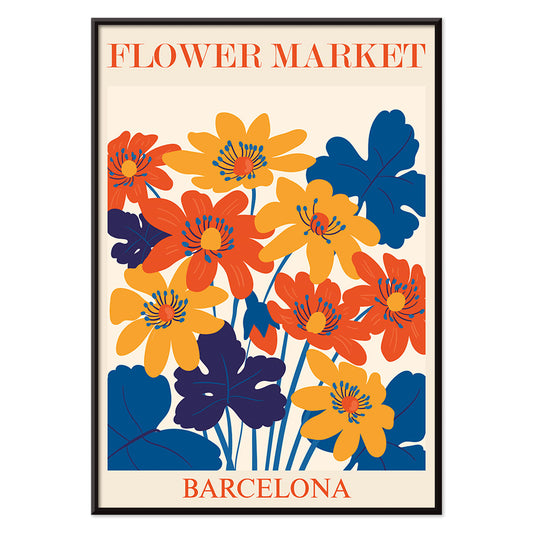
Flower Market Barcelona Poster
MORYARTY · 2022 · Vibrant floral tile motif poster with bold Mediterranean colors and clean geometry
Poster from €9 · Framed from €16
Regular price From €6,00Regular price -
British Overseas Airways Poster
Seymour E.O. · 1949 · Colorful BOAC world routes poster with sweeping lines across a stylized globe
Poster from €9 · Framed from €16
Regular price From €6,00Regular price -
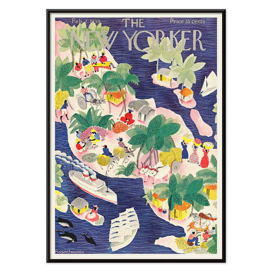
The New Yorker 2 Poster
Roger Duvoisin · 1935 · Whimsical tropical islands poster with playful shoreline details and bright mid-century color blocks
Poster from €9 · Framed from €16
Regular price From €6,00Regular price -
Silicon Valley Map Poster
Kirby Scudder · 1986 · Playful Silicon Valley map poster stretching America into a witty 1980s tech panorama
Poster from €9 · Framed from €16
Regular price From €6,00Regular price -
Girl with a earing Poster
MORYARTY · 2022 · Matisse inspired portrait poster with blue background, white face, and yellow earring
Poster from €9 · Framed from €16
Regular price From €6,00Regular price


72/707 items
- Destroy this mad brute Poster
- The good neighbor of South America Poster
- Italy with Vatican City Poster
- Onions Poster
- Bec-Kina Poster
- Kohler Chocolat Poster
- Strawberry Thief Poster
- Tom Krojer Exhibition Poster Poster
- Ernst Kirchner Exhibition Poster
- El Comienzo Poster
- Parler Seul 2 Poster
- Twilight’s Ring Poster
- Parler Seul Poster
- Faun and Nymphe Poster
- The Dream Poster
- Le Concert Poster
- Bird passing through a Cloud Poster
- Female Artist Poster
- Revenge of the Pink Panther Poster
- Woman and Bird at Night Poster
- Bauhaus 20 Poster
- Blue Japanese Crane Poster
- Snoopy come home Poster
- To London by Jet Clipper Poster
- Kyushu-Okinawa Poster
- Xerez Pedro Domeco Poster
- Balsam Aperitif Poster
- Butter Poster
- Crans Poster
- Monte Carlo Poster
- Beer and Cigarette Poster
- West Coast of Mexico Poster
- Rita Gaufres Poster
- Hibiscus Poster
- Mexican Art & Life 1 Poster
- Mexican Art & Life 4 Poster
- 25th of April Bridge Poster
- Joyful Mountain Poster
- Etoiles multiples colorées Poster
- Le Floral Poster
- Le Printemps en France Poster
- Tropical Flowers II Poster
- Huile Lesieur Poster
- Morning at Dotonbori Poster
- Daybreak over Lake Yamanaka Poster
- Flower Market Lisbon Poster
- Flower Market Barcelona Poster
- British Overseas Airways Poster
- The New Yorker 2 Poster
- Silicon Valley Map Poster
- Girl with a earing Poster
A Yellow Thread Through Art History
This collection is not about monochrome. It follows the way yellow behaves when it enters an image: as light, as warning, as ornament, as a quick lift of energy. In vintage poster culture it grabs attention from the street; in modern painting it becomes structure; in natural history it suggests pollen, rind, and sun-aged paper. Read these posters and prints as a vocabulary of warmth, from buttery highlights to sharp, electric notes that alter the temperature of wall art.
Gold, Citrus, and the Logic of Color
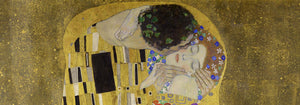
Few works show yellow as both luxury and technique as clearly as Gustav Klimt’s The Kiss (1907–1908), where metallic yellows behave like tesserae, turning paint into surface and surface into symbolism. At the opposite pole, Michel Eugène Chevreul’s Cercle chromatique treats hue as measurable information, a scientific diagram that still reads as decorative design. Together they explain why yellow persists across eras: it can signal opulence, illumination, or method, making a vintage art print feel both immediate and intellectually grounded.
Using Yellow Accents in Interior Decoration
In home decor, yellow works best when it has a job. A narrow hallway benefits from a small flare near a mirror; a kitchen welcomes yellows that feel citrus or grain-like; a study can take sharper, more analytic tones. Pair yellow posters with chalky whites, walnut, and linen for quiet warmth, or set them against deep greens and inky blues for contrast. For restraint and geometry, move between Minimalist and Abstract; for natural counterpoints, Botanical keeps the color tethered to stems, seed heads, and scientific observation.
Curating a Gallery Wall with Pattern and Structure
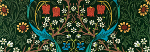
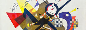
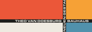
When building a gallery wall, think in rhythms: pattern, grid, then a single vivid note. William Morris’s Strawberry Thief (1883) brings textile density and a garden logic that softens modern furniture. Balance it with Piet Mondrian’s Composition in White, Red, and Yellow (1936), where yellow becomes a measured plane rather than atmosphere. Add controlled dynamism through Wassily Kandinsky’s Circles in a circle, Bauhaus exhibition (1923), a bridge between exhibition poster design and painting. To extend the mix, Advertising supports bolder typography, Bauhaus tightens the formal language, and Classic Art introduces quieter tonal anchors.
Why Yellow Feels So Present
Yellow is often dismissed as mere decoration, yet it is frequently a compositional strategy: guiding the eye, implying sunlight, or mapping a system. Hung with intention, a small yellow passage can make surrounding colors read cleaner or deeper, as if the room’s light has been adjusted without touching the lamps.