
Skip to product information
1 of 5

Moryarty

Amsterdam color city Poster

Amsterdam color city Poster

Poster Size
Regular price €9,00
Regular price Sale price €9,00
Sale Sold out
Taxes included. Shipping calculated at checkout.
Quantity

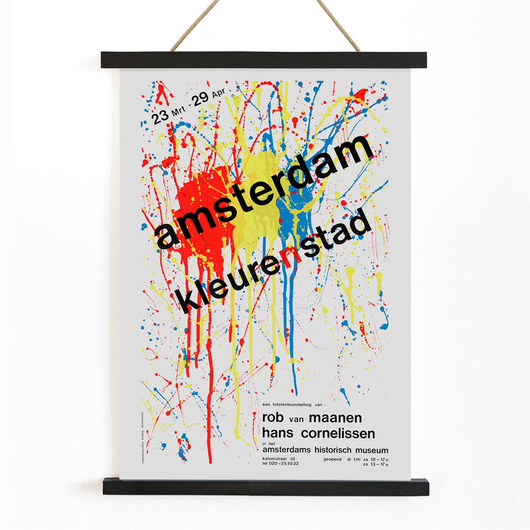
Amsterdam color city (1984) by Hans Cornelissen

Infuse your space with the lively spirit of Amsterdam through Hans Cornelissen’s dynamic abstract splatter technique, capturing the city’s energy and color in every brushstroke—a unique conversation piece that celebrates both artistic innovation and urban vibrancy.

Our posters are printed on thick (230gsm) acid-free matte art paper, using a long-lasting UV-resistant ink. We also offer the option of printing on textured canvas (300gsm), more flexible and resistant. Our frames are made of either light and resistant aluminium, or solid wood. More details in our FAQ

Ref : PUB156

View full details
1 of 3
1 of 3
  • "Very nice Posters. The quality is amazing and we received it very quickly !"

  • "A shop to visit absolutely. Huge selection of posters. We spent more than an hour there !"

  • "Perfect to find gift. Price are very good. An they can frame and pack it on site"

1 of 3

About the Artist

Hans Cornelissen is a late twentieth-century artist recognized for blending painterly spontaneity with graphic precision, revitalizing the poster tradition in Europe. His approach often transforms familiar subjects into vibrant visual experiences, as seen in his 1984 work Amsterdam color city. Cornelissen emerged during a period when artists were reimagining urban identity through expressive, contemporary design.

Collectors interested in European modernism and innovative graphic art will find his work in dialogue with other notable poster artists and the evolving legacy of art-driven poster design.

The Artwork

Amsterdam color city was created at a time when urban posters were shifting from literal depictions to more abstract, emotional interpretations. Rather than focusing on recognizable landmarks, Cornelissen sought to capture the energy and movement that define Amsterdam’s spirit. The artwork reflects the city’s dynamic atmosphere, shaped by its waterways, bustling neighborhoods, and cultural vibrancy.

This piece exemplifies the 1980s trend of using posters as a medium for personal and collective expression, turning a city’s essence into a bold visual statement. It stands as a testament to how place can be evoked through mood and rhythm rather than precise detail.

Style & Characteristics

The composition is marked by gestural splatters and layered forms, creating a lively sense of motion and immediacy. Cornelissen employs a high-contrast palette, with white space punctuated by vivid red, yellow, and blue accents, while black lines provide structure and rhythm. The abstract forms and energetic marks evoke both the chaos and harmony of city life.

This dynamic, modern poster is well-suited to interiors that embrace abstract art prints and bold graphic statements. Its striking use of primary colors and expressive technique make it a standout piece for contemporary spaces.

In Interior Design

This Amsterdam poster serves as a compelling focal point in living rooms, entryways, or creative workspaces, infusing energy and color into the environment. It pairs beautifully with minimalist furnishings and neutral tones, allowing the artwork’s vibrant palette to shine.

For a cohesive look, consider incorporating accents from the red or blue collections, echoing the poster’s primary hues and enhancing the overall design scheme.