
 "Beautiful prints, fast shipping !"
 "Amazing vintage poster selection"
 "A hidden gem for art lovers"
"Beautiful prints, fast shipping !"
"Amazing vintage poster selection"
"A hidden gem for art lovers"
"Beautiful prints, fast shipping !"
"Amazing vintage poster selection"
"A hidden gem for art lovers"
"Beautiful prints, fast shipping !"
"Amazing vintage poster selection"
"A hidden gem for art lovers"
"A hidden gem for art lovers"
"Beautiful prints, fast shipping !"
"Amazing vintage poster selection"
"A hidden gem for art lovers"
"Beautiful prints, fast shipping !"
"Amazing vintage poster selection"
"A hidden gem for art lovers"
"Beautiful prints, fast shipping !"
"Amazing vintage poster selection"
"A hidden gem for art lovers"
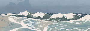
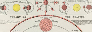
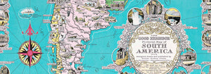

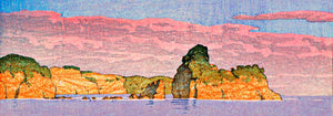
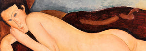
- Papiers découpés 3 Poster
- Nu Bleu III Poster
- Bleu de Ciel Poster
- Barcelona Text poster Poster
- Nu Bleu II Poster
- Bauhaus Poster 6 Poster
- The Dream Poster
- Bauhaus Poster 2 Poster
- Bauhaus Poster 11 Poster
- Papiers découpés 1 Poster
- Bauhaus Poster 10 Poster
- Bauhaus Poster 17 Poster
- Colorful Architecture Poster
- Southern Gardens Poster
- Bauhaus Poster 1 Poster
- Dance of Colours Poster
- Farbstudien, 10 Blätter IX Poster
- Bauhaus Poster 4 Poster
- Bauhaus Poster 19 Poster
- The Ten Largest, Childhood, No 2 Poster
- Bauhaus Poster 18 Poster
- Bauhaus Poster 3 Poster
- The Ten Largest No. 3 Poster
- Farbstudien, 10 Blätter VIII Poster
- Altarpiece No. 1 Poster
- Bauhaus Poster 12 Poster
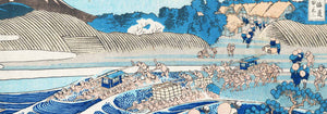
- Mount Fuji Poster
- Farbstudien, 10 Blätter III Poster
- Bauhaus Poster 14 Poster
- Métamorphose du violon Poster
- Bauhaus Poster 13 Poster
- Bauhaus poster 15 Poster
- The Dove, No. 1 Poster
- Beethoven Frieze Poster
- The Ten Largest No. 8 Poster
- Mystical head Poster
- Farbstudien, 10 Blätter X Poster
- Doves No. 2 Poster
- Childhood Group IV Poster
- The Ten Largest, No. 9, Old Age Poster
- Bauhaus Poster 5 Poster
- Le Modulor Poster
- Papiers découpés 2 Poster
- Yoshino Poster
- Design for a mural Poster
- Bauhaus poster 16 Poster
- Composition in red, blue, green and yellow Poster
- Papiers découpés 4 Poster
-


Composition in red, blue, green and yellow Poster
Wassily Kandinsky · 1913 · Energetic abstract art print with layered circles, angles, and bright primary color accents
Poster from €9 · Framed from €16
-

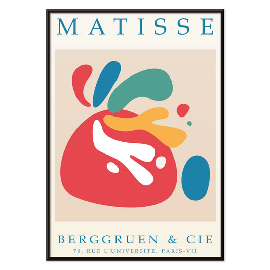
Papiers découpés 4 Poster
MORYARTY · 1952 · Joyful cut-paper style abstract poster with bold red and blue shapes on beige
Poster from €9 · Framed from €16
-

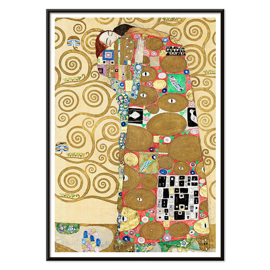
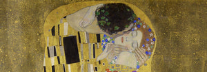
Fulfillment Poster
Gustav Klimt · 1910 · Ornamental embrace art print with mosaic-like gold patterns and tender symbolic intimacy
Poster from €9 · Framed from €16
-

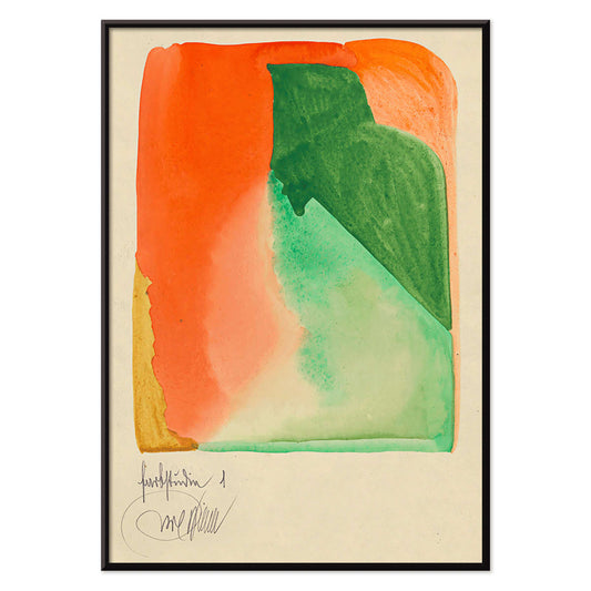
Farbstudien, 10 Blätter I Poster
Karl Wiener · 1923 · Energetic abstract poster balancing orange and green forms on warm beige
Poster from €9 · Framed from €16
-


Red and green tomatoes Poster
Christian Rohlfs · 1906 · Expressive still life art print of red and green tomatoes with modern color tension
Poster from €9 · Framed from €16
-

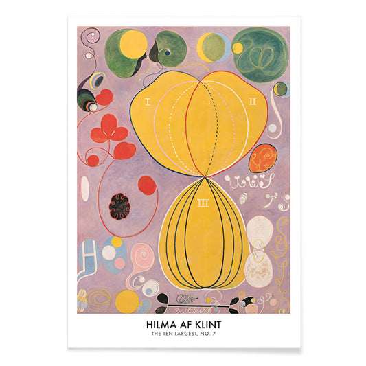
The Ten Largest No 7 Poster
Hilma af Klint · 1907 · Radiant abstract art print with swirling biomorphic forms on a sunlit yellow field
Poster from €9 · Framed from €16
-

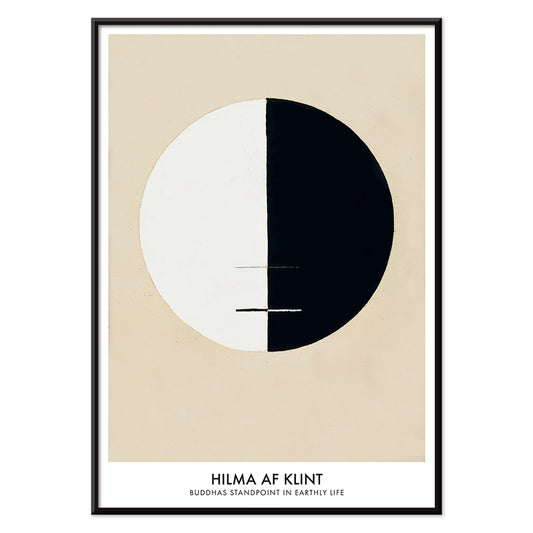
Buddha Standpoint In Early Life Poster
Hilma af Klint · 1921 · Meditative abstract art print with a bisected black and white circle on beige
Poster from €9 · Framed from €16
-


Farbstudien, 10 Blätter IV Poster
Karl Wiener · 1923 · Luminous abstract watercolor art print with layered color fields in blue, purple, and yellow
Poster from €9 · Framed from €16
-

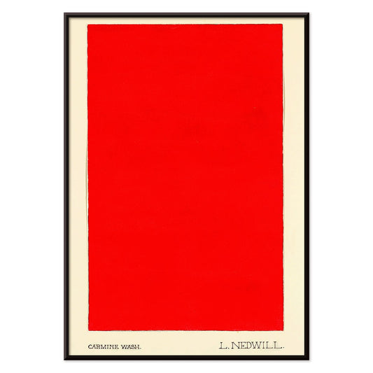
Carmine Wash Poster
Elizabeth A. Nedwill · 1900 · Minimalist abstract art print with a single carmine block floating on ivory
Poster from €9 · Framed from €16
-

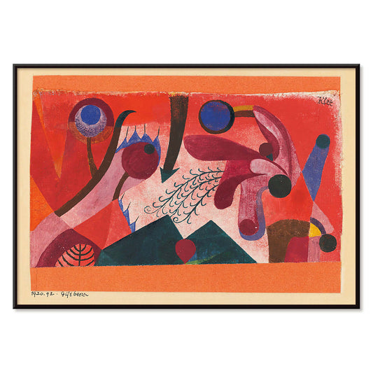
Poisonous Berries Poster
Paul Klee · 1920 · Playful abstract art print with berry like circles and rhythmic black linework
Poster from €9 · Framed from €16
-

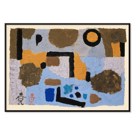
With the two lost ones Poster
Paul Klee · 1938 · Dreamlike abstract figures art print balancing delicate line and quiet symbolism
Poster from €9 · Framed from €16
-

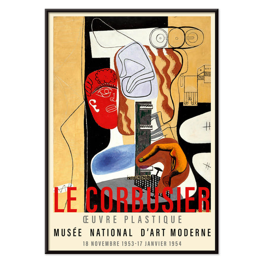
Arbalète I Poster
Le Corbusier · 1953 · Geometric modernist art print with crossbow-like forms in red, blue, and black
Poster from €9 · Framed from €16
-


Design for Dunhall Restaurant Poster
Winold Reiss · 1944 · Energetic geometric poster with warm red, orange, and yellow tones in modernist style
Poster from €9 · Framed from €16
-

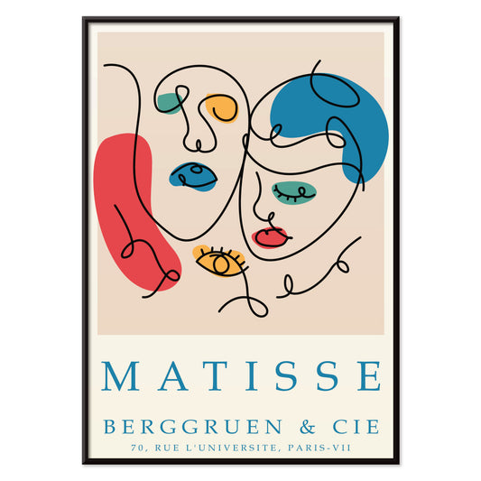
Papiers découpés 5 Poster
MORYARTY · 2023 · Colorful abstract faces poster built from crisp cut-paper shapes on a soft ground
Poster from €9 · Framed from €16
-

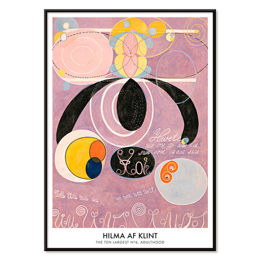
The Ten Largest, No. 6 Poster
Hilma af Klint · 1907 · Radiant abstract poster of swirling forms and symbols in soft pinks and purples
Poster from €9 · Framed from €16
-

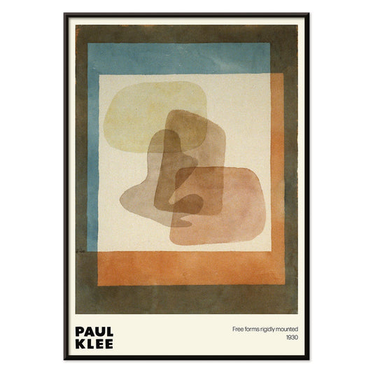
Free forms Poster
Paul Klee · 1930 · Playful abstract poster of free-form geometry with blue and orange accents
Poster from €9 · Framed from €16
-

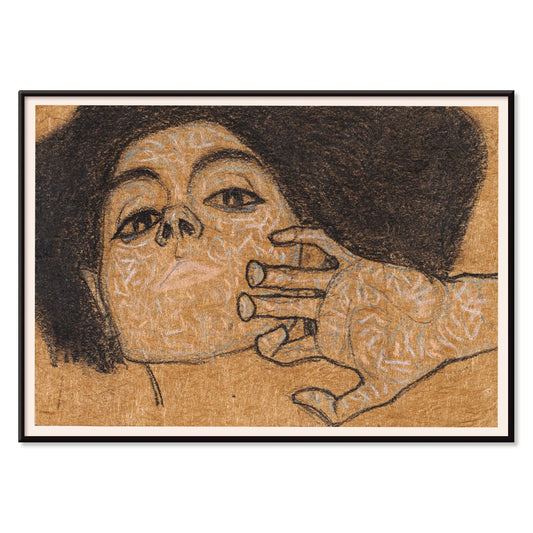
Head of a Woman Poster
Egon Schiele · 1908 · Expressive portrait art print with spare linework and warm brown washes
Poster from €9 · Framed from €16
-


Abstract Head Poster
Alexej von Jawlensky · 1928 · Icon-like abstract head art print with bold black lines and fiery color blocks
Poster from €9 · Framed from €16
-

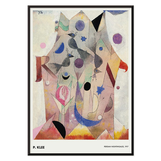
Persian Nightingales Poster
Paul Klee · 1917 · Dreamlike bird forms and jewel tones in an abstract art print
Poster from €9 · Framed from €16
-

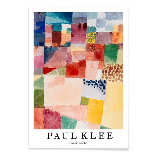
Hammamet Poster
Paul Klee · 1914 · Radiant abstract art print evoking Hammamet with mosaic blocks of red, blue, yellow
Poster from €9 · Framed from €16
-

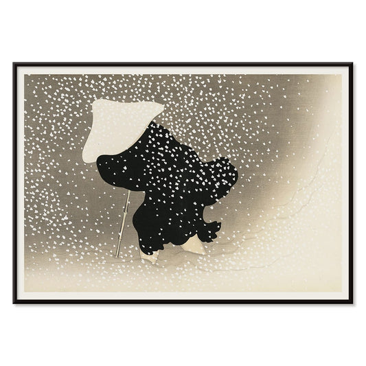
Tomoe no yuki Poster
Kamisaka Sekka · 1909 · Quiet snowfall art print balancing bold black curves with generous beige negative space
Poster from €9 · Framed from €16
-

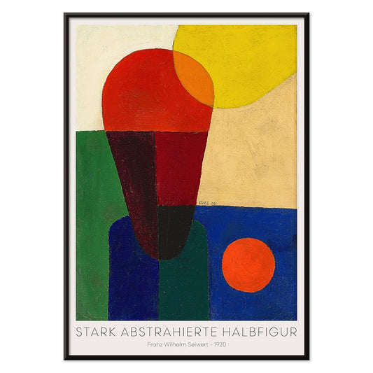
Stark abstrahierte Halbfigur Poster
Franz Wilhelm Seiwert · 1920 · Geometric half-figure art print balancing bold primary blocks with a crisp modernist rhythm
Poster from €9 · Framed from €16
-

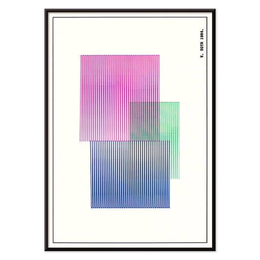
Red, Blue, Green Poster
W. Soya · 1964 · Geometric color-block poster with crisp lines and bright red, blue, green contrasts
Poster from €9 · Framed from €16
-

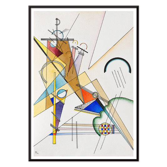
Gewebe Poster
Wassily Kandinsky · 1923 · Geometric abstract art print featuring rhythmic blocks and lines on warm beige
Poster from €9 · Framed from €16
-


Joan Miro Osaka Poster
Joan Miro · 1970 · Playful abstract poster with calligraphic black forms and bright primary accents
Poster from €9 · Framed from €16
-

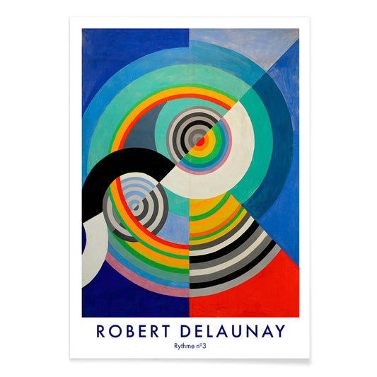
Rythme n°3 Poster
Robert Delaunay · 1938 · Energetic abstract poster of concentric circles pulsing in blue, red, yellow, and green
Poster from €9 · Framed from €16
-

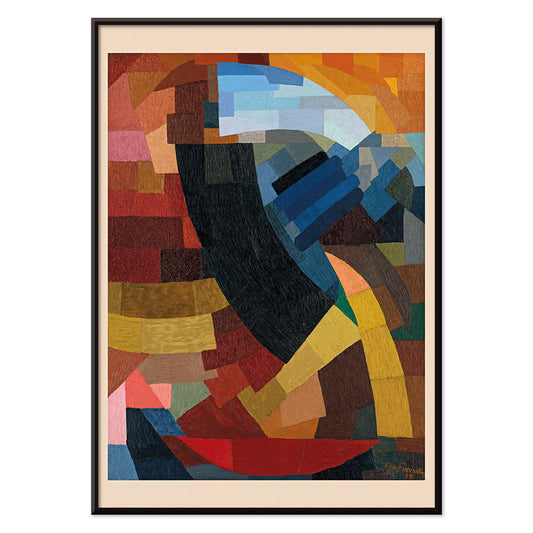
Fragments de figure Poster
Otto Freundlich · 1928 · Vibrant geometric poster of a fragmented figure with bold black outlines
Poster from €9 · Framed from €16
-

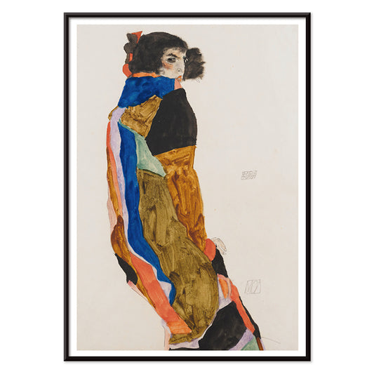
Moa Poster
Egon Schiele · 1911 · Intimate figure art print of a woman in a patterned robe, quietly self contained
Poster from €9 · Framed from €16
-

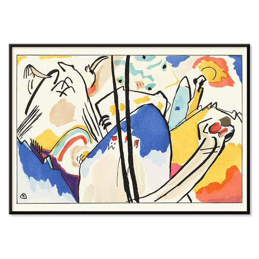
Der Blaue Reiter Poster
Wassily Kandinsky · 1914 · Expressive abstract poster with a blue rider silhouette and radiant color blocks
Poster from €9 · Framed from €16
-

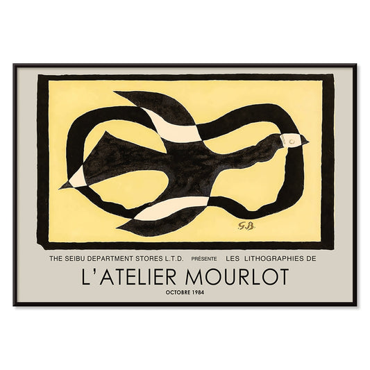
Bird passing through a Cloud Poster
George Braque · 1957 · Abstract bird poster drifting through a cloud with crisp black lines on warm yellow
Poster from €9 · Framed from €16
-

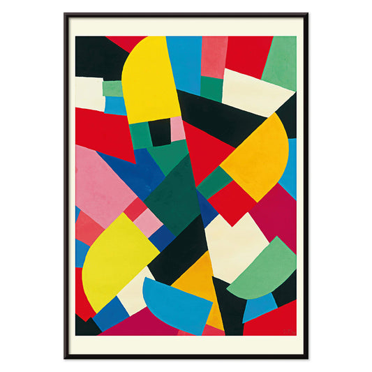
Color Patchwork Poster
Otto Freundlich · 1936 · Vibrant abstract poster of interlocking color tiles unified by bold black outlines
Poster from €9 · Framed from €16
-

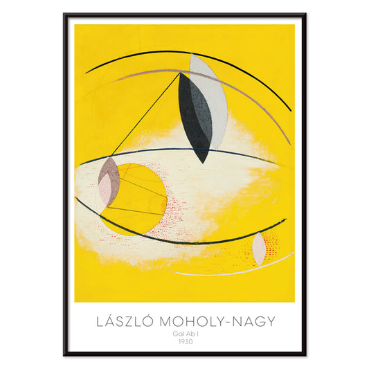
Gal Ab I Poster
László Moholy-Nagy · 1930 · Dynamic Bauhaus poster balancing circles and diagonals with bright yellow and deep black
Poster from €9 · Framed from €16
-

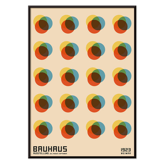
Bauhaus Poster 8 Poster
MORYARTY · 1923 · Geometric Bauhaus poster with bold cross of circles and squares on warm beige
Poster from €9 · Framed from €16
-

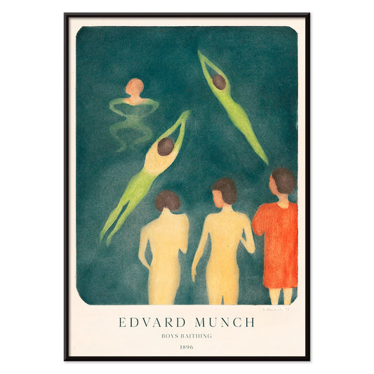
Boys Bathing Poster
Edvard Munch · 1896 · Dreamy seaside art print of boys bathing in muted blues and greens
Poster from €9 · Framed from €16
-

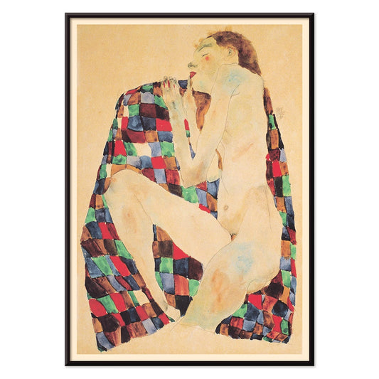
Female Nude on Checkered Cloth Poster
Egon Schiele · 1911 · Intense nude art print resting on a bold red-and-blue checkered cloth against a pale beige ground
Poster from €9 · Framed from €16
-

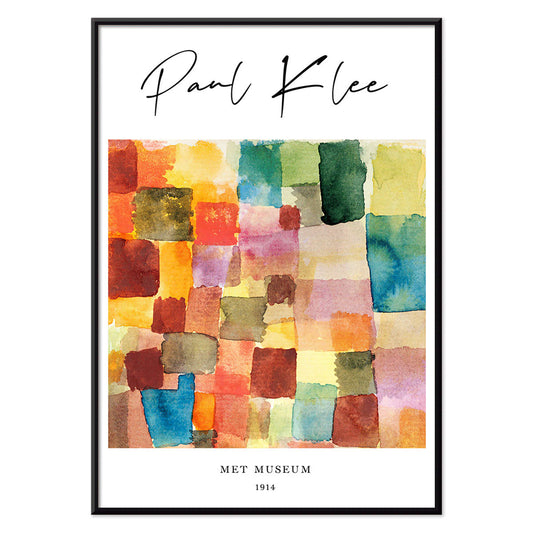
Color Patchwork Poster
Paul Klee · 1914 · Playful abstract art print of patchwork squares balancing warm reds and cool blues
Poster from €9 · Framed from €16
-

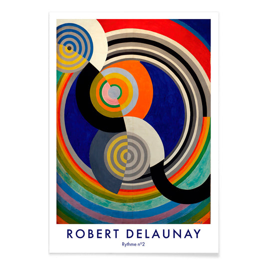
Rythme n°2 Poster
Robert Delaunay · 1938 · Abstract rhythm art print of interlocking circles and arcs in vibrant primaries
Poster from €9 · Framed from €16
-

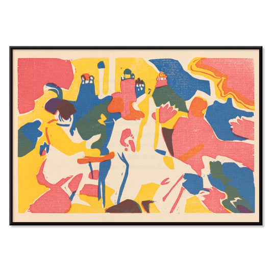
Klänge Pl.19 Poster
Wassily Kandinsky · 1913 · Abstract poster with rhythmic shapes echoing music across a warm beige field
Poster from €9 · Framed from €16
-

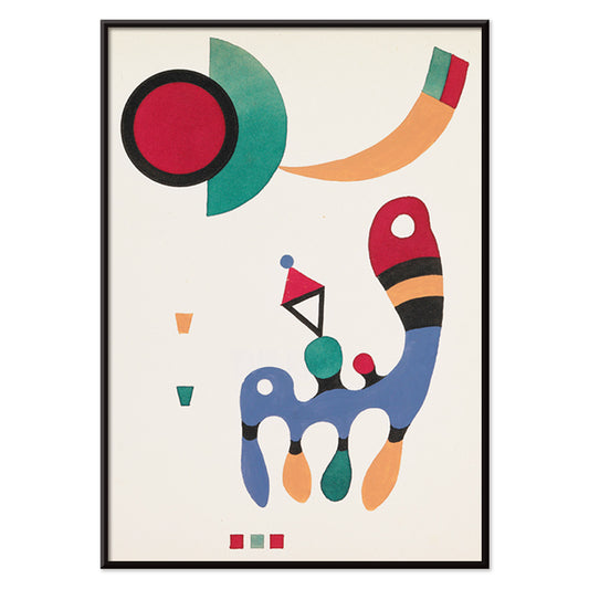
11 tableux et 7 poèmes Poster
Wassily Kandinsky · 1945 · Rhythmic geometric poster balancing bright primary shapes with refined modernist typography
Poster from €9 · Framed from €16
-

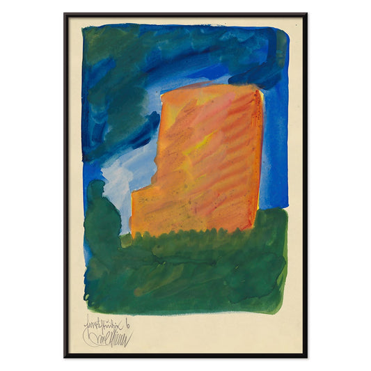
Farbstudien, 10 Blätter VI Poster
Karl Wiener · 1923 · Vibrant abstract art print balancing orange, blue, and green forms on warm beige
Poster from €9 · Framed from €16
-

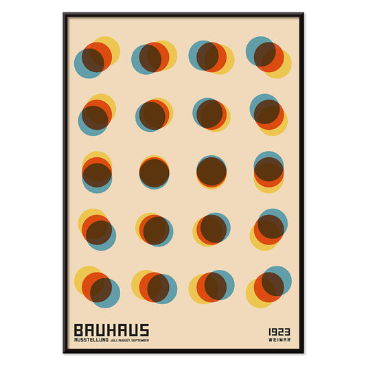
Bauhaus Poster 9 Poster
MORYARTY · Geometric circles poster balancing primary colors and crisp black lines on warm ground
Poster from €9 · Framed from €16
-

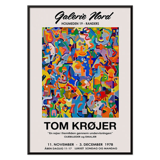
Tom Krojer Exhibition Poster Poster
Tom Krojer · 1989 · Dynamic geometric exhibition poster balancing vivid color blocks with crisp modern typography
Poster from €9 · Framed from €16
-

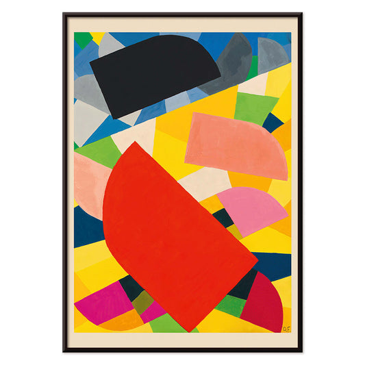
Komposition Poster
Otto Freundlich · 1936 · Vibrant geometric art print with interlocking color planes and bold modernist energy
Poster from €9 · Framed from €16
-

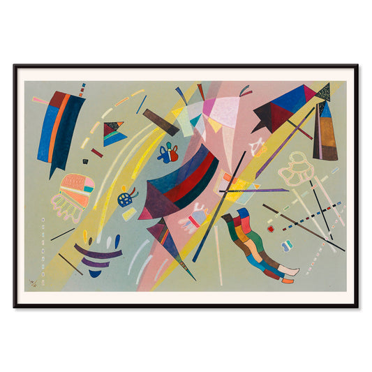
Kandinsky 1941 Poster
Wassily Kandinsky · 1941 · Lyrical abstract poster with floating geometric accents in blue, yellow, pink, and red
Poster from €9 · Framed from €16
-

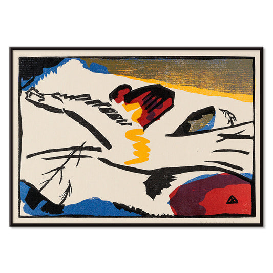
Lyrisches Poster
Wassily Kandinsky · 1911 · Lyrical abstract art print with energetic black linework and bright red, blue, yellow accents
Poster from €9 · Framed from €16
-

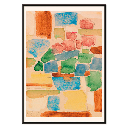
Floral still life Poster
Alexej von Jawlensky · 1924 · Vibrant floral art print with bold outlines and modernist blocks of color
Poster from €9 · Framed from €16
-

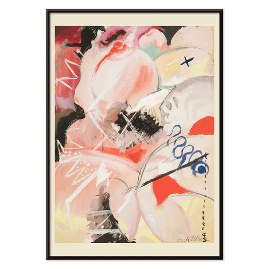
Female Figure Poster
Gert Wollheim · 1920 · Abstract female figure poster with bold black lines and vivid red and blue areas
Poster from €9 · Framed from €16
-

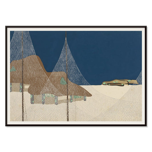
Ryoson Poster
Kamisaka Sekka · 1909 · Serene seascape art print with stylized waves and a quiet coastal silhouette
Poster from €9 · Framed from €16


48/209 items
- Composition in red, blue, green and yellow Poster
- Papiers découpés 4 Poster
- Farbstudien, 10 Blätter I Poster
- Red and green tomatoes Poster
- The Ten Largest No 7 Poster
- Buddha Standpoint In Early Life Poster
- Farbstudien, 10 Blätter IV Poster
- Carmine Wash Poster
- Poisonous Berries Poster
- With the two lost ones Poster
- Arbalète I Poster
- Design for Dunhall Restaurant Poster
- Papiers découpés 5 Poster
- The Ten Largest, No. 6 Poster
- Free forms Poster
- Head of a Woman Poster
- Abstract Head Poster
- Persian Nightingales Poster
- Hammamet Poster
- Tomoe no yuki Poster
- Stark abstrahierte Halbfigur Poster
- Red, Blue, Green Poster
- Gewebe Poster
- Rythme n°3 Poster
- Fragments de figure Poster
- Moa Poster
- Der Blaue Reiter Poster
- Bird passing through a Cloud Poster
- Color Patchwork Poster
- Boys Bathing Poster
- Color Patchwork Poster
- Rythme n°2 Poster
- Klänge Pl.19 Poster
- 11 tableux et 7 poèmes Poster
- Bauhaus Poster 9 Poster
- Tom Krojer Exhibition Poster Poster
- Komposition Poster
- Kandinsky 1941 Poster
- Lyrisches Poster
- Floral still life Poster
- Ryoson Poster
What Abstract Means in Poster Culture
Abstract art entered the twentieth century as a way to stop describing appearances and start composing experience: rhythm, pressure, silence, and speed. In posters and prints, abstraction becomes especially direct, because the medium favors strong decisions about line, color, and spacing. This collection follows that modern impulse, from early avant-garde experiments to Bauhaus-era graphic language, where a single circle or grid can carry the authority of architecture. If you want to compare neighboring visual dialects, move between Abstract and Minimalist, or sharpen the palette with Black & White.
From Spiritual Diagrams to Bauhaus Geometry
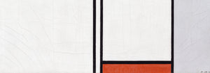
Many abstract artists treated composition as a form of thinking. Hilma af Klint built symbolic systems that feel botanical and cosmic at once; in The Ten Largest, No. 8, Adulthood (1907) by Hilma af Klint, spirals and pastel discs behave like stages of growth rather than decorative motifs. Piet Mondrian pushed in the opposite direction, reducing the world to balance and tension; Composition in White, Red, and Yellow (1936) by Piet Mondrian shows how asymmetry can feel steady when proportion is exact. Wassily Kandinsky, deeply attuned to music, treated shape as timbre; Four Parts (1932) by Wassily Kandinsky reads like a score, with crisp rectangles and buoyant circles entering and receding. For broader context around these makers, Famous Artists is a useful companion.
Interior Placement, Color, and Materials
Abstract wall art works best when you let the room supply the narrative. In an entry or hallway, a geometric print paired with oak, linen, and matte ceramics can make the space feel wider, because edges and negative space guide the eye forward. In a living room with saturated textiles, choose a poster that echoes one pigment rather than competing with every hue; cooler schemes can start with Blue, while warmer, dusty harmonies often live comfortably near Beige. In kitchens and studios, abstraction handles visual noise well: it stays legible beside cookbooks, tools, and shelving because it relies on structure more than detail.
Curating Pairings and a Gallery Wall
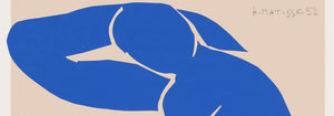
A strong gallery wall needs tempo. Anchor it with one disciplined composition, then add an artwork that breathes. Paul Klee is ideal for that role; Color Patchwork, Untitled (1914) by Paul Klee uses mosaic-like color to soften strict architecture without losing clarity at a distance. For a bolder counterpoint, Nu Bleu II by Henri Matisse turns the body into a single cut-out silhouette, making flat color feel surprisingly physical when hung near plants, wool, or textured curtains. Keep spacing consistent, and repeat one framing finish across the group to prevent the arrangement from fragmenting; Frames can help you decide whether pale wood keeps the palette airy or black lacquer sharpens edges.
Living with Abstraction Over Time
Abstraction rewards changing light. Morning makes paper texture and pale washes more present, while evening emphasizes contrast and the architecture of shapes. In homes with historic details such as mouldings or parquet, one abstract poster can act as a deliberate interruption; if you prefer a dialogue rather than a rupture, pair it with a quieter figurative neighbor from Classic Art. The point is not decoration as background, but a print that keeps offering small recalibrations of balance, line, and color as you pass.