


- Destroy this mad brute Poster
- Shaw or Irony Poster
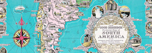
- The good neighbor of South America Poster
- Italy with Vatican City Poster
- Onions Poster
- Radishes Poster
- Carrots Poster
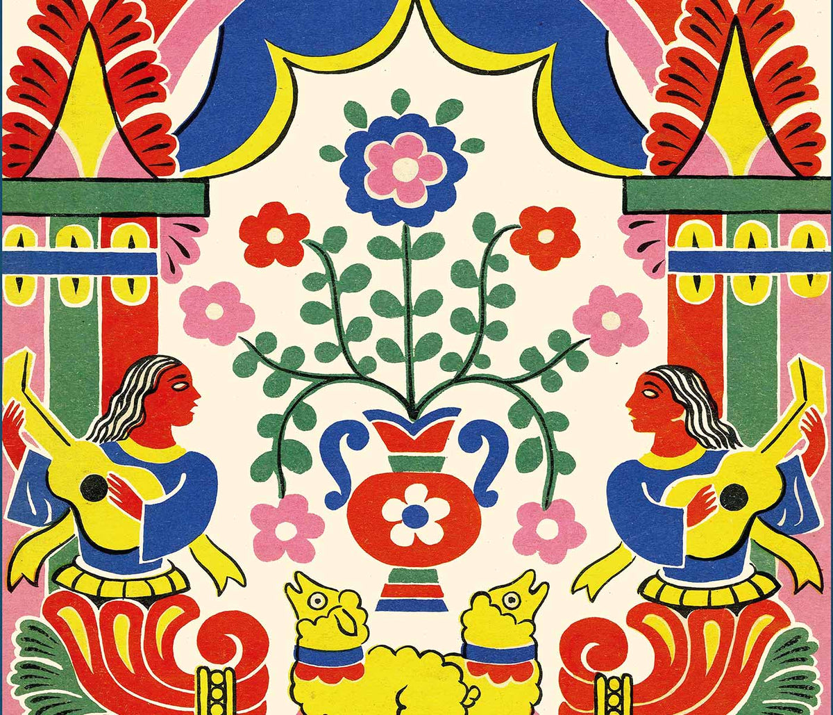
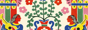
- Les Lalanne Poster
- Punch Boutique Poster
- Dancing couple in the snow Poster
- Judaism and Paganism Standpoint Poster
- Jet Clipper to Hawaii Poster
- Campari Soda Poster
- Bec-Kina Poster
- Kohler Chocolat Poster
- Strawberry Thief Poster
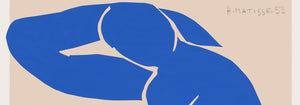
- Matisse Dancing Figures Poster
- Tom Krojer Exhibition Poster Poster
- Berlin Street Scene Poster
- Ernst Kirchner Exhibition Poster
- Tour Eiffel 2 Poster
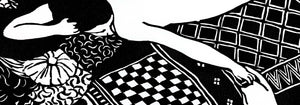
- Woman Seated Back Poster
- Red Hair Blue Hat Poster
- Park Near Lu Poster
- El Comienzo Poster
- Parler Seul 2 Poster
- The Current Standpoint of the Mahatmas Poster
- Twilight’s Ring Poster
- Parler Seul Poster
- Faun and Nymphe Poster
- The Dream Poster
- Le Concert Poster
- Female Artist Poster
-
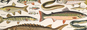
Poissons Poster
Claude Augé · 1908 · Detailed fish scientific print arranged as an educational chart on clean white ground
Poster from €9 · Framed from €16
Regular price From €6,00Regular price -
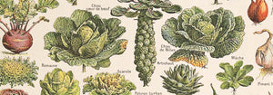
Plantes Potageres Poster
Claude Augé · 1908 · Educational vegetable print with labeled garden plants in crisp botanical detail
Poster from €9 · Framed from €16
Regular price From €6,00Regular price -
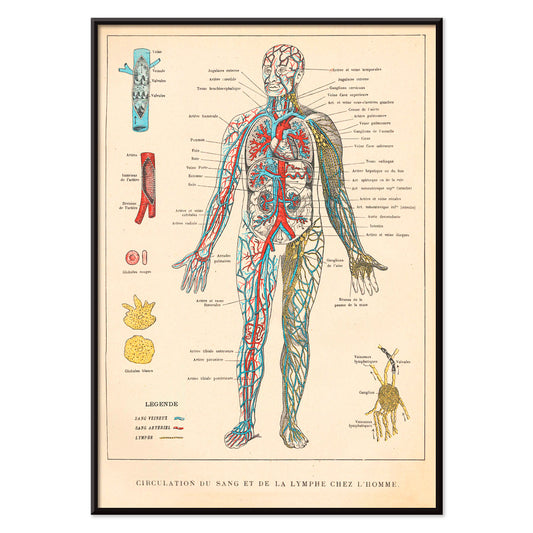
Circulation du sang Poster
Ferdinand Faideau · 1923 · Detailed anatomical poster mapping blood and lymph vessels in crisp red and blue
Poster from €9 · Framed from €16
Regular price From €6,00Regular price -
Decroissement Altitudinal de la vegetation Poster
Jean-Augustin Barral · 1860 · Educational scientific print mapping mountain vegetation zones in crisp colored bands
Poster from €9 · Framed from €16
Regular price From €6,00Regular price -
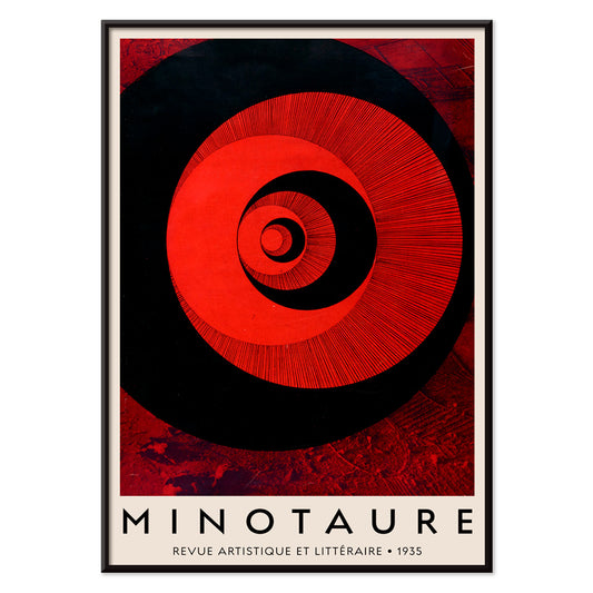
Minotaure Poster
E. Tériade · 1935 · Modernist spiral poster balancing bold red, black, and white graphic tension
Poster from €9 · Framed from €16
Regular price From €6,00Regular price -
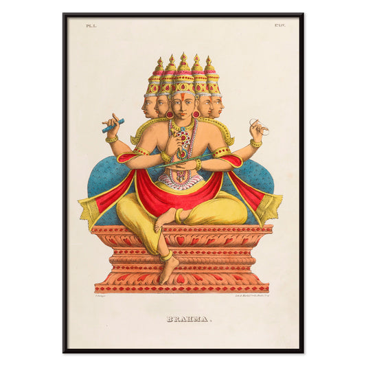
Brahma Poster
Jean-Jacques Chabrélie · 1840 · Vintage print of Brahma seated on a lotus with four faces and vibrant accents
Poster from €9 · Framed from €16
Regular price From €6,00Regular price -
Matsyavatara Poster
Jean-Jacques Chabrélie · 1840 · Mythic Matsyavatara poster with radiant blues and golden accents in a devotional composition
Poster from €9 · Framed from €16
Regular price From €6,00Regular price -
Vishnou Poster
Jean-Jacques Chabrélie · 1840 · Serene Vishnu poster with mythic throne scene and harmonious decorative details
Poster from €9 · Framed from €16
Regular price From €6,00Regular price -
Carte céleste Poster
R. Barbot · 1860 · Detailed celestial map poster with French constellation names on a deep blue background
Poster from €9 · Framed from €16
Regular price From €6,00Regular price -
Faust , tragédie de Goethe Poster
F. L. Schmied · 1925 · Dreamlike Faust poster with a radiant rainbow over calm sea and coast
Poster from €9 · Framed from €16
Regular price From €6,00Regular price -
Babar en Voiture Poster
Jean de Brunhoff · 1934 · Playful Babar driving a red car poster with crisp storybook linework
Poster from €9 · Framed from €16
Regular price From €6,00Regular price -
Histoire de Babar Poster
Jean de Brunhoff · 1931 · Playful Babar elephant poster with a polite hat tip and storybook clarity
Poster from €9 · Framed from €16
Regular price From €6,00Regular price -
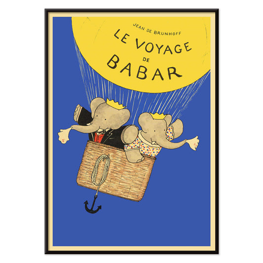
Le Voyage de Babar Poster
Jean de Brunhoff · 1932 · Whimsical Babar balloon poster with bright yellow lift against a clear blue sky
Poster from €9 · Framed from €16
Regular price From €6,00Regular price -
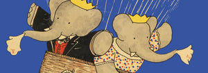
Babar en famille Poster
Jean de Brunhoff · 1935 · Gentle Babar family poster with bright outfits and classic storybook charm
Poster from €9 · Framed from €16
Regular price From €6,00Regular price -
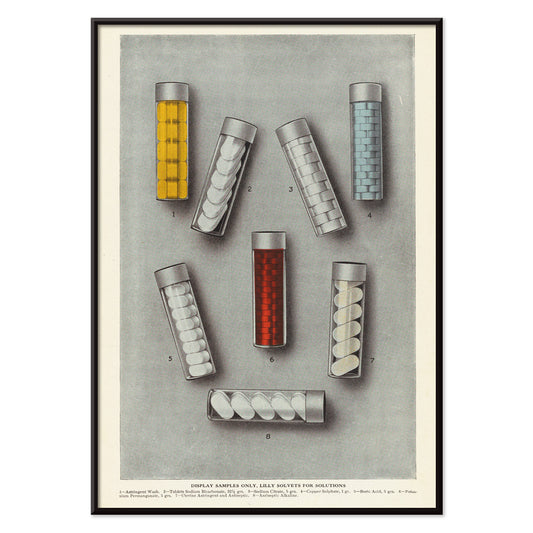
Lilly solvets for solutions Poster
Eli Lilly & Company · 1919 · Colorful laboratory vial poster with neat labels and classic industrial typography
Poster from €9 · Framed from €16
Regular price From €6,00Regular price -
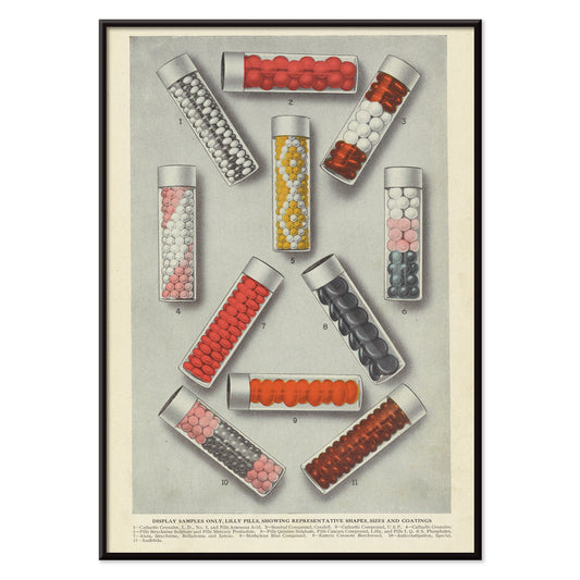
Lilly Pills Poster
Eli Lilly & Company · 1919 · Vivid pharmaceutical poster featuring colorful pill samples in orderly glass vials
Poster from €9 · Framed from €16
Regular price From €6,00Regular price -
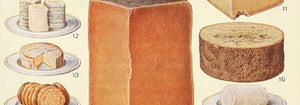
Cheeses Poster
Beeton · 1923 · Detailed cheese vintage print with labeled wedges and rounds in warm buttery tones
Poster from €9 · Framed from €16
Regular price From €6,00Regular price -
Drink Coca Cola Poster
Unknown artist · 1921 · Energetic advertising poster featuring a bold Coca-Cola billboard in vivid red and white
Poster from €9 · Framed from €16
Regular price From €6,00Regular price -
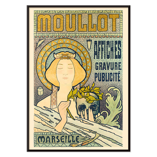
Moullot Marseille Poster
E. Roux · 1900 · Elegant Art Nouveau poster featuring a floral-crowned woman and Marseille lettering
Poster from €9 · Framed from €16
Regular price From €6,00Regular price -
Black & whites Poster
Ernest Peixotto · 1896 · Expressive clown poster with bold black-white contrast and playful polka-dot backdrop
Poster from €9 · Framed from €16
Regular price From €6,00Regular price -
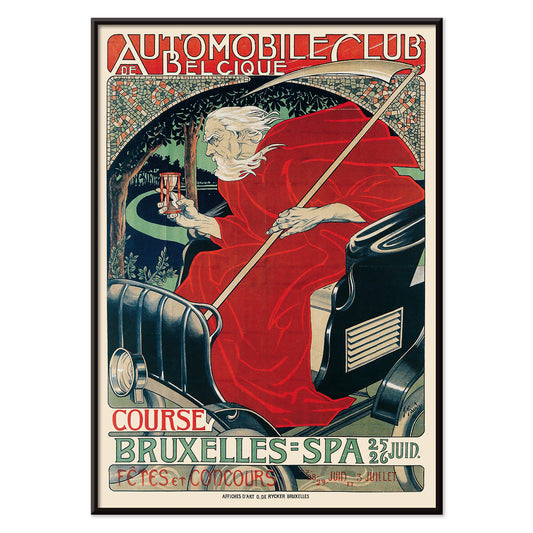
Automobile Club Belgique Poster
Georges Gaudy · 1898 · Dynamic racing poster with a red-cloaked figure presenting an hourglass
Poster from €9 · Framed from €16
Regular price From €6,00Regular price -
Capes & caps Poster
Unknown artist · 1868 · Colorful election parade poster featuring capes and caps in bold patriotic tones
Poster from €9 · Framed from €16
Regular price From €6,00Regular price -
Tarzan the Ape Man Poster
Eric Rohman · 1933 · Dramatic jungle poster featuring Tarzan carrying Jane through lush green foliage
Poster from €9 · Framed from €16
Regular price From €6,00Regular price -
The Revenge of Tarzan Poster
Unknown artist · 1920 · Classic jungle adventure poster of Tarzan wrestling a lion beneath bold title lettering
Poster from €9 · Framed from €16
Regular price From €6,00Regular price -
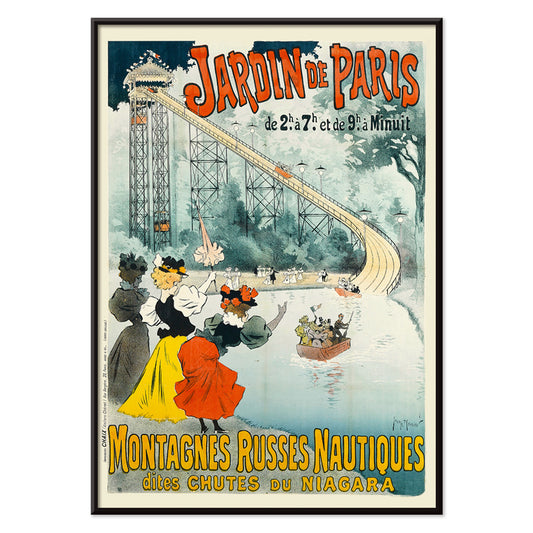
Montagnes Russes Nautiques Poster
Georges Meunier · 1895 · Energetic Belle Époque poster of a nautical roller coaster plunging into bright blue water
Poster from €9 · Framed from €16
Regular price From €6,00Regular price -
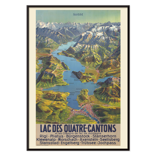
Lac Des Quatre-Cantons Poster
M. Bieder · 1935 · Swiss Lake Lucerne map poster with bright blue water and mountain relief
Poster from €9 · Framed from €16
Regular price From €6,00Regular price -
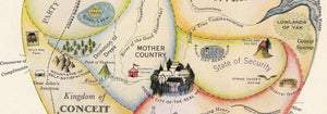
Geographical Guide to a Woman's Heart Poster
Jo Lowery · 1960 · Playful heart shaped map poster packed with witty labels and bright midcentury color
Poster from €9 · Framed from €16
Regular price From €6,00Regular price -
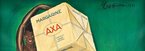
Margarine Axa Poster
Leonetto Cappiello · 1931 · Bold Margarine Axa poster with striking figure, green backdrop, and sunny yellow highlights
Poster from €9 · Framed from €16
Regular price From €6,00Regular price -
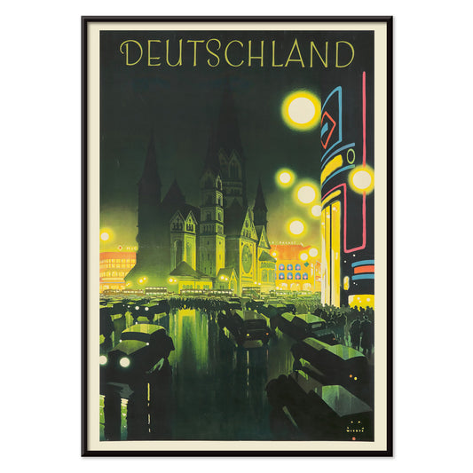
Deutschland Poster
Jupp Wiertz · 1927 · Glamorous night cityscape poster with glowing boulevard and cathedral skyline
Poster from €9 · Framed from €16
Regular price From €6,00Regular price -
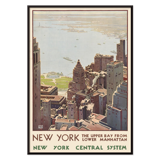
New York Central System Poster
Leslie Ragan · 1920 · Art Deco New York harbor poster with a sharp skyline and cool blue green tones
Poster from €9 · Framed from €16
Regular price From €6,00Regular price -
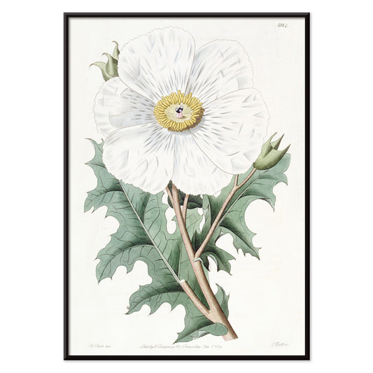
Mexican Poppy Poster
Sydenham Edwards · 1818 · Delicate Mexican poppy botanical print with pale petals, golden center, and crisp leaves
Poster from €9 · Framed from €16
Regular price From €6,00Regular price -
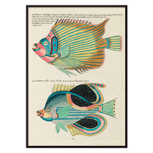
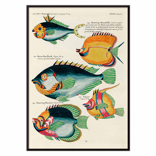
Colourful and surreal illustrations of fishes 8 Poster
Louis Renard · 1754 · Fantastical fish print with bold stripes, spots, and jewel like colors
Poster from €9 · Framed from €16
Regular price From €6,00Regular price -
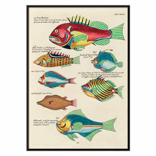
Colourful and surreal illustrations of fishes 6 Poster
Louis Renard · 1754 · Surreal tropical fish vintage print with vibrant colors and precise natural history linework
Poster from €9 · Framed from €16
Regular price From €6,00Regular price -
Colourful and surreal illustrations of fishes 4 Poster
Louis Renard · 1754 · Surreal tropical fish print with bold hand-colored forms on a clean specimen page
Poster from €9 · Framed from €16
Regular price From €6,00Regular price -
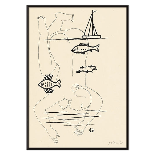
Drowned Poster
Mikuláš Galanda · 1930 · Surreal black-and-white poster merging human fragility with an aquatic fish motif
Poster from €9 · Framed from €16
Regular price From €6,00Regular price -
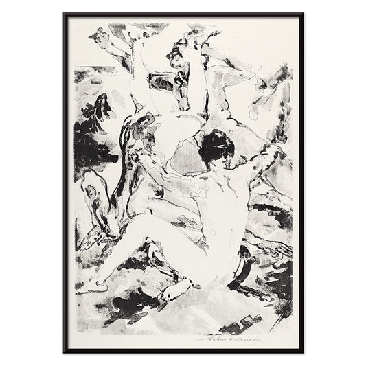
Three Acrobats Poster
Arthur Bowen Davies · 1920 · Lithe circus figures in a black and white art print with rhythmic modernist line
Poster from €9 · Framed from €16
Regular price From €6,00Regular price


36/1512 items
- Poissons Poster
- Plantes Potageres Poster
- Minotaure Poster
- Brahma Poster
- Matsyavatara Poster
- Carte céleste Poster
- Faust , tragédie de Goethe Poster
- Babar en Voiture Poster
- Histoire de Babar Poster
- Le Voyage de Babar Poster
- Babar en famille Poster
- Cheeses Poster
- Drink Coca Cola Poster
- Moullot Marseille Poster
- The Revenge of Tarzan Poster
- Lac Des Quatre-Cantons Poster
- Geographical Guide to a Woman's Heart Poster
- Margarine Axa Poster
- Colourful and surreal illustrations of fishes 6 Poster
Why vertical posters change a room
A vertical poster behaves like an architectural element: it draws the eye upward, narrows visual noise, and gives small rooms a clearer sense of proportion. Portrait-oriented formats have long been used for theatre bills, book covers, and street notices, where the tall rectangle supports a paced, top-to-bottom read. As wall art, that same structure can steady busy interiors and make circulation spaces feel composed. It is a useful format for entryways, corridors, and the slim wall between window and shelving, where a horizontal print would feel interrupted.
Graphic heritage and what it teaches the eye
The vertical format grew up in public view. Travel announcements, cinema programs, and commercial lithography trained designers to manage hierarchy with precision: headline, image, fine print, all balanced by margins. The best vintage posters carry this discipline into today, whether they are typographic or purely pictorial. Flat colour fields and crisp outlines help a composition read from a distance, while paper texture and ink density reward a closer look. The same logic links naturally to Bauhaus clarity, to the reduced forms of Minimalist design, and to the strong tonal scaffolding found in Black & White imagery.
Placing portrait wall art room by room
In living rooms, a tall print works well beside a bookcase, cabinet, or floor lamp, where it echoes the verticals already present in furniture. In bedrooms, portrait posters settle comfortably on the narrow strip between wardrobe and door, or as a single accent offset from the bed rather than centered over it. Kitchens and dining nooks often suit graphic vintage pieces, especially label-inspired layouts from Advertising, while quieter botanical studies from Botanical can soften hard surfaces like tile and steel. For colour, treat the poster as your accent note: pull one ink colour into linens or ceramics, then keep the surrounding wall and frame finishes restrained so the rectangle reads cleanly.
Curating pairs, framing, and gallery wall rhythm
Vertical prints are easiest to live with when curated in pairs: one image-dense sheet beside a calmer field so the wall alternates between detail and pause. A third element can widen the composition, such as a horizontal counterpoint from Landscape, but keep the spacing consistent so the arrangement feels deliberate. Thin black frames sharpen graphic designs; oak or walnut adds warmth to archival imagery, and coordinated options sit in Frames. Use a narrow mat to give darker prints breathing room, especially in smaller formats, and hang by a shared centerline at eye level while letting top edges step subtly to preserve the vertical rhythm.
The calm logic of a tall rectangle
Format-led collections stay flexible: portrait orientation can hold architectural photos, symbolic studies, abstraction, or vintage typography without forcing a single mood. What unites these posters is the way the tall crop edits a scene, keeping gesture and negative space in balance. When home decor starts to feel crowded, one considered vertical art print can restore order more effectively than a cluster. Treated as a single, quiet opening on the wall, it lets the room breathe while still offering a clear focal point.