


You may also like
-

This breaks the back of a book! Poster
Arlington Gregg · 1936 · Witty advertising poster showing a bent figure above an open book
Poster from €9 · Framed from €16
-

A book mark would be better! Poster
Arlington Gregg · 1936 · Witty poster showing a boy ironing an open book beneath bold lettering
Poster from €9 · Framed from €16
-

Rain Is Bad for a Book! Poster
Arlington Gregg · 1936 · A playful poster turns book protection into witty WPA graphic design
Poster from €9 · Framed from €16
-

Visit the Brookfield Zoo Poster
Arlington Gregg · 1937 · Cheerful panda poster inviting visitors to Brookfield Zoo with bold modern lettering
Poster from €9 · Framed from €16


-

"Very nice Posters. The quality is amazing and we received it very quickly !"
-

"A shop to visit absolutely. Huge selection of posters. We spent more than an hour there !"
-

"Perfect to find gift. Price are very good. An they can frame and pack it on site"
About the Artist
Arlington Gregg enters the story of American poster design through a 1936 WPA-era library warning. His name is tied here to a vertical poster that turns a small act of carelessness into a public message, using the language of New Deal graphics to speak directly to readers. The result feels rooted in the civic life of the library, where art print clarity had to do real work. In that setting, vintage poster design becomes part of daily behavior rather than decoration alone.
The Artwork
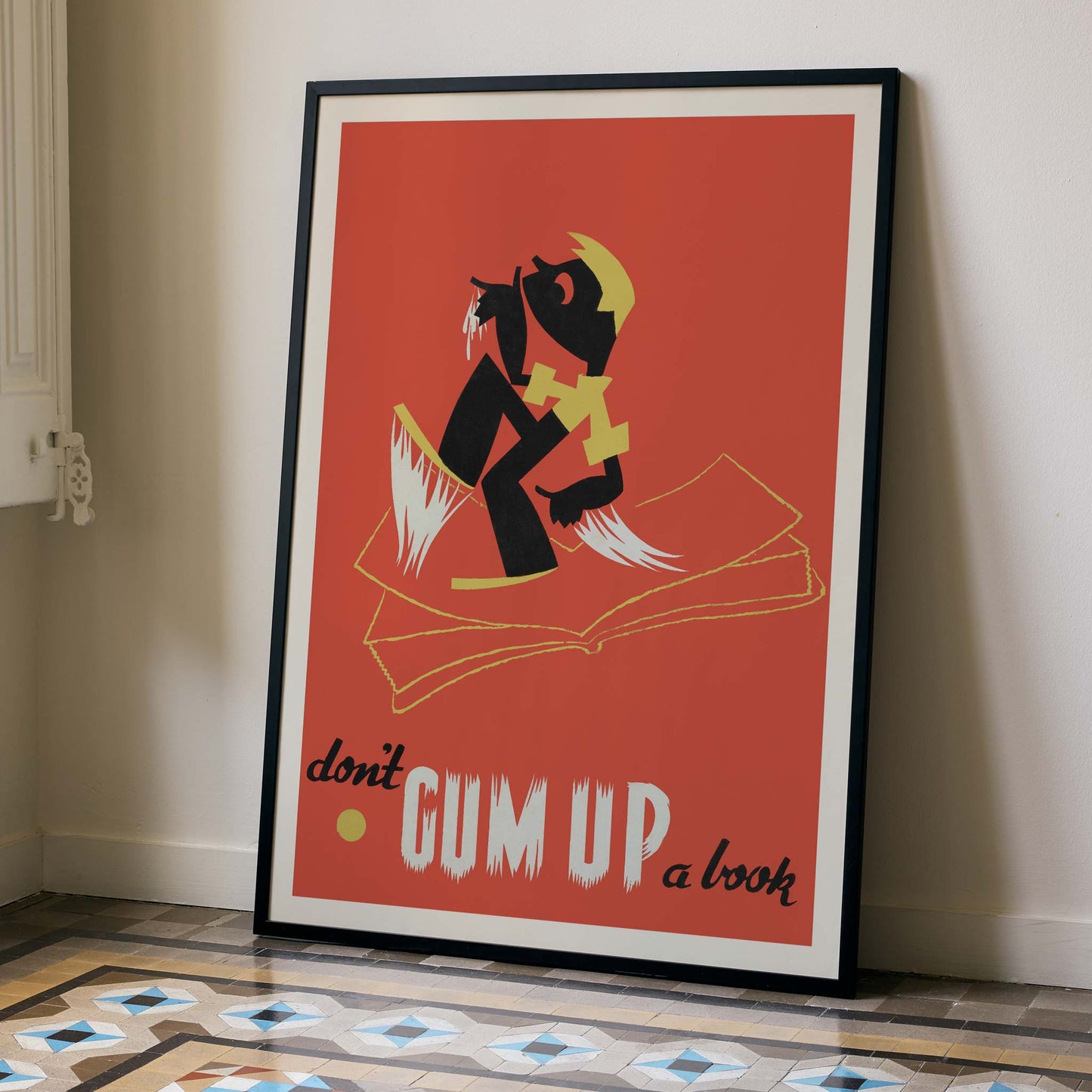
Don t gum up a book was made to discourage a habit that could damage shared reading material. The print speaks from the world of public libraries, where books moved constantly between hands and needed protection from sticky pages and torn corners. Its warning is memorable because it frames etiquette as a visual lesson instead of a dry rule. Seen today as a vintage print, it still carries the practical purpose of WPA-era wall art while preserving the social tone of 1930s public service graphics.
Style & Characteristics
A strong red field fills the page and sets off the black figure, which crouches over an open book in a bold, simplified shape. Yellow accents sharpen the outline of the head, limbs, and pages, while white marks slice through the composition like torn paper. The lettering at the bottom mixes rough block capitals with a cursive phrase, giving the poster a striking rhythm without crowding the image. Its minimalist graphic language keeps every shape visible at once, and the vertical format lets the figure hover over the book with immediate tension.
In Interior Design
In a narrow home office, this fine art print would bring a sharp burst of color beside a pale desk and a stack of well-used paperbacks. The red ground adds warmth, while the black figure creates a clear anchor on a quiet wall. As interior decoration, it works especially well where vintage art can add personality without cluttering the room. Framed cleanly, the poster gives the space a bookish edge that feels alert and lived in.